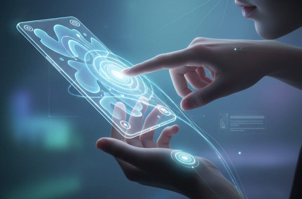
Smartphones are no longer just tools we hold in our hands. They are rapidly becoming extensions of our bodies, responding to swipes, taps, and even our gaze with near-zero delay.
As displays expand to 6.7 and 6.9 inches and bezels disappear, traditional point-and-click interfaces are reaching their limits. In their place, gesture navigation, back taps, predictive animations, and eye tracking are redefining how we interact with mobile devices.
In this article, you will discover how ergonomics, cognitive science, and OS-level innovations in iOS and Android are converging to create a new era of “transparent” interaction. You will learn why Fitts’s Law explains the rise of edge swipes, how gesture design can reduce thumb strain, and how power users customize Galaxy, Pixel, and iPhone devices to operate at the speed of thought.
- From Physical Buttons to Invisible Interfaces: The Rise of Gesture-First Design
- Fitts’s Law and the Large-Screen Dilemma: Why Edge Swipes Win
- Thumb Strain and De Quervain’s Tenosynovitis: The Medical Case for Gesture Optimization
- iOS vs Android in 2025–2026: Market Dynamics and Interaction Philosophies
- Japan’s Flick Input Culture and What It Reveals About Gesture Literacy
- Deep Dive into iOS: Back Tap, AssistiveTouch, and the Expansion into 3D Interaction
- Eye Tracking on iPhone and iPad: The Beginning of Hands-Free Control
- Android 15’s Predictive Back Gesture: Reducing Cognitive Load Through Animation
- Google Pixel Quick Tap and Motion Gestures: Machine Learning in Everyday UX
- Samsung One UI and Good Lock: Building a Personalized Gesture Language
- Third-Party Gesture Tools and Accessibility Layers for Large Displays
- Gesture Navigation vs 3-Button Navigation: Reliability, Precision, and User Psychology
- A Three-Level Roadmap to Embodied Smartphone Mastery
- 参考文献
From Physical Buttons to Invisible Interfaces: The Rise of Gesture-First Design
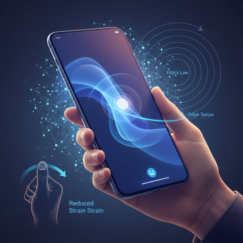
Smartphone interfaces are undergoing a quiet but radical transformation. As displays expand to 6.7–6.9 inches, the era of precise point-and-click tapping is reaching its ergonomic limits. In its place, gesture-first design is emerging as a way to make interaction feel less mechanical and more embodied.
This shift is not merely aesthetic. It is grounded in human–computer interaction theory. According to Fitts’s Law, proposed by psychologist Paul Fitts in 1954, the time required to reach a target depends on the distance to and size of that target. As screens grow taller and icons become relatively smaller, the “index of difficulty” inevitably increases.
Edge-based gestures fundamentally change this equation. When the edge of the screen becomes the target, its effective width approaches infinity, dramatically lowering the difficulty of the action. A rough swipe from the side replaces the cognitive and muscular precision required to hit a tiny back button in the corner.
| Interaction Model | Target Size (W) | Motor Precision Required |
|---|---|---|
| Physical / On-screen Button | Fixed, limited | High |
| Edge Swipe Gesture | Screen edge (effectively large) | Low to moderate |
The result is what many designers describe as interface “transparency.” Instead of consciously aiming and confirming each tap, users perform fluid motions that blend into natural thumb movement. The interface recedes, and the action feels closer to a bodily reflex than a command.
Research in applied HCI models, including contemporary re-evaluations of Fitts’s Law, suggests that reducing target acquisition complexity lowers error rates and mental workload. In practical terms, gesture navigation reduces the micro-decisions involved in each interaction, especially on elongated displays.
This design philosophy also reflects a return to physicality. While early smartphones relied on visible buttons to reassure users, gesture-first systems trust muscle memory. Swiping up to go home or sideways to go back becomes procedural knowledge, stored not in verbal memory but in motor circuits.
The disappearance of visible controls is not a loss of control; it is a transfer of control to the body itself. As users internalize gestures, latency between intention and execution shrinks. The device begins to function less like a tool and more like an extension of the hand.
However, this invisibility requires careful onboarding and feedback. Without tactile cues, systems must rely on animation and haptics to signal successful execution. The most refined implementations subtly mirror physical metaphors, such as pages sliding or layers receding, reinforcing intuitive understanding.
Gesture-first design therefore represents more than a UI trend. It is a structural response to hardware growth, cognitive efficiency principles, and the human need for fluid movement. As interfaces become increasingly invisible, the real interface is no longer the screen. It is the user’s embodied skill.
Fitts’s Law and the Large-Screen Dilemma: Why Edge Swipes Win
As smartphone displays stretch to 6.7 inches and beyond, a classic principle from 1954 suddenly feels more relevant than ever. Fitts’s Law, proposed by psychologist Paul Fitts, predicts that the time required to reach a target depends on the distance to it and its size. In simple terms, the farther and smaller the target, the harder it is to hit.
On modern tall screens with 20:9 or 21:9 aspect ratios, this creates a structural problem. Your thumb rests near the bottom edge, yet critical UI elements such as back buttons or menus often sit at the top. Distance increases, target size shrinks, and the index of difficulty rises accordingly.
This is the large-screen dilemma: hardware has grown, but the human thumb has not.
| Factor | Effect on Fitts’s Law | Impact on Large Phones |
|---|---|---|
| Distance (D) | Longer movement time | Top-of-screen buttons become harder to reach |
| Target Width (W) | Smaller width increases difficulty | Compact icons demand precision |
| Edge Gesture | Effectively large target width | Lower difficulty, faster execution |
According to the mathematical model described in Fitts’s original work and later HCI research summarized by sources such as MDPI’s applied sciences reviews, when target width approaches a very large value, the index of difficulty approaches zero. Edge swipes cleverly exploit this principle.
When you swipe from the screen edge to go back, you are not aiming at a tiny icon. You are interacting with an entire boundary. The “target” becomes the full vertical edge of the display, which is practically expansive compared to a small button.
By transforming a point target into a boundary interaction, edge gestures dramatically reduce cognitive and motor load.
This is why gesture navigation often feels more “natural.” Your brain no longer calculates pixel-level precision. Instead, it executes a gross motor movement: push from the edge inward. The neuromuscular demand drops, and error rates decrease.
There is also a biomechanical dimension. Reaching for a top-left back button with one hand forces thumb extension and wrist deviation, movements associated with higher tendon strain. Swiping from the side keeps the thumb within a more neutral arc of motion, aligning better with ergonomic recommendations discussed in medical commentary on smartphone overuse.
In practice, this means edge swipes are not just a design trend. They are a mathematically and anatomically rational response to display inflation. Large screens amplify distance-based difficulty, and gestures neutralize it by redefining what counts as a target.
For gadget enthusiasts chasing peak efficiency, the takeaway is clear. The future of large-screen usability does not lie in shrinking buttons or stretching thumbs further. It lies in designing interactions where the screen edge itself becomes the button, effectively bending Fitts’s Law in the user’s favor.
Thumb Strain and De Quervain’s Tenosynovitis: The Medical Case for Gesture Optimization
As smartphones have grown to 6.7–6.9 inches, your thumb is asked to travel farther than human anatomy comfortably allows. What feels like a minor stretch toward the top-left corner can, when repeated hundreds of times a day, accumulate into clinically significant strain.
One of the most common conditions linked to intensive one-handed smartphone use is De Quervain’s tenosynovitis. It is an inflammatory condition affecting the tendon sheath of the abductor pollicis longus and extensor pollicis brevis at the thumb side of the wrist.
According to medical explanations cited by SoftBank News, the combination of thumb extension and wrist deviation toward the little finger side places maximal tension on this tendon compartment. Large-screen phones amplify this exact movement pattern.
| Risk Factor | Biomechanical Impact | Typical Smartphone Scenario |
|---|---|---|
| Thumb overextension | Increased tendon friction | Reaching top navigation buttons |
| Wrist ulnar deviation | Elevated sheath compression | One-handed diagonal stretching |
| Repetitive micro-movements | Cumulative inflammation | Scrolling and tapping cycles |
The critical issue is repetition. Even low-force movements become harmful when performed thousands of times per week. The modern gesture-heavy interface does not eliminate motion; it redistributes it.
This is where gesture optimization becomes a medical, not just usability, concern.
From an ergonomic perspective grounded in Fitts’s Law, reducing the distance to frequently used targets lowers motor difficulty. But from a clinical standpoint, reducing extreme thumb abduction and wrist deviation lowers tendon stress.
Medical guidance consistently suggests that two-handed use distributes load more evenly across both thumbs and reduces unilateral strain. However, one-handed operation is often unavoidable during commuting, walking, or multitasking.
In those scenarios, optimization strategies matter. Swiping within the natural arc of thumb flexion is biomechanically safer than stretching to fixed tap targets located at screen extremities.
Keeping interactions inside the thumb’s neutral zone—rather than at its anatomical limits—can significantly reduce cumulative stress.
Feature-level adjustments support this preventive approach. Relocating high-frequency controls to the lower half of the display, using edge gestures instead of small corner buttons, and enabling back-tap functions reduce the need for diagonal extension.
Even subtle grip stabilization techniques help. When users rely on gestures that allow the thumb to stay in contact with the screen, they avoid micro-adjustments in grip force that otherwise increase muscular fatigue.
These refinements may seem minor, but over months and years they define whether smartphone use remains sustainable or becomes symptomatic.
De Quervain’s tenosynovitis is not limited to athletes or manual laborers. In the era of large displays and continuous scrolling, heavy smartphone users are an emerging risk group.
Gesture optimization should therefore be viewed as preventive ergonomics—an investment in long-term hand health rather than a mere productivity hack.
When interface design aligns with anatomical reality, the device begins to adapt to the body, instead of forcing the body to compensate for the device.
iOS vs Android in 2025–2026: Market Dynamics and Interaction Philosophies
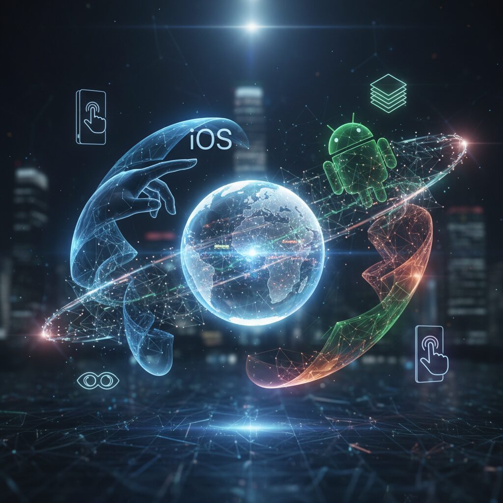
In 2025–2026, the competition between iOS and Android is no longer just about hardware specs or AI features. It is about how each platform interprets the relationship between the human body and the screen. The market is mature, but the philosophies behind interaction continue to diverge in meaningful ways.
According to MMD Research Institute’s September 2025 survey, Japan remains one of the rare markets where iOS and Android are almost perfectly balanced. This equilibrium forces both ecosystems to refine their interaction models rather than rely on dominance.
| OS | 2025 Share (Japan) | Notable Trend |
|---|---|---|
| iOS | 48.3% | Strong among teens and 20s |
| Android | 51.4% | Growth among seniors and enthusiasts |
This near 50–50 split creates a unique laboratory of interaction design. Developers must comply with Apple’s Human Interface Guidelines while also adapting to Android’s Material Design and predictive navigation systems. Users, in turn, are often bilingual in gesture logic.
iOS prioritizes coherence and embodied smoothness. Through vertical integration, Apple tightly controls gesture timing, haptic feedback, and animation curves. Features like Back Tap and upcoming eye-tracking accessibility functions extend interaction into physical space, reinforcing the idea that the device should “disappear” into the body.
Android, especially from version 15 onward, emphasizes adaptability and cognitive transparency. The predictive back gesture, documented by Android Developers, previews the destination screen in real time. This reduces uncertainty about whether the user is exiting an app or navigating within it, lowering cognitive load through visual anticipation.
The philosophical contrast becomes clearer when we consider senior adoption. MMD data shows smartphone usage among people aged 60–79 has reached 96.5% in Japan. For many in this group, fully gesture-based navigation can feel intangible. This explains the continued support for 3-button navigation on Android, which offers binary certainty instead of analog swipes.
In short, iOS pursues “transparent immersion,” while Android explores “predictive clarity and customization.” One minimizes friction through controlled harmony; the other reduces ambiguity through feedback and user-adjustable systems.
These interaction philosophies are not merely aesthetic differences. They reflect contrasting assumptions about human motor learning. Apple assumes gestures will become procedural memory through repetition. Google assumes users benefit from explicit previews and modifiable controls during that learning process.
As screen sizes stabilize around 6.7 to 6.9 inches, the battlefield shifts from display innovation to embodied ergonomics. The OS that best aligns motor movement, visual confirmation, and cognitive confidence will define the next phase of market momentum.
Japan’s Flick Input Culture and What It Reveals About Gesture Literacy
Japan’s flick input culture offers a rare lens into how gesture literacy is socially cultivated rather than individually improvised.
Unlike many countries where QWERTY became the default mental model for smartphone typing, Japan evolved a distinct thumb-based swipe system from feature phone keypads. This historical continuity matters.
Flick input is not merely a text entry method. It is a national-scale training program in micro-gestural precision.
In flick input, a single key expands into five directional outputs—tap for the central kana, swipe up, down, left, or right for variations. The cognitive load shifts from locating discrete keys to mastering vector direction and movement amplitude.
According to education-focused reports in 2025, elementary students in Japan practice flick typing alongside PC keyboard skills, using gamified apps that measure speed and accuracy.
This early exposure builds procedural memory, embedding directional swipes into muscle memory before adulthood.
| Input Model | Primary Skill | Motor Pattern |
|---|---|---|
| QWERTY Tap | Spatial key search | Discrete vertical taps |
| Flick Input | Directional selection | Radial micro-swipes |
This distinction has broader implications. Flick users internalize a radial interface logic: center plus vectors. That mental model aligns naturally with pie menus, edge swipes, and multi-directional gesture handles found in modern operating systems.
When Samsung’s One Hand Operation+ allows six directional variations per edge, or when Android’s predictive back gesture responds dynamically to swipe distance, Japanese users often adapt quickly.
Their thumbs are already conditioned to modulate direction and length with fine control.
Research on motor learning consistently shows that repeated low-amplitude directional movement strengthens neuromuscular efficiency. While flick input studies are rarely framed in academic motor control terms, the behavioral outcome is visible: high-speed, low-error thumb articulation.
Gamified training apps such as competitive flick typing tools further reinforce reaction speed and movement accuracy, blending entertainment with motor refinement.
Gesture literacy here becomes cultural capital.
There is also a social dimension. Because iOS and Android market share in Japan remains closely balanced, as reported by MMD Research Institute, users frequently encounter multiple gesture paradigms across peer groups.
This cross-platform exposure encourages flexible gesture interpretation rather than rigid brand-specific habits.
In effect, Japanese users develop bilingualism in interface logic.
Flick input also reveals something deeper about interface transparency. The act of swiping outward from a single locus reduces visual dependency; users rely on proprioception rather than constant confirmation.
This mirrors the broader industry shift toward reducing cognitive latency between intention and execution.
When gesture becomes reflexive, the device feels less like a tool and more like an extension of the thumb.
At the same time, flick culture demonstrates that gesture literacy is learned, not innate. Without structured exposure, directional systems can feel ambiguous.
Japan’s example shows that when education, gaming, and daily communication reinforce a gesture grammar, complex swipe systems become intuitive at scale.
What appears “natural” is often the result of sustained cultural rehearsal.
For global UX designers, this insight is critical. Gesture adoption depends not only on hardware ergonomics or software polish, but on the accumulated motor vocabulary of users.
Japan’s flick input ecosystem proves that when a society trains its thumbs in vectors rather than buttons, advanced gestural interfaces are not a leap—they are a continuation.
Gesture literacy, in this sense, is a cultural infrastructure quietly shaping the future of human-device interaction.
Deep Dive into iOS: Back Tap, AssistiveTouch, and the Expansion into 3D Interaction
As smartphones approach 6.7 to 6.9 inches, the challenge is no longer processing power but reachability. According to Fitts’s Law, the time to hit a target increases as distance grows and size shrinks. On modern iPhones, top-edge controls such as Notification Center become ergonomically expensive for one-handed use.
Apple’s response is not to enlarge buttons, but to expand interaction into depth and abstraction. Back Tap and AssistiveTouch effectively redesign the interaction surface, while upcoming eye-tracking pushes iOS from 2D touch toward 3D spatial intent.
Back Tap: Turning the Entire Device into an Input Surface
Introduced in iOS 14, Back Tap uses the accelerometer to detect double or triple taps on the rear glass. Instead of targeting pixels, users trigger actions through physical impulses, enabling blind operation without visual confirmation.
| Gesture | Recommended Assignment | Rationale |
|---|---|---|
| Double Tap | Control Center / Reachability | High frequency, low risk |
| Triple Tap | Screenshot / Silent Mode | Intentional, high certainty |
Industry analyses of iPhone ergonomics note that top-edge interactions are among the hardest to perform one-handed. Assigning those to Back Tap effectively collapses the distance variable in Fitts’s equation, reducing both movement time and muscular strain.
When paired with the Shortcuts app, Back Tap becomes a macro trigger. A triple tap can translate clipboard text, log it to Notes, and return to the previous app in a single motion. This shifts interaction from app-centric navigation to system-level command execution.
AssistiveTouch: Precision Through Virtual Consolidation
Originally designed as an accessibility feature, AssistiveTouch now functions as a customizable command hub. Its floating button can host single tap, double tap, and long press actions, effectively centralizing navigation into a thumb-friendly zone.
From an ergonomic standpoint, this minimizes thumb extension toward the upper diagonal — the movement associated with higher strain in De Quervain’s tenosynovitis, often called “smartphone thumb.” Medical guidance from Japanese carrier research highlights that reducing extreme thumb stretch lowers tendon friction risk.
By anchoring core functions like App Switcher or Lock Screen to a lower screen position, users reduce repetitive high-tension gestures. The result is not only speed but sustainable usage.
Eye Tracking: The Third Axis of Interaction
Apple has announced advanced eye-tracking accessibility features scheduled for Japanese support within 2025, drawing on spatial computing research developed for Vision Pro. With Dwell Control, users select UI elements by gazing at them for a defined duration.
This introduces a crucial shift: selection by vision, confirmation by gesture. A user can look at a button, then confirm with Back Tap. In this hybrid model, distance in physical space becomes nearly irrelevant, because targeting is performed by gaze rather than reach.
Human–computer interaction research emphasizes that reducing cognitive uncertainty improves perceived fluidity. By making intent visible through gaze and action confirmable through tactile input, iOS moves closer to “transparent interaction,” where device mediation fades into embodied reflex.
Together, Back Tap, AssistiveTouch, and eye-driven selection redefine the iPhone not as a flat touch panel, but as a layered interaction system. The screen remains central, yet the true interface expands across hardware, software, and spatial awareness.
For power users, mastering these layers means reducing friction between thought and execution. The device stops being something you operate and starts behaving like something you extend.
Eye Tracking on iPhone and iPad: The Beginning of Hands-Free Control
The arrival of Eye Tracking on iPhone and iPad marks a decisive shift from touch-based interaction to true hands-free control.
Announced as part of Apple’s upcoming accessibility features for 2025, this capability extends technologies refined in spatial computing to mainstream mobile devices.
For the first time, gaze itself becomes a primary input method, not just a supplementary signal.
According to ITmedia’s coverage of Apple’s announcement, the feature is designed to run using the front-facing camera, enabling users to control iOS and iPadOS without additional hardware.
This approach lowers the barrier to entry dramatically compared to earlier eye-tracking systems that required dedicated infrared sensors.
What was once confined to research labs or specialized assistive devices now becomes software-defined and widely deployable.
| Interaction Method | Primary Input | Physical Requirement |
|---|---|---|
| Touch | Finger contact | Hand mobility |
| Gesture | Swipe from edge | Thumb reach |
| Eye Tracking | Gaze fixation | Visual focus only |
The core mechanism relies on Dwell Control.
Users look at an interface element, and after a configurable dwell time—ranging from milliseconds to several seconds—the system registers a selection.
This transforms the act of “looking” into a deliberate command, effectively redefining what it means to tap.
From a human–computer interaction perspective, this development challenges the traditional constraints described by Fitts’s Law.
If touch input requires physical distance to a target, gaze input collapses that distance into a purely perceptual shift.
The constraint is no longer thumb reach, but attentional precision.
Practical scenarios highlight its potential.
During cooking, when hands are wet or gloved, a user can scroll a recipe or trigger playback controls without touching the screen.
In mobility contexts—such as commuting while holding onto a strap—brief eye-based interaction reduces the need for grip adjustments.
There is also a profound accessibility dimension.
Eye tracking has long been essential for users with limited motor control, but mainstream integration signals a philosophical shift toward inclusive design as default.
Apple’s broader accessibility roadmap, as reported by Japanese tech media, positions this not as a niche add-on but as a system-level capability.
Importantly, Eye Tracking does not eliminate other inputs.
It opens the door to multimodal interaction, where gaze selects and another gesture—such as a back tap—confirms.
This layered approach increases intentionality and reduces accidental activation.
For gadget enthusiasts, the real excitement lies in experimentation.
Adjusting dwell timing, combining gaze with shortcuts, and optimizing interface layouts for visual scanning will become new frontiers of personalization.
Hands-free control is no longer science fiction—it is the beginning of a new operational literacy for mobile devices.
Android 15’s Predictive Back Gesture: Reducing Cognitive Load Through Animation
Android 15’s Predictive Back Gesture is not just a visual refresh. It is a carefully engineered response to a long-standing usability problem: users often do not know what will happen when they go “back.” That small uncertainty accumulates into cognitive load, especially during rapid multitasking.
In earlier versions of Android, pressing back could mean returning to a previous screen within the app or exiting to the home screen. Because the outcome was not always visible beforehand, users had to simulate the result mentally. According to research on human-computer interaction grounded in Fitts’s Law, even micro-decisions increase perceived effort when repeated dozens of times per session.
When you begin swiping from the edge in Android 15, the current activity shrinks in real time. Behind it, the destination screen—whether the previous in-app page or the launcher—appears as a live preview. This animation is not decorative. It externalizes system state, turning uncertainty into perception.
Google documents this behavior in its developer guidance, encouraging the implementation of the OnBackInvokedCallback API so that app navigation and system navigation remain consistent. The result is a unified motion language across the OS.
| Interaction Phase | Before Android 15 | Android 15 Predictive Back |
|---|---|---|
| Gesture Start | No clear visual feedback | Immediate window scaling animation |
| Outcome Awareness | Inferred mentally | Previewed visually in real time |
| User Confidence | Variable | High, due to confirmation before release |
This preview mechanism directly addresses what cognitive psychology calls “decision uncertainty.” Instead of committing to an irreversible action, users can modulate the swipe. If the preview shows an unintended destination, they simply cancel mid-gesture. The interface behaves less like a binary switch and more like a continuous physical object.
The animation therefore functions as cognitive scaffolding. It supports working memory by offloading prediction from the brain to the display. Over time, as procedural memory develops, users rely less on conscious evaluation and more on embodied intuition.
There is also an ergonomic dimension. Because the gesture originates from the screen edge—an effectively infinite target in Fitts’s Law terms—it remains fast and low-effort even on 6.7-inch and larger devices. The predictive animation complements this motor efficiency with perceptual clarity.
Importantly, this system benefits not only power users but also seniors and users transitioning from 3-button navigation. Visual confirmation reduces anxiety associated with accidental exits, a factor frequently discussed in Android community forums. By making navigation consequences visible before completion, Android 15 narrows the psychological gap between gesture fluidity and button certainty.
In practice, Predictive Back transforms “going back” from a leap of faith into a guided motion. The gesture becomes reversible, observable, and trustworthy. That trust is what ultimately lowers cognitive load and brings Android navigation closer to true interface transparency.
Google Pixel Quick Tap and Motion Gestures: Machine Learning in Everyday UX
Google Pixel’s Quick Tap and motion gestures represent a shift from touch-centric UI to machine learning–assisted embodied interaction. Instead of forcing users to precisely target on-screen buttons, Pixel leverages accelerometers, gyroscopes, and on-device ML models to interpret intent from subtle physical movement.
According to Google’s official Pixel documentation, Quick Tap allows users to double-tap the back of the device to trigger actions such as screenshots or launching specific apps. What differentiates Pixel from simpler tap-detection systems is its filtering logic, designed to distinguish intentional taps from accidental shocks.
In settings, users can enable a “require stronger taps” option. This reflects an adaptive threshold model: walking vibrations, desk impacts, or case-induced resonance must not be misclassified as commands. By adjusting sensitivity, Pixel balances responsiveness and false-positive suppression in real-world conditions.
| Gesture | Sensor Basis | Primary Use Case |
|---|---|---|
| Quick Tap (Back Double Tap) | Accelerometer + ML filtering | Screenshot, app launch, voice recorder |
| Power Button Double Press | Hardware interrupt | Instant camera launch |
| Twist to Switch Camera | Gyroscope + motion detection | Rear/front camera toggle |
The camera gestures illustrate another principle: latency elimination through motion prediction. Double-pressing the power button launches the camera without navigating the UI stack. Twisting the wrist twice switches cameras using gyroscopic motion cues. These gestures bypass visual targeting entirely, which aligns with human–computer interaction research showing that reducing pointing distance lowers cognitive and motor load.
Work-hack case studies featured in productivity media such as Lifehacker highlight assigning Quick Tap to voice recording or note apps. The advantage is not novelty but temporal compression: instead of unlock → locate app → launch, the flow collapses into a single physical micro-action. When ideas decay within seconds, this half-second gain becomes strategically meaningful.
From a machine learning perspective, Pixel’s implementation operates locally on-device. This ensures immediate inference and avoids cloud latency. The model must classify tap signatures based on amplitude, frequency, and temporal spacing. The optional “stronger tap” toggle effectively raises the decision boundary to prioritize precision over recall.
What makes Pixel’s gesture ecosystem compelling is its consistency: hardware button gestures, motion gestures, and Quick Tap all function without requiring visual confirmation. This creates a parallel input layer independent of the display, particularly valuable when attention is divided or hands are partially occupied.
In everyday UX, this means the smartphone behaves less like a flat panel and more like a responsive physical tool. Machine learning does not replace interaction; it interprets intention embedded in motion. The result is a device that anticipates meaning from movement, narrowing the gap between impulse and execution.
Samsung One UI and Good Lock: Building a Personalized Gesture Language
Samsung’s One UI, combined with the Good Lock ecosystem, allows you to move beyond preset gestures and design a personalized gesture language tailored to your own thumb reach, grip style, and cognitive habits.
In an era where 6.7–6.9-inch displays are becoming standard, this level of customization is not cosmetic. It is an ergonomic strategy grounded in human–computer interaction theory.
By redefining where and how commands are triggered, you effectively reshape the device around your body rather than forcing your hand to adapt to the screen.
One Hand Operation+: Vector-Based Gesture Architecture
The Good Lock module One Hand Operation+ introduces virtual “handles” along the left and right edges of the display. From each handle, you can assign multiple actions based on direction and swipe length.
This is not a simple shortcut tool. It is a vector-based input system that combines direction and distance, expanding the expressive range of a single thumb movement.
| Input Variable | Options | Resulting Actions |
|---|---|---|
| Direction | Horizontal / Diagonal Up / Diagonal Down | Different system or app commands |
| Swipe Length | Short / Long | Secondary layer of commands |
| Screen Side | Left / Right | Contextual separation of functions |
With three directions and two lengths per side, a single edge can host six distinct commands. Both sides combined enable up to twelve gesture mappings.
From the perspective of Fitts’s Law, edge gestures are powerful because the screen boundary acts as an effectively infinite target width. This minimizes the index of difficulty and reduces fine motor strain.
Instead of reaching for small icons at the top of the display, you perform broad, low-precision swipes near your natural thumb resting zone.
Advanced users often assign diagonal long swipes to screenshot-and-edit workflows, allowing capture and annotation in one fluid motion. Short diagonal swipes can open quick tool panels without pulling down the notification shade.
Crucially, handle position and sensitivity can be adjusted. You can avoid interference with the keyboard area or disable gestures when using the S Pen, creating context-aware behavior.
This level of granularity transforms gestures from generic shortcuts into a structured personal language.
RegiStar: Redefining Hardware Intent
Another Good Lock module, RegiStar, extends customization to hardware buttons and even the Settings interface itself.
You can remap the long press of the side key from its default assistant trigger to actions such as launching a specific app or toggling the flashlight.
While not a gesture in the strict sense, this redefinition shortens the action chain between intention and execution.
RegiStar also allows reordering items inside the Settings menu. By placing frequently accessed options at the top, you reduce scrolling distance—effectively lowering physical interaction cost.
In usability research, even small reductions in navigation depth can meaningfully improve perceived efficiency. Here, Samsung gives users direct control over that hierarchy.
The result is a system where both software gestures and hardware inputs operate under a unified, personalized logic.
When you intentionally assign meaning to each direction, length, and button press, repetition converts these actions into procedural memory.
Over time, your thumb no longer searches for UI elements; it executes patterns automatically.
This is where One UI and Good Lock move from customization tools to instruments of embodied interaction, enabling your Galaxy device to function less like a tool you operate and more like an extension of your motor system.
Third-Party Gesture Tools and Accessibility Layers for Large Displays
As displays approach 6.9 inches, even optimized system gestures cannot fully eliminate reachability issues. This is where third-party gesture tools and accessibility layers become strategically important. Rather than replacing the OS, they operate on top of it, redefining how touch input is interpreted and redistributed across the screen.
According to discussions in Android enthusiast communities such as Reddit, large-phone users frequently seek solutions that minimize thumb travel without sacrificing full-screen immersion. These tools effectively create a secondary interaction layer that reshapes the ergonomics of oversized devices.
Two representative examples often cited are UbikiTouch and Archand. Both leverage Android’s accessibility service framework to intercept edge gestures and trigger custom actions such as cursor mode or radial menus.
| Feature | Cursor Mode | Pie Menu |
|---|---|---|
| Interaction Model | Trackpad-style pointer control | Radial directional selection |
| Best Use Case | Top-screen precision taps | Quick multi-command access |
| Learning Curve | Moderate | Low to Moderate |
Cursor mode effectively overlays a virtual trackpad at the bottom of the display. By sliding a thumb within a small zone, users move a pointer to otherwise unreachable areas. This approach mirrors laptop trackpad ergonomics and reduces extreme thumb extension, which is associated with De Quervain’s tendon stress as noted in medical guidance referenced by SoftBank News.
Pie menus, by contrast, rely on directional muscle memory. Because the selection radiates outward from a central point, target size increases relative to movement direction. This aligns conceptually with Fitts’s Law, which states that larger effective targets reduce movement time. By converting small icons into large directional sectors, these tools decrease the index of difficulty without modifying the original app interface.
In gaming contexts, especially emulator environments like Classic Boy Pro discussed in user forums, gesture remapping introduces both flexibility and friction. Swipes can be translated into D-pad or button inputs, but the absence of tactile feedback increases cognitive load. Community reports emphasize enabling vibration feedback to partially restore sensory confirmation.
Accessibility layers also serve users wearing gloves or thick cases, where edge detection becomes unreliable. By expanding gesture activation zones inward, these tools compensate for hardware limitations that standard navigation may not address.
However, because they rely on accessibility permissions, resource consumption and input latency must be monitored. Advanced users often fine-tune sensitivity thresholds to avoid accidental triggers, effectively balancing speed and certainty.
For large-display power users, the goal is not more gestures but smarter gesture geometry. By relocating interaction gravity toward the thumb’s natural arc, third-party tools transform oversized screens from ergonomic liabilities into customizable control surfaces.
When configured thoughtfully, these overlays do not add complexity. They reduce reach, shorten movement distance, and convert spatial disadvantage into programmable efficiency.
Gesture Navigation vs 3-Button Navigation: Reliability, Precision, and User Psychology
When discussing gesture navigation versus 3-button navigation, the debate is not about modern versus outdated design. It is about reliability, precision, and how the human brain evaluates risk during interaction.
As screen sizes have expanded to 6.7 inches and beyond, gesture navigation has become the default on most flagship devices. However, 3-button navigation remains available on Android, and a significant number of users deliberately keep it enabled.
The reason is psychological as much as technical.
| Aspect | Gesture Navigation | 3-Button Navigation |
|---|---|---|
| Input Nature | Analog (direction, speed, distance) | Digital (tap = execute) |
| Error Risk | Possible mis-swipe or mis-detection | Highly predictable activation |
| Screen Usage | Maximizes display area | Consumes fixed UI space |
| Context Sensitivity | Can conflict with in-app gestures | Functionally isolated |
From an HCI perspective, gesture navigation reduces motor difficulty. According to Fitts’s Law, expanding the effective target width lowers the index of difficulty. Edge swipes effectively turn the entire screen border into a large activation zone, reducing precision demands compared to tapping a small on-screen button.
In theory, this makes gestures faster and more efficient. In practice, however, analog input introduces variability. A swipe must meet certain thresholds of distance and velocity. If it falls short, the system may interpret it as scrolling instead of “Back.”
This small uncertainty triggers cognitive friction.
Research in cognitive psychology shows that humans prefer deterministic systems when performing high-frequency actions. A button represents a binary contract: tap equals result. There is no ambiguity. This predictability explains why discussions on communities such as Reddit consistently highlight a “100% certainty” feeling with 3-button navigation.
Certainty reduces mental load, even if the action takes slightly longer.
Gesture navigation, by contrast, demands micro-calibration. Users unconsciously adjust swipe angle, speed, and starting position. Over time this becomes procedural memory, but during the learning phase it increases error sensitivity.
Android 15’s Predictive Back Gesture addresses this psychological gap. According to Android Developers documentation, the system now previews the destination screen as the user swipes. This visual feedback transforms a blind command into a reversible action.
The interface effectively says, “This is where you will go.”
By externalizing system intent, it restores user confidence without reintroducing buttons.
Environmental factors also influence reliability. Thick protective cases can obstruct edge detection. Gloves reduce capacitive accuracy. In such scenarios, a visible navigation bar offers mechanical clarity. The input area is explicit and visually anchored.
Gesture systems are elegant under ideal conditions. Button systems are resilient under imperfect ones.
This distinction explains why neither paradigm has fully eliminated the other.
Precision is another nuanced dimension. Gestures excel in spatial fluidity, especially when switching apps or returning home in one continuous motion. However, when rapid repetitive navigation is required, discrete buttons may reduce cumulative error.
The difference is subtle but meaningful in professional or accessibility contexts.
Reliability is not just about technical accuracy; it is about perceived control.
Ultimately, gesture navigation aligns with the philosophy of interface invisibility. It aims to dissolve UI chrome and let content dominate. 3-button navigation, on the other hand, prioritizes explicit affordance and cognitive assurance.
One optimizes spatial efficiency and motor theory. The other optimizes psychological certainty.
The superior system depends not on trend, but on how much ambiguity a user is willing to tolerate in exchange for fluidity.
A Three-Level Roadmap to Embodied Smartphone Mastery
Mastering smartphone gestures is not about memorizing features. It is about transforming conscious actions into embodied skill. According to research on motor learning and Fitts’s Law, repeated low-difficulty movements gradually shift from declarative knowledge to procedural memory. In other words, you stop thinking about the gesture and simply perform it.
This roadmap structures that transformation into three progressive levels. Each level reduces cognitive latency and physical strain while increasing speed, precision, and confidence.
| Level | Focus | Primary Outcome |
|---|---|---|
| Level 1 | Ergonomic Basics | Reduced strain and fewer errors |
| Level 2 | Physio-Digital Fusion | One-step execution of core actions |
| Level 3 | Ultimate Customization | Personal gesture language |
Level 1: Ergonomic Basics. Here, you optimize for human anatomy. Large 6.7–6.9 inch displays increase thumb travel distance, which raises the Index of Difficulty described by Paul Fitts. Instead of fighting physics, you redesign access. Assign top-screen functions such as notifications to Back Tap on iOS or Quick Tap on Pixel. Practice system gestures like back navigation until you can execute them without visual confirmation. The goal is consistency, not speed.
Level 2: Physio-Digital Fusion. At this stage, you collapse multi-step flows into single triggers. For example, mapping screenshots, voice memos, or payment apps to rear taps removes the unlock-search-open sequence. As highlighted in Android’s Predictive Back documentation, visual feedback reduces cognitive uncertainty. You begin to trust the gesture before completion. Japanese users already possess an advantage here: flick input culture trains multidirectional micro-swipes, improving fine motor precision.
Level 3: Ultimate Customization. Now you design a personal interaction grammar. Samsung’s One Hand Operation+ allows direction-and-distance combinations, effectively multiplying command capacity per edge. iOS users can pair AssistiveTouch with Shortcuts to create macro-level automations. The objective is not complexity but compression: maximum output from minimal thumb displacement.
Looking ahead, Apple’s planned eye-tracking support introduces multimodal input. Selecting with gaze and confirming with a rear tap eliminates physical distance constraints entirely. This represents a shift from touch optimization to intention optimization.
Technology evolves rapidly, but your biomechanics remain constant. By progressing deliberately through these three levels, you do not merely learn gestures. You internalize them, reduce strain such as the thumb overextension linked to De Quervain’s risk, and approach true interface transparency.
参考文献
- Wikipedia:Fitts’s law
- MDPI Applied Sciences:A Study of Model Iterations of Fitts’ Law and Its Application to Human–Computer Interactions
- MMD Research Institute:September 2025 Smartphone OS Share Survey
- Android Developers:Predictive Back Gesture
- Android:Use Quick Tap to Quickly Open Apps or Take Screenshots
- ITmedia PC USER:Apple Announces Accessibility Features Planned for Introduction in 2025
- SoftBank News:Proper Smartphone Holding Methods and How to Prevent Thumb Strain