How many times do you wake your iPhone each day? For most users, it is well over a hundred interactions, and every one of them starts on the Lock Screen. What used to be a simple security barrier has quietly evolved into a powerful information hub.
Since iOS 16, Apple has transformed the Lock Screen with widgets, Live Activities, Focus mode integration, and Always-On Display. With iOS 18 refining intelligent notifications and reports suggesting a visionOS-inspired redesign in iOS 19, the Lock Screen is becoming a spatial, context-aware interface rather than a static gateway.
In this article, you will explore how to optimize your iPhone Lock Screen for performance, battery efficiency, and real-world productivity. From LTPO display power data to automation triggered by battery level or location, you will discover how to turn your Lock Screen into a true ambient computing dashboard.
- From Security Barrier to Ambient Interface: The Evolution of the iPhone Lock Screen
- iOS 19 Design Rumors: visionOS Glass UI and Spatial Depth on the Lock Screen
- iOS 18 and Intelligent Notifications: Focus Mode and Smart Breakthrough Explained
- Always-On Display Under the Microscope: LTPO Technology and Real Battery Drain Data
- Wallpaper On or Off? OLED Physics, Black Pixels, and Energy Efficiency Trade-Offs
- The iPhone Mirroring Effect: Hidden Software Factors Behind Standby Battery Drain
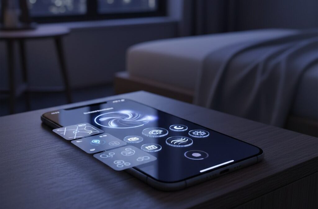
- Best Lock Screen Widgets for Power Users: Calendar, Launcher, Weather, and Beyond
- Live Activities in Action: Real-Time Transit, Sports Scores, and Micro-Interactions
- Context-Aware Automation: Location, Focus Modes, and Dynamic Wallpaper Shortcuts
- Designing for Cognitive Load: How to Build a Glanceable, Zero-Tap Lock Screen
- Troubleshooting Customization Issues: WidgetKit Limits, Caching, and System Constraints
- 参考文献
From Security Barrier to Ambient Interface: The Evolution of the iPhone Lock Screen
When the first iPhone launched in 2007, the lock screen had a single, clear mission: keep intruders out. The iconic “Slide to Unlock” gesture functioned as a digital gate, a deliberate action that separated the physical world from the device’s private data. At that time, the lock screen was a barrier by design, not a destination.
Over the years, however, that barrier has steadily transformed. What began as a static security layer has evolved into what can only be described as an ambient interface—an always-available surface where information lives before you even decide to unlock your phone. The lock screen is no longer just protection; it is presence.
Key Phases in the Lock Screen’s Evolution
| Era | Primary Role | User Interaction Model |
|---|---|---|
| 2007–2015 | Security barrier | Unlock first, act later |
| 2016–2021 | Notification hub | Preview before unlock |
| 2022–present | Ambient interface | Act without fully unlocking |
The turning point came gradually. Notifications became interactive. Control Center allowed quick toggles without entering the home screen. Then iOS 16 fundamentally redefined the paradigm by introducing deep lock screen customization, widgets, and Focus-linked profiles. According to Apple’s official platform documentation, Focus modes can now be tied directly to specific lock screens, meaning the interface adapts to context rather than remaining static.
This shift aligns closely with the broader concept of ambient computing, a term popularized in human-computer interaction research to describe technology that recedes into the background while remaining contextually aware. In this model, devices do not demand attention; they offer relevant information at the periphery. The modern iPhone lock screen embodies this principle by reducing the need for full app launches.
The introduction of Always-On Display (AOD) on iPhone 14 Pro further accelerated this evolution. By leveraging LTPO OLED technology capable of lowering refresh rates to 1Hz, Apple enabled persistent visibility with controlled power consumption. Independent battery tests reported by MacRumors and user experiments shared on Reddit demonstrate that power impact varies significantly depending on whether wallpaper remains enabled, reinforcing the idea that design and energy efficiency are now intertwined decisions.
But the real transformation is behavioral. Instead of unlocking the phone hundreds of times a day to check trivial updates, users increasingly rely on glanceable data: calendar events, weather alerts, live sports scores, transit countdowns. Live Activities extend this into real-time streams, turning the lock screen into a dynamic status dashboard.
In cognitive terms, this reduces micro-friction. Each avoided unlock eliminates a small but repeated action. Over hundreds of daily interactions, that reduction meaningfully lowers cognitive load. The lock screen becomes a low-attention information layer—a “Layer 0” interface that exists before the traditional home screen hierarchy.
Visually, rumored design directions inspired by visionOS suggest even greater emphasis on depth, translucency, and spatial layering. If realized, these glass-like surfaces would not merely beautify the interface but signal information hierarchy through perceived depth, subtly guiding user attention without explicit prompts.
The evolution from wall to window—and now to living surface—reflects Apple’s broader philosophy shift. Security remains foundational, enforced through Face ID and biometric authentication. Yet the experience is no longer about stopping access; it is about intelligently staging it. The lock screen has become a context-aware canvas where identity, urgency, and utility converge before a single swipe upward.
In this sense, the iPhone lock screen is no longer the beginning of the experience. It is the experience already in motion.
iOS 19 Design Rumors: visionOS Glass UI and Spatial Depth on the Lock Screen
Recent industry reports suggest that iOS 19 may introduce one of the most visually significant updates to the iPhone in years. According to multiple leak-based analyses cited by Japanese tech media and well-known leaker Jon Prosser, Apple is expected to adopt a visionOS-inspired “glass” interface across the system, including the Lock Screen.
This shift is not simply cosmetic. It represents a deeper transition from flat layers to a spatial interface model, where depth, translucency, and light define hierarchy. In other words, the Lock Screen may begin to feel less like a static panel and more like a window into layered digital space.
The key rumor: iOS 19 could bring frosted glass materials and enhanced spatial depth directly to the Lock Screen UI.
From Flat Cards to Floating Glass
Current Lock Screen notifications are relatively flat, even with subtle blur effects. Reports indicate that in iOS 19, notification banners may adopt a more pronounced frosted glass appearance, similar to visionOS floating windows.
This means increased translucency, stronger background diffusion, and more visible separation between UI layers. Instead of stacked cards, elements may appear to hover above the wallpaper, creating a measurable sense of Z-axis depth.
Rounded geometry is also expected to evolve. App icons, quick actions like Flashlight and Camera, sliders in Control Center, and contextual menus may adopt more circular or capsule-like forms, mirroring visionOS design language.
| Element | Current iOS | Rumored iOS 19 |
|---|---|---|
| Notifications | Flat or lightly translucent cards | Frosted glass with deeper blur |
| Quick Actions | Minimal depth | Rounded, floating appearance |
| Layer Hierarchy | Primarily 2D stacking | Spatial separation with light effects |
Why Spatial Depth Matters on the Lock Screen
Apple’s broader ecosystem strategy provides context. With Vision Pro and visionOS built around spatial computing, aligning iPhone UI with similar visual metaphors reduces cognitive friction between devices.
When translucency and depth communicate hierarchy, users can intuitively understand which information is foregrounded and which sits in the background. This taps into natural human spatial perception rather than relying solely on typography or color contrast.
Apple has long emphasized depth cues in interface design, and visionOS pushes that philosophy further. Bringing it to the Lock Screen suggests Apple sees this surface not as a gateway, but as an active interaction layer.
Refinement Over Feature Expansion
Importantly, current reporting does not point to major new Lock Screen features in iOS 19. Instead, this release may prioritize design unification and polish over functionality expansion.
This approach mirrors past Apple cycles where visual and structural refinement strengthened the platform’s coherence. By standardizing materials, curvature, and lighting across iOS and visionOS, Apple reinforces a cross-device visual grammar.
For users deeply invested in customization, this means existing widgets, Live Activities, and notifications may feel more immersive without changing how they fundamentally work.
The most compelling implication is subtle but powerful. A Lock Screen rendered in layered glass does not just display information. It creates the illusion that data exists within physical space, ready to be touched, moved, or entered.
In that sense, iOS 19’s rumored design evolution is less about decoration and more about preparing the iPhone for a spatial computing era.
iOS 18 and Intelligent Notifications: Focus Mode and Smart Breakthrough Explained
iOS 18 takes notification management beyond simple filtering and turns it into an intelligent, context-aware system. With deeper integration between Focus Mode and what Apple calls Intelligent Breakthrough, the lock screen becomes a dynamic control layer rather than a passive alert board.
According to Apple Support documentation, Focus Mode can now be customized per scenario, allowing specific people and apps while silencing others. What changes in iOS 18 is not just the filtering itself, but how intelligently the system decides what truly deserves your attention.
This shift reflects Apple’s broader move toward ambient computing, where the device understands context and reduces cognitive load automatically.
Focus Mode in iOS 18: More Than Do Not Disturb
Focus Mode is no longer a blunt “on or off” switch. Users can tie a specific Focus to a dedicated Lock Screen, meaning widgets, wallpaper, and notification behavior change together as one preset.
For example, activating a Work Focus can display calendar widgets and silence social apps, while a Personal Focus can prioritize messaging apps and hide email notifications. Apple’s official guidance highlights that these configurations can be triggered by time, location, or app usage.
This automation reduces decision fatigue. Instead of manually managing notifications throughout the day, the system enforces boundaries based on predefined contexts.
| Feature | Traditional Do Not Disturb | iOS 18 Focus Mode |
|---|---|---|
| Notification Control | Manual allow list | Context-based filtering |
| Lock Screen Customization | Not linked | Linked per Focus |
| Automation | Limited scheduling | Time, location, app triggers |
Intelligent Breakthrough: Letting the Right Alerts In
The most significant evolution in iOS 18 is Intelligent Breakthrough. Instead of relying solely on static allow lists, the system can analyze notification content and determine urgency.
As described in Apple’s support materials for Focus enhancements, urgent or time-sensitive notifications can break through even when a Focus is active. This may include delivery arrivals, critical family messages, or sudden schedule changes.
The key difference is semantic awareness. Rather than asking users to predict every important scenario in advance, the system evaluates incoming notifications in real time.
This dramatically changes user psychology. Previously, strict notification blocking created anxiety about missing something critical. With Intelligent Breakthrough, users can confidently enable stronger filters without constant fear of oversight.
For gadget enthusiasts and productivity-focused users, this means fewer screen wake-ups and less habitual unlocking. The lock screen becomes quieter, but more meaningful.
In practice, the result is a smarter signal-to-noise ratio. Only high-priority information surfaces, while low-value interruptions are deferred.
From a marketing and UX perspective, this is a pivotal move. Attention is the scarcest resource in the mobile era. By combining Focus Mode presets with AI-assisted breakthrough logic, Apple reframes the lock screen as an adaptive gateway that respects both urgency and mental bandwidth.
For power users, the strategic advantage lies in deliberate configuration. Define clear Focus categories, link them to purpose-built Lock Screens, and allow Intelligent Breakthrough to handle edge cases.
The result is a notification system that feels less reactive and more curated—precisely aligned with how modern users expect their devices to behave.
Always-On Display Under the Microscope: LTPO Technology and Real Battery Drain Data
Always-On Display (AOD) on recent iPhone Pro models is not just a cosmetic feature. It is a hardware-driven capability made possible by LTPO OLED panels that dynamically reduce the refresh rate down to 1Hz.
This ultra-low refresh rate dramatically cuts GPU and display controller workload compared to 60Hz or 120Hz operation. However, low refresh rate does not mean zero power consumption, and real-world data makes that distinction clear.
According to community battery tests shared on Reddit and covered by MacRumors, measurable drain persists even when the phone appears “idle.” The key variable is whether wallpaper remains visible during AOD.
| Configuration | Estimated Drain per Hour | 24-Hour Impact |
|---|---|---|
| AOD with wallpaper | Approx. 0.8%–1% | Up to ~20% |
| AOD without wallpaper (black background) | Significantly lower | Only a few percent difference vs. AOD off |
The explanation lies in OLED physics. When wallpaper remains visible, most pixels stay partially active, even at reduced brightness. When users disable wallpaper, black pixels turn fully off, leveraging OLED’s inherent power-saving advantage.
This single toggle can mean the difference between negligible drain and double-digit daily loss. For power users who leave their phones on desks all day, that distinction compounds quickly.
Environmental lighting adds another variable. The ambient light sensor continuously adjusts AOD brightness to maintain readability. Tests discussed in user forums indicate that in bright indoor lighting, power consumption can more than double compared to dim environments.
In contrast, when the device is placed face down or inside a pocket, proximity and motion sensors turn the display fully off. Real battery impact therefore depends not just on settings, but on physical usage patterns.
Software behavior can also distort expectations. Apple Support Community discussions around iOS 18 noted cases where background processes—such as iPhone Mirroring connections to macOS—contributed to abnormal standby drain. In such scenarios, AOD may be blamed, but the root cause lies elsewhere.
Distinguishing hardware-level display consumption from background connectivity drain is essential for accurate diagnosis.
Compared to many Android implementations that default to minimalist black-and-white AOD layouts, Apple initially prioritized aesthetic continuity by dimming the full lock screen. The later addition of a wallpaper-off option reflects a balance between design philosophy and measurable efficiency.
Under the microscope, AOD is neither a battery killer nor a free feature. It is a controllable trade-off. With LTPO reducing refresh to 1Hz and OLED pixels selectively shutting off, efficiency is technically optimized—but user configuration ultimately determines real-world drain.
For gadget enthusiasts who care about measurable performance, the takeaway is clear: understanding the interaction between panel technology, brightness conditions, and software background activity matters more than simply toggling AOD on or off.
Wallpaper On or Off? OLED Physics, Black Pixels, and Energy Efficiency Trade-Offs
When discussing Always-On Display efficiency, the real question is not simply whether AOD is on or off, but whether your wallpaper is displayed. The answer lies in OLED physics.
Unlike LCD panels, OLED displays emit light per pixel. This means a black pixel is effectively turned off, drawing almost no power. Apple’s Pro models use LTPO OLED technology that can drop the refresh rate to 1Hz in AOD mode, drastically reducing controller and GPU load.
However, reduced refresh rate does not mean zero energy use. If pixels are lit, they still consume power.
| Mode | Pixel Activity | Typical Drain (per hour) |
|---|---|---|
| AOD with wallpaper | Most pixels dimly active | Approx. 0.8–1% |
| AOD without wallpaper (black) | Majority of pixels off | Significantly lower; often only a few % per day |
| AOD Off | Display fully off | Baseline standby |
Independent battery drain tests discussed on Reddit and demonstrated by reviewers such as PhoneBuff show that enabling wallpaper in AOD can consume roughly 0.8% to 1% per hour. Over 24 hours, that can approach 20% battery loss without active usage.
By contrast, disabling wallpaper and keeping a black background allows OLED’s defining advantage to shine. Since black pixels are electrically off, power draw drops dramatically. Multiple user reports indicate the difference between AOD-off and black-background AOD may shrink to only a few percentage points across an entire day.
The physics is simple: brightness equals power, and lit surface area multiplies that cost.
Ambient light also plays a critical role. The display dynamically adjusts brightness based on environmental lighting. Tests shared in community discussions suggest that placing the device under bright indoor lighting can more than double AOD power draw compared to dim environments. In a pocket or face-down on a desk, sensors shut the display off entirely, eliminating drain.
This makes AOD energy impact highly contextual. A desk-bound user in bright office lighting may see measurable loss. Someone who keeps the phone in a pocket most of the day may see almost none.
There is also a design philosophy trade-off. Many Android devices default to minimalist black AOD layouts to maximize OLED efficiency. Apple initially prioritized aesthetic continuity by dimming the full wallpaper. Later updates introduced the option to disable wallpaper, reflecting user demand for practical efficiency.
For power users who rely on widgets and glanceable data, black-background AOD often represents the optimal balance: persistent information with minimal pixel activation. For users who value visual identity and ambient personalization, keeping the wallpaper may justify the additional energy cost.
Ultimately, this is not a binary on/off decision. It is an energy design choice rooted in display physics, ambient conditions, and personal priorities.
The iPhone Mirroring Effect: Hidden Software Factors Behind Standby Battery Drain
One of the most overlooked causes of standby battery drain in iOS 18 is not the display, widgets, or even Always-On Display. It is iPhone Mirroring, a continuity feature introduced alongside macOS Sequoia that quietly changes how your iPhone behaves while idle.
On the surface, iPhone Mirroring is remarkably convenient. It allows you to control your iPhone directly from your Mac, even when the phone itself remains locked. However, under specific conditions, this cross-device connection can keep background processes more active than many users realize.
According to discussions on Apple Support Communities, some users running iOS 18.1–18.3 observed abnormal battery drain attributed to “Home & Lock Screen” in battery usage logs. In several reported cases, disabling iPhone Mirroring significantly reduced overnight drain.
| Condition | Expected Idle Behavior | Observed Impact |
|---|---|---|
| Mirroring disabled | Deep standby state | Minimal background wake-ups |
| Mirroring enabled, Mac nearby | Low-power readiness | Periodic background activity |
The technical mechanism is subtle. Even when your MacBook is in sleep mode, the system may attempt to maintain readiness for mirroring sessions. That means your iPhone can intermittently wake radio components and system services to preserve continuity. These micro-wake cycles are small individually, but over 6–8 hours of standby, they accumulate.
This is not a hardware limitation. It is a software-layer interaction within Apple’s ecosystem. Unlike Always-On Display, which is governed by LTPO panel efficiency and brightness scaling, Mirroring-related drain originates from communication frameworks operating in the background.
What makes this particularly confusing is how it appears in battery analytics. Users often see “Home & Lock Screen” consuming higher-than-expected percentages, leading them to blame widgets or wallpaper effects. In reality, the lock screen process can act as a reporting umbrella for background connectivity activity.
From an architectural standpoint, this reflects Apple’s broader push toward ambient computing. The iPhone is no longer an isolated device; it behaves as a node within a persistent, multi-device mesh. That design philosophy improves convenience but introduces new idle-state complexity.
If you suspect Mirroring-related drain, navigate to Settings → General → AirPlay & Continuity → iPhone Mirroring and disconnect the linked Mac. Multiple user reports indicate noticeable improvement after doing so, especially in overnight standby scenarios.
The key insight is this: modern standby is no longer just about screen pixels and battery chemistry. It is about software relationships between devices. As Apple deepens ecosystem integration, understanding these invisible connections becomes essential for anyone optimizing lock screen efficiency and standby longevity.
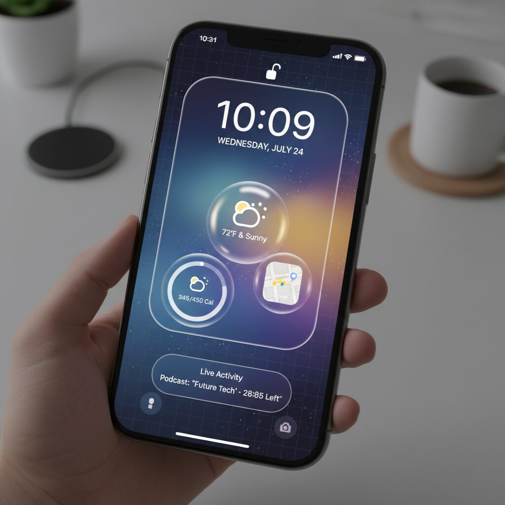
Best Lock Screen Widgets for Power Users: Calendar, Launcher, Weather, and Beyond
For power users, the lock screen is no longer a passive display. It becomes a command center where time-to-information and time-to-action are aggressively minimized.
With iOS 16 and later opening up Lock Screen widgets via WidgetKit, third-party developers have turned this “Layer 0” interface into a high-density dashboard. The key is not adding more widgets, but selecting the right ones for maximum cognitive efficiency.
Below is a practical breakdown of high-impact widget categories for advanced users.
| Category | Primary Benefit | Best Use Case |
|---|---|---|
| Calendar | Reduces cognitive load | Instant awareness of next event |
| Launcher | Shortens access time | Payments, messaging, automation |
| Weather | Supports micro-decisions | Commute and outdoor planning |
| Live Activities | Real-time state tracking | Transit, sports, deliveries |
Calendar widgets are foundational. Apps like FirstSeed Calendar offer flexible formats beyond Apple’s default, including detailed list views and time-to-next-event indicators. Displaying only the next appointment—rather than a full agenda—improves “glancability,” a usability principle emphasized in human–computer interaction research. A single, readable data point beats dense information blocks on a locked interface.
Launcher widgets, particularly through apps like Lock Launcher, fundamentally change workflow speed. By linking directly to payment apps, specific chat threads, or even iOS Shortcuts, users eliminate multiple gestures. At checkout counters, this reduces friction from several seconds of navigation to near-instant execution. In productivity terms, this compresses repeated micro-delays that compound over hundreds of daily unlocks.
Weather widgets are not cosmetic—they are behavioral triggers. In Japan, Weathernews provides high-resolution local forecasting and rain cloud alerts, while Apple’s native Weather app integrates tightly with system design. According to Weathernews’ own announcements, Lock Screen support allows immediate access to precipitation data. A simple rain indicator can determine whether you carry an umbrella, directly influencing daily comfort.
Then there are Live Activities, introduced in iOS 16.1. Unlike static widgets, these maintain persistent, real-time updates at the bottom of the Lock Screen. Transit apps such as NAVITIME display live delays and arrival progress, while sports apps like Club J.LEAGUE surface live scores. Instead of repeatedly unlocking and refreshing apps, the information flows to you. This transforms the lock screen from a snapshot into a dynamic status board.
Overloading the Lock Screen defeats its purpose. Each widget should justify its presence by either saving time, reducing mental effort, or preventing a future interruption.
When configured deliberately, the Lock Screen evolves into a precision instrument—an ambient control layer that anticipates needs before the Home Screen is ever reached.
Live Activities in Action: Real-Time Transit, Sports Scores, and Micro-Interactions
Live Activities fundamentally redefine what the lock screen can do. Instead of static widgets that require manual refresh or app launches, they deliver continuously updating information in a persistent, glanceable format.
Introduced with iOS 16.1, this framework allows apps to surface time-sensitive data directly on the lock screen and, on supported models, inside the Dynamic Island. The result is a shift from “checking” information to simply “seeing” it.
This is where the lock screen stops being a preview layer and becomes a real-time operational dashboard.
| Use Case | Displayed Data | User Action Required |
|---|---|---|
| Transit | Departure countdown, delay status | None (glance only) |
| Sports | Live score, inning/half progress | None unless deeper view needed |
| Navigation | Arrival time, route progress bar | None during tracking |
In transit scenarios, the impact is especially clear. According to reporting by Impress Watch, apps such as Yahoo!乗換案内 use Live Activities to display second-by-second departure countdowns on the lock screen. Instead of unlocking, opening the app, and refreshing, commuters simply glance at their device.
NAVITIME and バスNAVITIME have extended this further by showing real-time bus location and delay information via Live Activities, as announced in their official PR communications. The cognitive difference is subtle but powerful: the system eliminates the “search-refresh-confirm” loop.
Commuting becomes a zero-interaction experience.
Sports tracking provides another compelling micro-interaction model. The official Club J.LEAGUE app and services such as ベースボールLIVE surface live match scores directly on the lock screen. Google’s live score pinning function offers similar behavior, as covered by ケータイ Watch.
For fans who cannot stream games during work hours, this creates a lightweight awareness channel. You do not commit to watching; you remain passively informed. The lock screen becomes a live ticker, not a distraction portal.
This subtle distinction reduces attention fragmentation while preserving emotional engagement.
What makes Live Activities strategically important is not just real-time data, but persistence. Unlike push notifications that disappear into Notification Center, Live Activities remain visible until the event concludes.
This persistence transforms temporal information—”the train arrives in 3 minutes,” “top of the 8th inning”—into ambient knowledge. It mirrors the principles of ambient computing, where context stays available without demanding interaction.
The lock screen no longer interrupts you with updates; it quietly hosts them.
For power users, the optimization strategy is clear. Limit simultaneous Live Activities to genuinely time-sensitive flows such as commuting, food delivery, or live events. Overloading the space reduces glanceability and weakens the signal-to-noise ratio.
Used selectively, Live Activities minimize unlock frequency, shorten decision cycles, and lower cognitive load. Each avoided unlock may save only seconds, but across dozens of daily interactions, the cumulative efficiency gain becomes meaningful.
In practical terms, Live Activities represent the most mature expression of the lock screen’s evolution: real-time, low-friction, and context-aware micro-interactions that happen exactly when you need them.
Context-Aware Automation: Location, Focus Modes, and Dynamic Wallpaper Shortcuts
The real breakthrough of the modern iPhone lock screen is not visual customization but context-aware automation. By combining Location triggers, Focus Modes, and dynamic wallpaper shortcuts, your device can reshape itself depending on where you are, what you are doing, and even how much battery remains.
According to Apple Support documentation on Focus and automation, each Focus Mode can be linked to a specific Lock Screen. This turns the Lock Screen into a context-sensitive interface layer rather than a static surface.
Location-based triggers are the most powerful starting point. When you arrive at a predefined place such as your office, gym, or home, iOS can automatically enable a corresponding Focus Mode.
This creates a chain reaction: Focus Mode activates, the Lock Screen switches, and only relevant widgets and notifications remain visible. Noise disappears without manual input.
| Trigger | Automatic Action | Resulting Lock Screen |
|---|---|---|
| Arrive at Office | Work Focus ON | Calendar + Task widgets only |
| Enter Gym Area | Fitness Focus ON | Activity + Music controls |
| Return Home | Personal Focus ON | Weather + Smart Home widgets |
Technology media such as Mac Fan Portal have highlighted how assigning Lock Screens to Focus Modes dramatically reduces friction in daily switching. Instead of manually editing layouts, you pre-design environments and let the system rotate them.
More advanced users can extend this logic using the Shortcuts app. Battery level, time of day, or charging state can serve as automation triggers.
For example, when battery drops below 20%, a Shortcut can automatically switch to a dark, minimal wallpaper. This leverages OLED efficiency while visually signaling urgency.
This is not cosmetic. By changing the entire visual tone of the interface, the device communicates system status through peripheral vision. You no longer need to consciously check percentages.
Apple’s Focus Mode enhancements, including intelligent notification filtering described in official support resources, further strengthen this system. Only time-sensitive or AI-prioritized alerts can break through, ensuring that context remains intact.
The result is a Lock Screen that behaves like ambient computing: adaptive, quiet, and situationally aware. Instead of launching apps to match your environment, your environment configures the interface automatically.
For gadget enthusiasts, this represents the highest level of customization. You are no longer decorating your Lock Screen. You are programming it to respond to reality in real time.
Designing for Cognitive Load: How to Build a Glanceable, Zero-Tap Lock Screen
A lock screen is checked dozens, sometimes hundreds of times a day. That makes it a high-frequency cognitive surface, not just a decorative layer. If each glance forces you to interpret, decide, and act, you accumulate invisible mental fatigue. Designing for cognitive load means reducing that friction until information is processed almost subconsciously.
According to cognitive load theory, working memory is severely limited. When too many elements compete for attention, decision speed drops and error rates increase. On a lock screen, this translates into missed notifications, unnecessary unlocks, and habitual app switching.
A glanceable, zero-tap lock screen delivers the right information at the right moment without requiring interpretation or interaction.
The goal is not to show more. It is to show less, but with higher semantic density. Research in human–computer interaction consistently shows that recognition is faster than recall. If the lock screen surfaces exactly what you are likely to need next, you eliminate the cognitive cost of searching.
Design Variables That Directly Impact Cognitive Load
| Element | Low Cognitive Load | High Cognitive Load |
|---|---|---|
| Widget Count | 1–3 prioritized items | Maxed-out slots with mixed purposes |
| Visual Contrast | Clear hierarchy, strong legibility | Decorative fonts and low contrast |
| Update Logic | Context-aware (Focus, Live) | Static, always-on clutter |
For example, a single upcoming calendar event reduces uncertainty about “What’s next?” more effectively than a compressed multi-line agenda. Similarly, a Live Activity showing train departure countdown eliminates the need to unlock and refresh a transit app.
Apple’s implementation of Live Activities and Focus-linked lock screens reflects a shift toward ambient computing. Information flows to the surface when context demands it. When you are commuting, transit data dominates. When working, distractions recede. This context binding is what makes zero-tap interaction realistic.
Battery-aware design also matters. Community battery tests on Always-On Display show higher drain when full wallpapers remain lit. A minimalist black background with essential data not only conserves power but also reduces visual noise, reinforcing faster recognition.
The paradox is clear: aesthetic excess increases both energy consumption and cognitive cost. Minimalism here is not stylistic purity; it is functional optimization.
To build a true zero-tap lock screen, apply three principles. First, prioritize immediacy over completeness. Second, bind layouts to context using Focus modes. Third, design for peripheral vision—large numerals, bold contrasts, and spatial consistency.
When done correctly, the lock screen stops being a gateway you pass through. It becomes an ambient dashboard that answers micro-questions instantly: What time is my next meeting? When does my train leave? Is something urgent happening? If those answers appear in under a second, without unlocking, you have successfully engineered for cognitive load.
Troubleshooting Customization Issues: WidgetKit Limits, Caching, and System Constraints
When your lock screen setup does not behave as expected, the root cause is rarely “user error.” In most cases, it comes down to WidgetKit design limits, aggressive system caching, or iOS-level resource management rules.
Understanding these architectural constraints allows you to troubleshoot logically instead of randomly reinstalling apps or resetting settings.
WidgetKit Structural Limits
Lock screen widgets are powered by WidgetKit, introduced in iOS 16. Unlike full apps, widgets are not continuously running processes. Apple’s developer documentation makes it clear that widgets are timeline-driven and snapshot-based.
This means your widget does not refresh in real time unless explicitly supported through mechanisms such as Live Activities.
| Component | System Behavior | User Impact |
|---|---|---|
| Standard Widget | Timeline-based refresh | Data may appear delayed |
| Live Activity | Near real-time updates | Dynamic information stays current |
| Widget Extension | Runs separately from main app | Requires app launch to initialize |
If a newly installed app does not appear in the widget picker, the most common cause is that the system has not yet registered its Widget Extension. Launching the app once often resolves the issue because iOS completes background indexing at that moment.
Widgets are intentionally sandboxed and memory-limited, which prevents them from behaving like mini apps. This constraint improves battery efficiency but reduces flexibility.
Caching and SpringBoard Glitches
The lock screen interface is managed by SpringBoard, the core iOS process responsible for Home and Lock Screen rendering. When long-press customization fails to activate, it is often a temporary UI process stall.
Apple Support Communities have documented cases after major iOS updates where “Home & Lock Screen” shows abnormal background activity. In such scenarios, a simple restart clears cached UI states and reloads SpringBoard cleanly.
Rebooting works not because it is magical, but because it resets volatile memory allocations tied to widget rendering and gesture recognition.
If customization freezes or widgets fail to update:
1. Open the related app once.
2. Check Focus mode restrictions.
3. Restart the device to refresh system UI processes.
System Constraints You Cannot Override
Some behaviors are not bugs at all. They are deliberate system policies.
For example, low power mode reduces background refresh frequency. If your weather widget stops updating aggressively, iOS may be conserving energy. Similarly, Focus filters can silently suppress Live Activities or notification-driven refresh triggers.
Another overlooked factor is network state. Widgets relying on real-time data will not refresh properly under weak connectivity because WidgetKit enforces bandwidth efficiency rules.
The lock screen is optimized for glanceability, not computational depth. Apple prioritizes battery life and stability over unrestricted customization. Once you understand that philosophy, most “issues” reveal themselves as predictable system behavior rather than malfunctions.
Mastering lock screen customization therefore requires thinking like the OS: minimize expectations of real-time processing, respect extension boundaries, and design within Apple’s power-management framework.
参考文献
- Taisyo:Rumor Claims iOS 19 Will Adopt a visionOS-Like Glass Design
- GoriMe:iOS 19 Major Redesign Revealed With Rounded Icons and Glass UI
- Apple Support:Use Focus on Your iPhone
- MacRumors:Test Shows How Much Battery Drain Your Wallpaper Causes on the iPhone 14 Pro’s Always-On Display
- Reddit:iPhone 14 Pro: Always ON vs OFF Battery Drain Test – Any Difference?
- Apple Support Communities:Home & Lock Screen Consuming Screen Time After iOS 18
- PR TIMES:NAVITIME and Bus NAVITIME Launch Live Activities for Real-Time Bus Information on iOS