Notifications are no longer just simple alerts on your smartphone; they have become the command center of your digital life. If you use a Samsung Galaxy device, you may already feel that One UI offers far more control than standard Android, yet many of its most powerful notification features remain hidden by default.
With the transition from One UI 6.1 to One UI 7, Samsung has fundamentally rethought how notifications work, introducing bold design changes, deeper customization, and entirely new interaction models. While these updates promise better usability, they can also feel confusing or even frustrating if you do not know how to take back control.
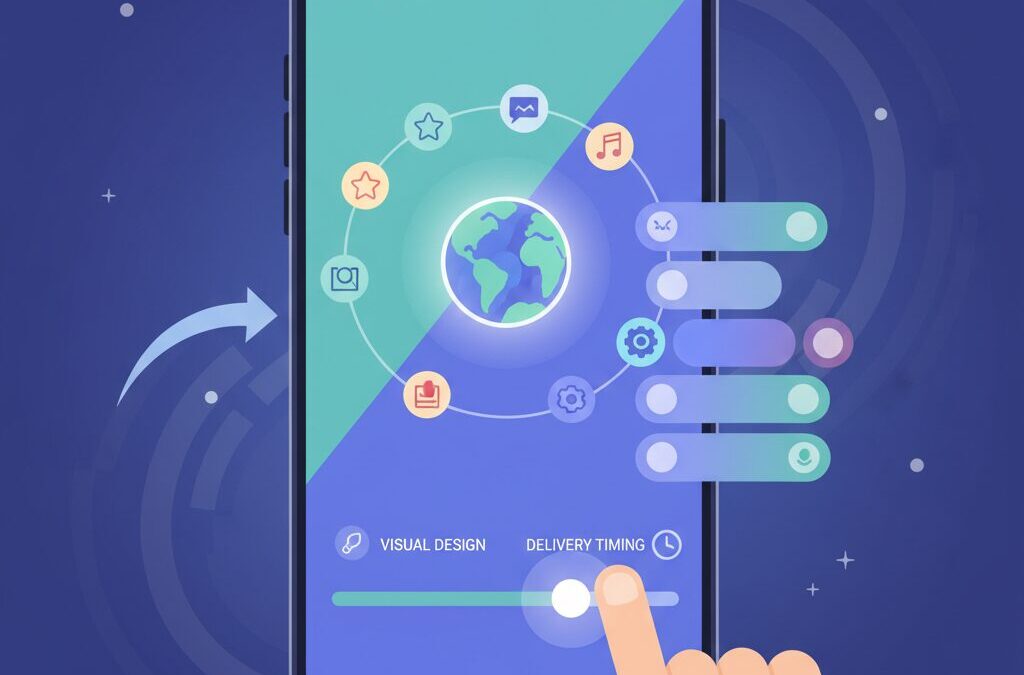
In this article, you will learn how Galaxy’s notification system really works, why Samsung made these changes, and how you can customize everything from visual design to delivery timing. By understanding these mechanisms, you will be able to reduce noise, avoid missed alerts, and transform your Galaxy into a smarter, more responsive daily companion.
- Why Notifications Matter in the Android and Galaxy Ecosystem
- What Changed in One UI 7: A New Philosophy for Notifications
- Split vs Unified Panels: How to Choose the Best Notification Layout
- Visual Redesign in One UI 7 and Its Impact on Information Density
- Now Bar Explained: Samsung’s Answer to Live Activities
- Hidden Essential Setting in One UI 6.1: Restoring Notification Categories
- Good Lock Modules That Redefine Notification Control
- Solving Delayed Notifications: Battery Optimization and System Behavior
- Automation with Modes and Routines for Context-Aware Notifications
- 参考文献
Why Notifications Matter in the Android and Galaxy Ecosystem
Notifications are not just passive alerts anymore; they function as the primary interface between users and the Android ecosystem. In daily smartphone usage, people unlock their devices dozens, sometimes hundreds, of times, and research from Google’s Android UX team has shown that a large portion of those interactions are triggered by notifications rather than intentional app launches. **This makes notifications the true front door of the operating system**, shaping how quickly and confidently users can act on information.
Within the Android world, Samsung’s Galaxy lineup holds a unique position. Samsung ships millions of devices globally each year, and according to market analyses frequently cited by firms such as IDC, Galaxy phones account for a significant share of active Android users. That scale means Samsung’s design decisions around notifications do not merely affect Galaxy owners; they influence user expectations across the entire Android ecosystem. **When Galaxy changes how notifications look, behave, or prioritize information, it effectively redefines Android habits for power users.**
| Aspect | Standard Android | Galaxy with One UI |
|---|---|---|
| Role of notifications | Entry point to apps | Central command layer |
| User control | Moderate customization | Extensive, user-driven control |
Experts writing for outlets like Android Authority often point out that Android’s strength lies in flexibility, but flexibility only has value when it is surfaced through notifications in a usable way. Samsung’s One UI philosophy treats notifications as actionable objects rather than simple messages. A message, a navigation update, or a system warning is designed to be read, judged, and resolved directly from the notification layer. **This reduces cognitive load and shortens the distance between awareness and action**, which is critical on large-screen smartphones.
There is also a productivity dimension that should not be overlooked. Studies in human-computer interaction published by institutions such as MIT have indicated that poorly managed notifications increase stress and task-switching costs. Galaxy’s emphasis on granular notification control reflects an understanding of this research. By allowing users to decide which information deserves interruption and which can wait, the notification system becomes a personal filter rather than a source of noise.
In the Android and Galaxy ecosystem, notifications therefore matter because they define trust. **When users trust that important alerts will arrive clearly and on time, they rely more deeply on their devices.** That trust is the foundation on which advanced features, ecosystem services, and long-term user loyalty are built.
What Changed in One UI 7: A New Philosophy for Notifications
In One UI 7, Samsung fundamentally rethinks what notifications are supposed to do in everyday smartphone use. Rather than treating notifications and system controls as a single surface, the new design philosophy clearly separates “information intake” from “device control,” and this change affects how users perceive urgency, context, and cognitive load.
The most visible shift is the default split between the notification panel and the Quick Settings panel. Swiping down from different areas of the status bar now produces different results, which aligns Galaxy’s behavior more closely with trends seen in iOS and other Android skins. According to analyses by Android Authority and Android Police, Samsung’s intent is not imitation, but clarity: notifications are meant to be read, while toggles are meant to be acted upon.
| Aspect | Before One UI 7 | One UI 7 Default |
|---|---|---|
| Panel structure | Unified view | Separated panels |
| Primary focus | Information density | Context clarity |
| User action flow | Scroll-centric | Gesture-directional |
This separation allows notifications to breathe visually. Cards are larger, icons are clearer, and the source app becomes immediately recognizable. Samsung itself explains that this design improves glanceability, especially on large displays where crowded lists can slow recognition. At the same time, this comes with a trade-off: fewer notifications fit on screen, a point widely discussed in Galaxy user communities.
What defines Samsung’s philosophy, however, is flexibility. Unlike ecosystems that lock users into a single interaction model, One UI 7 preserves choice. Users who prefer the traditional unified panel can revert to it through built-in settings, reinforcing Samsung’s long-standing stance that UX should adapt to the user, not the other way around.
In practical terms, One UI 7 reframes notifications as a focused information stream rather than a control hub. This philosophical pivot signals Samsung’s belief that modern smartphones must reduce friction not by showing more, but by showing the right thing at the right moment.
Split vs Unified Panels: How to Choose the Best Notification Layout
Choosing between split and unified notification panels in One UI 7 is not merely a matter of taste, but a decision that directly affects daily efficiency and cognitive load. Samsung’s move toward a split layout, where notifications and quick settings live in separate panels, reflects a broader industry trend also seen in iOS and HyperOS. According to analyses by Android Authority and Android Police, the core intention is to separate reading information from taking action, reducing accidental toggles and visual clutter.
In a split layout, notifications gain more vertical space and clearer card separation, while quick settings evolve into a dense control hub optimized for Wi-Fi, Bluetooth, media output, and Smart View. This is particularly beneficial on large Galaxy Ultra devices, where quick settings have grown into a mini dashboard. Samsung’s official UX documentation explains that this separation improves legibility and tap accuracy, especially for users who frequently manage connected devices.
| Aspect | Split Panels | Unified Panel |
|---|---|---|
| Primary strength | Clarity and focus | Speed and overview |
| Best for | Large screens, media-heavy use | Power users, one-handed use |
| Interaction cost | Context switch required | Single continuous flow |
However, the unified layout remains deeply appealing to long-time Android users. With a single swipe, users can scan alerts and immediately react by toggling connectivity or modes. Reddit discussions and Samsung Community threads consistently highlight that muscle memory and one-handed ergonomics favor the unified approach, particularly on smaller Galaxy models or when the device is used on the move.
The critical advantage of One UI lies in choice. Samsung allows users to revert to a unified panel through built-in settings, a flexibility that experts like Joe Maring have described as a defining strength of Galaxy UX. This means the “best” layout depends on behavior: users who primarily read notifications may benefit from split panels, while those who constantly act on them will feel faster and more in control with a unified view.
Ultimately, the decision should be guided by context rather than ideology. One UI 7 demonstrates that notification design is no longer static but adaptive, and the ability to switch layouts empowers users to align the interface with their habits, not the other way around.
Visual Redesign in One UI 7 and Its Impact on Information Density
One UI 7 introduces a bold visual redesign that significantly reshapes how information is perceived at a glance, and this change directly affects information density in daily notification use. Samsung has clearly prioritized visual clarity and brand consistency, adopting larger app icons, more rounded notification cards, and increased spacing throughout the notification panel. This design shift makes each notification easier to recognize instantly, especially when multiple apps compete for attention.
According to analyses by Android Authority and Android Police, the enlarged icons and card-based layout improve app identification speed, a key usability metric in modern UX research. Nielsen Norman Group has long emphasized that recognizability often outweighs raw data volume in high-frequency interfaces like notifications, and One UI 7 appears aligned with this principle. Users can now distinguish a message from a banking app versus a social app in a fraction of a second, even without reading text.
At the same time, this refinement creates a clear trade-off. As icons and padding grow, fewer notifications fit on the screen at once. Information density is reduced compared to One UI 6.1, meaning users may need to scroll more frequently, particularly on smaller displays such as Galaxy Z Flip cover screens or base Galaxy models.
| Design Aspect | One UI 6.1 | One UI 7 |
|---|---|---|
| Icon size | Smaller, uniform | Larger, app-identical |
| Card spacing | Tighter | More generous |
| Notifications per screen | Higher | Lower |
This balance between readability and density reflects a broader industry trend also seen in iOS and HyperOS. Samsung’s approach is notable because it favors comfort and reduced cognitive load over maximal data compression. For power users, this can feel like a regression, but for most users it reduces visual fatigue during repeated checks throughout the day.
Some advanced users experiment with text size or display scaling to reclaim density, yet Samsung does not officially position these as primary solutions. Instead, One UI 7 suggests a philosophical shift: notifications are no longer a compact log of events, but a visually curated feed meant to be scanned, not scrutinized. Understanding this intent helps explain why the redesign feels different, and why its impact on information density is both deliberate and consequential.
Now Bar Explained: Samsung’s Answer to Live Activities
Samsung’s Now Bar is best understood as the company’s software-first interpretation of Apple’s Live Activities and Dynamic Island, designed specifically around Galaxy ergonomics and One UI’s reachability philosophy. Rather than hiding hardware constraints, Now Bar treats ongoing activities as glanceable, touch-ready information that lives exactly where your thumb naturally rests, especially on today’s large displays.
In One UI 7, Now Bar surfaces real-time activities such as timers, music playback, voice recording, and stopwatch sessions directly on the lock screen and status bar. Samsung positions it just above the fingerprint sensor on the lock screen, a choice that UI researchers frequently recommend for one-handed use. According to usability analyses cited by Android Authority, interactions placed in the lower third of large screens reduce thumb strain and error rates compared to top-mounted controls.
When the device is unlocked and you move between apps, Now Bar collapses into a compact pill in the status area. A single tap expands controls or jumps back into the originating app. This behavior mirrors Live Activities on iOS, but Samsung deliberately keeps it visually independent from the camera cutout, avoiding layout conflicts and preserving space for traditional status icons.
| Aspect | Samsung Now Bar | Apple Live Activities |
|---|---|---|
| UI foundation | Pure software element | Integrated with hardware cutout |
| Lock screen position | Lower, thumb-reachable area | Upper screen area |
| Status bar impact | Independent pill overlay | Expands around camera area |
Customization is another area where Samsung’s approach stands out. From the Lock Screen and AOD settings, users can toggle which system apps are allowed to appear in Now Bar. Samsung has also confirmed, in its official support documentation, that third-party support is expanding to navigation, ride-hailing, and live sports updates. This gradual rollout reflects Samsung’s cautious stance on battery usage and background processing, a topic often debated in Android developer communities.
Industry commentators at Android Police note that this design aligns with Samsung’s broader ambient computing strategy: information should be visible only when it matters, and disappear the moment it does not. By limiting Now Bar to active states rather than every incoming alert, Samsung avoids the visual noise that plagues traditional notification-heavy workflows.
In practice, the real value of Now Bar emerges over time. Music controls replace repeated notification pulls, timers no longer require unlocking the phone, and navigation progress remains visible without hijacking the entire screen. For Galaxy users accustomed to deep customization, Now Bar feels less like an imitation and more like a natural extension of One UI’s long-standing promise: powerful features, placed where they are easiest to use.
Hidden Essential Setting in One UI 6.1: Restoring Notification Categories
In One UI 6.1, Samsung quietly changed one of Android’s most powerful notification features by hiding Notification Categories by default. This decision surprised many power users, because Notification Categories, originally introduced by Google in Android 8.0, are the foundation of granular notification control.
Without restoring this hidden setting, users can only toggle notifications on or off per app, losing the ability to fine-tune which types of alerts truly deserve attention.
Samsung’s intention appears to be simplification. According to Android Authority’s analysis of One UI 6.x, Samsung has been progressively reducing visible complexity in system menus to lower friction for casual users. However, this comes at the cost of control for enthusiasts.
The good news is that Notification Categories are not removed. They are merely disabled at the UI level. Once re-enabled, the system immediately exposes the same category structure defined by app developers under Android’s official notification framework.
This setting acts like a master switch. Turning it on instantly restores deep per-category controls across all installed apps.
The difference in behavior before and after enabling this option is significant, especially for communication and commerce apps.
| State | Available Controls | User Impact |
|---|---|---|
| Default (Off) | Single notification toggle per app | All alerts treated equally |
| Categories Enabled | Per-category sound, vibration, priority | Noise reduction without missing essentials |
For example, messaging apps such as LINE or WhatsApp typically define separate categories for direct messages, calls, group mentions, and promotional content. With categories restored, promotional alerts can be silenced while calls remain loud and intrusive.
This aligns with Google’s original design philosophy, where notification channels act as a contract between developers and users. Google’s Android documentation clearly states that categories should never change importance without user consent.
By hiding the toggle, Samsung did not break this contract technically, but it made it far less discoverable.
E-commerce apps demonstrate an even clearer benefit. Shipping updates can be set to high priority with lock screen visibility, while sales campaigns remain silent and unobtrusive. This approach has been recommended by UX researchers studying notification fatigue, including studies cited by the Nielsen Norman Group.
Restoring categories is therefore not just customization, but a proven method to reduce cognitive overload.
Users who complain about “too many notifications” are often suffering from missing category-level control, not from excessive apps.
Importantly, this setting does not increase battery consumption or background activity. It only changes how notifications are classified and presented. Samsung’s own support documentation confirms that categories rely entirely on existing Android APIs.
In other words, there is no downside, except for the extra responsibility of choosing what truly matters.
For users who value signal over noise, restoring Notification Categories in One UI 6.1 is one of the most impactful hidden settings available.
Good Lock Modules That Redefine Notification Control
Samsung’s Good Lock suite fundamentally changes how Galaxy users interact with notifications, moving far beyond simple on/off toggles.
Instead of treating notifications as disposable alerts, Good Lock reframes them as data that can be stored, filtered, and visually prioritized.
This philosophy aligns with Samsung’s long‑stated UX direction, frequently highlighted in official One UI documentation and analyzed by Android Authority.
Among the most influential modules is NotiStar, which effectively turns the notification panel into a searchable archive.
While stock Android limits notification history to roughly 24 hours, NotiStar allows users to retain logs for weeks or longer, depending on settings.
This single change transforms notifications from fleeting interruptions into a reliable information record.
| Module | Primary Role | Notification Impact |
|---|---|---|
| NotiStar | Notification history | Long‑term storage and keyword search |
| Edge Lighting+ | Visual alerts | Color and effect‑based prioritization |
| QuickStar | Status bar control | Cleaner notification icon visibility |
NotiStar’s keyword filtering is particularly powerful in real‑world use cases.
For example, finance‑related terms such as “OTP” or “verification” can be isolated instantly, even days after the original alert arrived.
Samsung engineers have noted in developer interviews that this design supports professional users who rely on notifications as task inputs rather than distractions.
Edge Lighting+ takes a different but equally strategic approach by leveraging peripheral vision.
Instead of forcing users to read every alert, it communicates urgency through color and motion alone.
Research in human–computer interaction, including studies cited by Google UX teams, shows that color‑based cues reduce cognitive load during multitasking.
In practice, a red edge glow for emergency contacts and a subtle blue glow for work apps enables instant triage without touching the device.
This becomes especially effective when the phone is face‑down or across the room, a scenario often discussed in Galaxy power‑user communities.
Unlike third‑party apps, Edge Lighting+ operates at the system level, ensuring consistent behavior and low battery impact.
QuickStar completes the notification control loop by reclaiming status bar real estate.
As One UI 7 introduces larger icons and persistent elements like Now Bar, space management becomes critical.
By hiding nonessential system icons, QuickStar ensures that incoming notifications remain visible at a glance.
Taken together, these Good Lock modules illustrate Samsung’s unique stance within the Android ecosystem.
Rather than simplifying notifications for the average user alone, Samsung preserves advanced controls for those who seek them.
This layered design approach is frequently praised by Android Police as a key reason Galaxy devices remain the preferred choice for notification‑heavy workflows.
Solving Delayed Notifications: Battery Optimization and System Behavior
Delayed notifications on Galaxy devices are rarely random bugsですが、ほとんどの場合はバッテリー最適化とシステム挙動の結果として説明できます。AndroidにはDozeモードやApp Standby Bucketsといった省電力機構が標準搭載されており、画面オフ時にはネットワーク通信やCPUアクセスが段階的に制限されます。Samsungはバッテリー持ちを重視する設計思想から、これらをやや積極的に適用していると指摘されています。
GoogleのAndroid公式ドキュメントによれば、Dozeは端末が静止し、画面が消灯して一定時間が経過した後に発動し、アプリのバックグラウンド通信はメンテナンスウィンドウまで遅延されます。**その結果、画面を点灯した瞬間に通知がまとめて届く現象が発生します。**LINEやGmailで報告が多いのは、リアルタイム性が高く期待されるアプリほど、この挙動が体感しやすいためです。
| System Feature | Purpose | Impact on Notifications |
|---|---|---|
| Doze Mode | Reduce idle power drain | Delays background network access |
| Battery Optimization | Extend daily battery life | May suppress app wake-ups |
| Adaptive Notifications | AI-based prioritization | Lower-priority alerts arrive later |
実用的な対策として最も効果的なのは、アプリ単位での制御です。設定から対象アプリのバッテリー項目を「制限なし」に変更すると、Dozeの影響を大幅に受けにくくなります。また、Samsung公式サポートでも案内されているように、最近使ったアプリ画面で「開いたままにする」を指定すると、メモリ解放による強制終了を防げます。
それでも改善しない場合、Android AuthorityやRedditの技術的議論で評価が高いのがADBによるDozeホワイトリスト登録です。**これはOSの深い省電力制御から特定アプリだけを除外する方法で、即時性とバッテリー消費のバランスが最も優れています。**通知遅延は仕様を理解し、正しく付き合うことで解決できる問題だと言えます。
Automation with Modes and Routines for Context-Aware Notifications
Automation with Modes and Routines transforms Galaxy notifications from static alerts into context-aware signals that adapt to your real-world situation. Built into One UI and officially documented by Samsung, this system evolved from Bixby Routines into a more transparent and reliable automation layer. Instead of manually toggling sound modes or notification behavior, the device evaluates conditions such as time, location, app state, and connected accessories, then applies predefined actions automatically.
This approach aligns with Google’s broader Android philosophy of ambient computing, where the system fades into the background and reacts intelligently. According to Samsung’s official support documentation, Modes and Routines operate locally on the device, reducing latency and improving reliability compared with cloud-dependent automation. This is why notification-related actions, such as Do Not Disturb or notification read-aloud, trigger consistently even when connectivity is unstable.
The real power lies in combining notification controls with precise triggers. For example, a routine can silence all visual pop-ups when a video app enters full screen, yet still allow vibration for priority contacts. Reddit communities focused on Galaxy Ultra and Fold models frequently highlight that this layered logic eliminates the need to constantly check notification panels, significantly reducing cognitive load during focused activities.
| Trigger Context | Notification Action | User Benefit |
|---|---|---|
| Time + Charging State | Do Not Disturb with exceptions | Undisturbed sleep without missing urgent calls |
| Specific App in Foreground | Disable pop-up notifications | Deep immersion during reading or gaming |
| Bluetooth Car Connection | Read notifications aloud | Hands-free awareness while driving |
Context-aware notification automation is particularly valuable in regions like Japan, where messaging apps such as LINE dominate daily communication. Community-shared routines demonstrate how users allow message notifications only from selected contacts at night, while muting promotional categories entirely. This fine-grained control complements notification categories rather than replacing them, creating a two-layer defense against notification overload.
Experts at Android Authority note that Samsung’s implementation stands out because it exposes advanced conditions without requiring third-party apps. This lowers the barrier for mainstream users while still satisfying power users. The result is not fewer notifications, but better-timed ones, delivered only when they add value.
As One UI continues to evolve, Modes and Routines function as the silent conductor of the notification orchestra. By reacting to context instead of demanding attention, Galaxy devices shift notifications from interruptions into purposeful cues, reinforcing Samsung’s vision of a phone that understands not just what arrives, but when it truly matters.
参考文献
- Android Authority:Just downloaded One UI 7? Here are two settings to change immediately
- Android Police:Samsung’s new notification tray in One UI 7 sucks, but it doesn’t have to
- Samsung:One UI 7 New Features
- SamMobile:One UI 7 lets you add quick setting toggles to notifications screen
- Android Central:Samsung Good Lock: The ultimate guide to customizing your Galaxy phone
- Samsung Support:Use Modes and Routines on your Galaxy phone or tablet