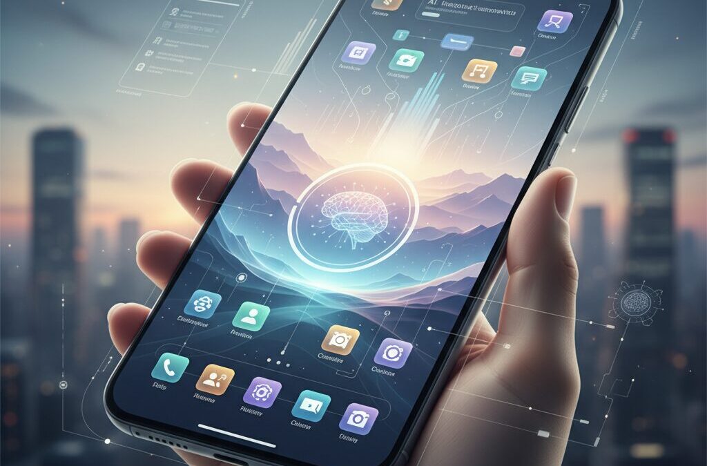
In 2026, your smartphone is no longer just a device in your pocket. It functions as an extension of your memory, attention, and even identity. Yet as mobile OS platforms become smarter and more expressive, many users feel something else growing quietly in the background: cognitive overload.
From AI-powered home screens in iOS 19 to Android 16’s Material 3 Expressive redesign, today’s interfaces promise immersion and personalization. But more features do not automatically mean better experiences. Without intentional design, your home screen can become a battlefield for your attention.
This article explores how cognitive science, ergonomics, and emerging digital culture trends reshape the way we should build our home screens in 2026. You will discover research-backed strategies to reduce mental friction, optimize for one-handed use, balance aesthetics with productivity, and even rethink whether your home screen should be touched at all. If you care about gadgets, performance, and human-centered design, this is your blueprint for the next-generation digital environment.
- Why the Home Screen Matters More Than Ever in 2026
- iOS 19 and the Rise of Liquid Glass: Depth, AI, and Predictive Interfaces
- Android 16 and Material 3 Expressive: Personalization Meets Functional Precision
- The Science of the Thumb Zone: Ergonomics, Screen Size, and One-Handed Reality
- Cognitive Load and Spatial Memory: Designing for Faster App Retrieval
- Grayscale Mode and Dopamine Control: What Color Psychology Reveals
- From Minimalism to Maximalism: Cultural Aesthetics and Emotional Interfaces
- Focus Modes and Context Switching: Turning Your Home Screen into Adaptive Infrastructure
- Gen Z and the Death of Folders: Search-First Behavior and Super Apps
- Beyond the Phone: Universal Control, Phone Link, and the Extended Home Screen
- Physical Desk Setup and Digital Clarity: Why Environment Still Matters
- 参考文献
Why the Home Screen Matters More Than Ever in 2026
In 2026, the home screen is no longer just a grid of apps. It has become the control surface of our extended cognition.
Smartphones now function as external memory, navigation system, and social gateway all at once. According to cognitive load research summarized in UX design literature, every additional decision point on an interface consumes measurable mental resources.
Your home screen is where that cognitive cost either compounds—or disappears.
The shift is especially visible in the evolution of mobile operating systems. Apple’s latest design language emphasizes translucency and depth, reinforcing what cognitive psychology calls “affordance”—the ability to understand how to interact with something without instruction. When interface layers visually separate action from background, users spend less time decoding the screen.
Google’s Material 3 Expressive follows a parallel path, refining personalization while maintaining structural clarity. The result is not decoration for its own sake, but a measurable reduction in friction between intent and execution.
The home screen has become an optimization layer between human intention and machine response.
| 2020s Home Screen | 2026 Home Screen |
|---|---|
| Static app launcher | Context-aware dashboard |
| Manual organization | AI-assisted prediction |
| Visual abundance | Cognitive efficiency focus |
This transformation is driven by scale. The average power user now manages hundreds of installed apps across devices. Without structural intention, the home screen becomes a high-noise environment. Research on contextual cueing in interface design shows that consistent spatial patterns significantly improve search performance and reduce mental strain.
That means layout stability is not aesthetic preference—it is neurological leverage.
Every unnecessary icon, notification badge, or color contrast competes for finite attention.
There is also a cultural dimension. In Japan, where commuting density and mobile dependency are exceptionally high, the home screen acts as a personal command center in constrained physical environments. When interaction time is fragmented into seconds, the cost of hesitation multiplies.
At the same time, expressive customization—whether through themed widgets or dynamic color extraction—turns the device into a psychological anchor. The interface is not only functional; it regulates mood and identity.
In 2026, the home screen sits at the intersection of ergonomics, neuroscience, and self-expression.
Major platforms now integrate predictive intelligence directly into the first screen users see. Context-aware widget stacks, live updates, and adaptive layouts reduce the need to open full applications. Studies on flow and task interruption suggest that minimizing context switches preserves concentration and improves perceived productivity.
When information surfaces proactively, the user’s cognitive bandwidth is protected.
The most powerful home screen today is the one that prevents unnecessary action.
For gadget enthusiasts and optimization-driven users, this shift matters more than ever. Hardware improvements have plateaued into incremental gains. Interface architecture, however, directly determines daily friction.
The home screen is the first interaction every time you unlock your device. It defines whether your digital environment feels chaotic or composed.
In 2026, mastering the home screen is not customization—it is cognitive strategy.
iOS 19 and the Rise of Liquid Glass: Depth, AI, and Predictive Interfaces
With iOS 19, Apple shifts the conversation from flat efficiency to sensory depth. The new design language, Liquid Glass, introduces layered translucency and subtle reflections inspired by visionOS, creating an interface that feels less like a static grid and more like a living surface. According to Apple’s official newsroom, the goal is to make software “delightful and elegant,” but the deeper implication is cognitive: the UI now communicates hierarchy through light, blur, and spatial separation.
Depth is not decoration. It is information. By visually lifting interactive elements from the background, iOS 19 strengthens affordance—the concept in cognitive psychology that objects should suggest how they are used. As UX research on cognitive load indicates, clearer visual hierarchy reduces the mental effort required to distinguish action from context. Liquid Glass operationalizes this principle at the system level.
| Element | Previous iOS | iOS 19 (Liquid Glass) |
|---|---|---|
| Visual hierarchy | Primarily flat layers | Translucent, depth-aware layers |
| Icons | Static appearance | Wallpaper-reactive tinting |
| Dark mode | Uniform dimming | Context-sensitive tonal adjustment |
The Tinted Icons feature exemplifies this shift. Icons dynamically adapt to wallpaper color and ambient tone, creating visual coherence across the screen. In low-light environments, the refined Auto dark mode subtly adjusts luminance rather than simply darkening the interface, preserving legibility while reducing glare. These refinements are not aesthetic luxuries; they lower perceptual friction during prolonged use.
Equally transformative is the maturation of free icon placement. First introduced in iOS 18 and refined in iOS 19, users are no longer constrained by a rigid top-left grid. This seemingly simple change alters spatial memory patterns. By aligning frequently used apps with the lower thumb zone, users reduce physical strain while reinforcing muscle memory—an ergonomic and cognitive win.
However, the most profound evolution lies in predictive intelligence. Through Apple Intelligence integration, the home screen becomes context-aware. Time, location, device state, and usage history inform Smart Stack suggestions that surface relevant apps before users consciously search for them. During commuting hours, news and audio apps may rise to prominence; in the evening, home controls or relaxation playlists appear instead.
This transition echoes broader research into flow and context switching. Studies published in PubMed Central on mobile app engagement show that reducing unnecessary app switching preserves cognitive resources. By surfacing the next probable action, iOS 19 minimizes the need for manual navigation, effectively compressing the gap between intention and execution.
In practical terms, iOS 19 signals a paradigm shift toward predictive interfaces layered in perceptual depth. Liquid Glass provides spatial clarity, AI delivers temporal relevance, and flexible layout restores ergonomic control. Together, they redefine the home screen as a responsive, intelligent surface—less a folder of apps and more a personalized, anticipatory environment.
Android 16 and Material 3 Expressive: Personalization Meets Functional Precision
Android 16 marks a decisive shift from simple customization to context-aware personalization grounded in functional precision. At the center of this evolution is Material 3 Expressive, a design system that refines how color, typography, and motion respond to user intent rather than merely aesthetic preference. According to Google’s official Android Developers documentation, Android 16 expands dynamic color extraction and component-level theming, allowing system UI and third-party apps to align more coherently with user-selected wallpapers.
This is not cosmetic excess. By harmonizing visual hierarchy across widgets, notifications, and system controls, Android 16 reduces cognitive friction and improves scannability. Research on cognitive load in interface design suggests that consistent visual language shortens decision time and lowers mental effort, and Material 3 Expressive operationalizes that principle at the OS level.
| Feature | Functional Impact |
|---|---|
| Dynamic Color 2.0 | System-wide tonal consistency and faster visual parsing |
| Live Updates | Real-time progress in notifications without app switching |
| Vertical Text API | Native Japanese layout support with improved rendering |
The enhanced Vertical Text API, including the new rendering flags introduced in Android 16, is particularly meaningful for Japanese users. It enables native vertical typography in widgets and reading apps, elevating cultural readability without third-party workarounds.
Meanwhile, Live Updates transform notifications into persistent micro-dashboards. By minimizing context switching, Android 16 protects user focus, aligning expressive design with measurable usability gains.
For gadget enthusiasts, this balance between identity and efficiency is where Android 16 truly differentiates itself.
The Science of the Thumb Zone: Ergonomics, Screen Size, and One-Handed Reality
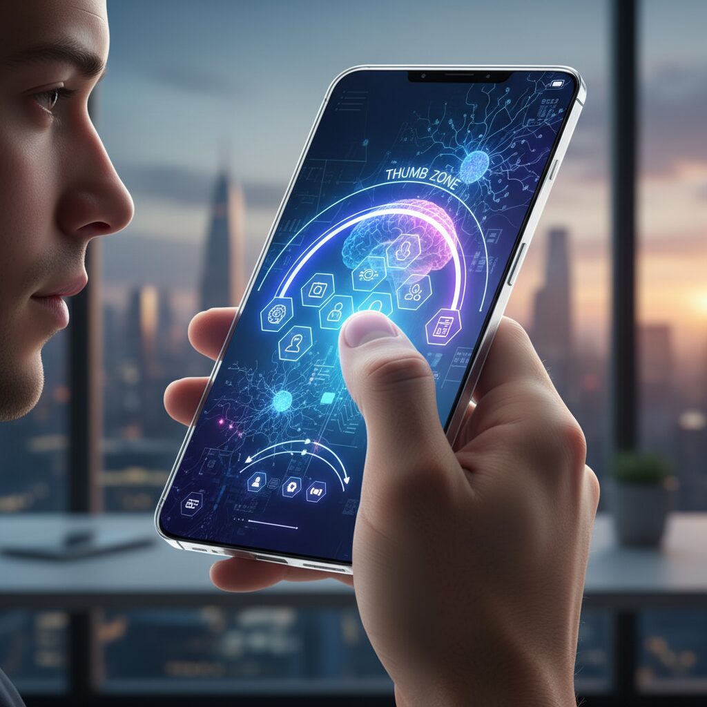
As smartphones approach 6.7 inches and beyond, the promise of immersive displays collides with a stubborn biological fact: our thumbs have not evolved at the same pace as our screens. The so-called “Thumb Zone” is not a design trend but an ergonomic boundary defined by joint range, muscle tension, and grip stability.
Research from Yonsei University on one-handed smartphone interaction demonstrates that thumb reach is strongly affected by both thumb length and screen size. As displays grow larger, the natural reach area shrinks proportionally, pushing key UI elements into what researchers describe as extension zones—areas that require uncomfortable stretching and reduce pointing accuracy.
In practical terms, the upper-left quadrant of a large device (for right-handed users) often becomes a low-efficiency region. Studies on thumb input performance further show that dragging and precise tapping tasks degrade when users operate near the edge of their maximum reach, increasing error rates and muscular strain.
| Screen Size Class | Natural Thumb Zone | Risk Area |
|---|---|---|
| 5.2 inches and below | Majority of lower half | Upper corners |
| 6.1–6.7 inches | Lower central third | Upper third and far left |
Human–computer interaction research consistently confirms a simple principle: frequently used controls should reside inside the natural thumb zone. When designers ignore this, users compensate by shifting grip, using the second hand, or micro-adjusting their palm—each adding cognitive and physical load.
This is not merely about comfort. SoftBank’s guidance on proper smartphone handling in Japan warns that repeated overstretching of the thumb can contribute to tendon strain. Over months of daily commuting and one-handed use, small inefficiencies compound into fatigue.
The ergonomic solution is architectural rather than cosmetic. Separate the screen into two functional territories. The upper area can serve as a passive information layer—widgets, glanceable data, static visuals. The lower third becomes an action hub: primary apps, navigation gestures, and high-frequency controls.
Operating systems have begun to acknowledge this biological constraint. Android’s One-handed mode physically shifts content downward, effectively re-centering the interaction field within reachable space. iOS offers Reachability, temporarily lowering the interface to reduce stretch distance. These features are not accessibility afterthoughts—they are ergonomic necessities for large displays.
The most efficient home screen is not the most symmetrical one. It is the one aligned with your thumb’s biomechanical limits.
Grip stability also matters. When tapping near the top edge, users subtly loosen their grip to extend reach, which increases drop risk. This trade-off between reach and stability rarely appears in marketing materials but becomes obvious in real-world one-handed use.
For gadget enthusiasts optimizing performance, the implication is clear: measure your own comfort boundary. Place your thumb naturally on the screen without adjusting your grip. Map that arc. Everything inside it is prime territory. Everything outside it should be secondary.
Screen size will continue to grow in pursuit of immersion. The science of the Thumb Zone reminds us that immersion without ergonomics is friction. True usability begins not with pixels, but with anatomy.
Cognitive Load and Spatial Memory: Designing for Faster App Retrieval
Every extra second you spend searching for an app is a tax on your brain. In cognitive psychology, this tax is known as cognitive load—the mental effort required to process information and make decisions.
On a crowded home screen, your brain must visually scan, categorize, compare icons, and recall past locations. That micro-decision process, repeated dozens of times a day, accumulates into measurable friction.
Designing for faster app retrieval therefore is not about aesthetics alone. It is about engineering your layout to align with how spatial memory actually works.
Why Spatial Memory Matters More Than You Think
Humans are exceptionally good at remembering locations. This ability, called spatial memory, allows us to recall where objects are placed in physical environments—and the same mechanism applies to digital grids.
A study on foldable smartphones published in PubMed Central found that when icon positions were remapped after screen changes, search performance significantly declined. Conversely, maintaining relative icon positions—known as position invariance—improved speed and accuracy.
This suggests a simple principle: your brain does not want to “search.” It wants to “reach.”
| Layout Strategy | Impact on Cognitive Load | Retrieval Speed |
|---|---|---|
| Frequently moving icons | High (requires re-learning) | Slower over time |
| Fixed core app positions | Low (muscle memory reinforced) | Faster and automatic |
| Consistent folder placement | Moderate | Stable performance |
The takeaway is clear: stability beats novelty. Rearranging your home screen for visual freshness may feel productive, but it resets spatial learning.
In practical terms, your dock and first-row apps should become untouchable territory. Once your thumb learns the distance and direction, retrieval becomes pre-conscious.
This shift—from visual search to motor memory—is where true speed emerges.
Color, Grouping, and Visual Processing Speed
Spatial memory does not work alone. Visual cues such as color significantly influence recognition speed.
Research published in MDPI examining icon color combinations under varying cognitive load conditions indicates that color differentiation can improve task performance when mental demand is high. The brain processes color faster than text labels.
This means grouping apps by dominant icon color—rather than abstract categories—can reduce lookup time.
However, excessive visual variety increases noise. The goal is not rainbow chaos, but controlled contrast.
A limited palette with deliberate clusters supports rapid pattern recognition while avoiding overstimulation.
Think of it as designing a visual map, not a decorative collage.
Reducing Decision Points
Every additional icon on the first screen introduces a micro-decision: ignore or select. According to established cognitive load theory in UX research, reducing extraneous elements preserves working memory capacity.
This is why minimal first pages often feel “faster” even if the total number of apps remains unchanged. The brain evaluates fewer options.
Speed in app retrieval is not about finger movement. It is about minimizing cognitive branching.
To optimize retrieval performance:
Fix the position of high-frequency apps and never move them.
Use spatial zones consistently—communication bottom right, finance top left, for example.
Limit the first screen to essentials to reduce visual competition.
When your layout respects spatial memory and reduces unnecessary cognitive load, the difference feels subtle but powerful. Apps stop being “found” and start being “instinctively accessed.”
That transition—from conscious search to automatic recall—is the hallmark of a truly optimized home screen.
Grayscale Mode and Dopamine Control: What Color Psychology Reveals
Color is not decoration. It is a trigger.
Modern app icons and notification badges are engineered to capture attention, and color plays a central role in that process. Especially saturated reds and oranges are known to activate urgency and salience, pulling our gaze even when the content itself is trivial.
According to research on attentional capture in UX design, visually salient elements reduce the cognitive effort required to notice them—but at the cost of increasing overall cognitive load when everything competes for attention.
When every icon screams in color, your dopamine system stays on standby.
Neuroscientifically, rewarding stimuli—such as social notifications—are linked to dopaminergic pathways associated with anticipation and habit formation. Studies on mobile app engagement published in peer-reviewed journals such as those indexed in PubMed Central suggest that habit and perceived enjoyment strongly predict repetitive checking behavior.
Color amplifies that loop. A red badge does not just inform; it signals potential reward.
Over time, this creates micro-cycles of anticipation and relief that resemble variable reward conditioning.
That is where grayscale mode becomes strategically powerful.
A study titled “True colors: Grayscale setting reduces screen time in college students” reported a measurable reduction in screen time when participants switched their phones to grayscale. By stripping away chromatic stimulation, apps lost part of their emotional pull.
The interface became functional rather than enticing.
| Mode | Visual Salience | Behavioral Tendency |
|---|---|---|
| Full Color | High (contrast, red badges, brand colors) | Frequent checking, impulsive taps |
| Grayscale | Low (uniform tone) | Intentional use, reduced idle browsing |
Importantly, grayscale does not remove functionality. It removes stimulus intensity.
From a cognitive load perspective, fewer competing color cues mean fewer bottom-up attentional interruptions. Your brain is not constantly reacting; it can choose.
This shifts control from stimulus-driven behavior to goal-driven behavior.
There is also an interesting psychological side effect. When entertainment apps look visually similar to productivity tools, their perceived reward value subtly decreases. Research published in Collabra has shown that perceived reward does not always equal actual attentional capture, suggesting that our assumptions about “irresistible” apps are partially constructed by interface design.
By flattening the visual hierarchy, grayscale challenges that construction.
Suddenly, the difference between a messaging app and a banking app is semantic, not emotional.
For practical implementation, both iOS and Android allow system-level grayscale through accessibility settings. Many users assign it to a shortcut toggle, enabling color only for photos or video editing. This hybrid strategy preserves creative tasks while dampening habitual scrolling.
The goal is not aesthetic minimalism—it is neurochemical moderation.
In a hyper-saturated digital ecosystem, grayscale mode functions as a dopamine regulator you control.
Ultimately, the question is simple: do you want your attention pulled by color, or directed by intention?
Grayscale does not make your phone less powerful. It makes your relationship with it more deliberate.
And in 2026, deliberate interaction is the rarest optimization of all.
From Minimalism to Maximalism: Cultural Aesthetics and Emotional Interfaces
In 2026, the home screen is no longer just a grid of apps. It has become a cultural canvas where minimalism and maximalism collide, and where interfaces are designed not only for efficiency but also for emotion.
On one end, we see ultra-clean layouts with monochrome icons and strict alignment. On the other, highly decorated screens filled with photos, colors, countdown widgets, and layered transparency inspired by trends like iOS 19’s Liquid Glass.
This shift reflects a deeper question: should an interface disappear, or should it make us feel something?
Minimalism as Cognitive Strategy
Digital minimalism is often framed as an aesthetic choice, but cognitive science suggests it is fundamentally about mental energy management. Research on cognitive load, summarized by UX scholars and design researchers, shows that reducing visual stimuli lowers decision fatigue and speeds up task initiation.
Studies on grayscale phone settings, including experiments published on ResearchGate, indicate measurable reductions in screen time when color-driven cues are removed. By muting reward-triggering reds and saturated hues, users report less impulsive app switching.
In this context, minimalism becomes a performance tool rather than a stylistic trend.
| Aspect | Minimalist Interface | Maximalist Interface |
|---|---|---|
| Visual Density | Low, controlled stimuli | High, layered elements |
| Primary Goal | Focus and efficiency | Emotional engagement |
| Cognitive Impact | Reduced load | Increased stimulation |
Maximalism as Emotional Infrastructure
Yet, especially in Japan, high-density visual culture tells a different story. As The Japan Times has observed in its analysis of Japanese web design, information-rich layouts are not necessarily perceived as chaotic. They can signal abundance, care, and reassurance.
Home screens built around oshikatsu culture illustrate this vividly. Fans integrate idol photos, theme colors, and commemorative widgets into daily interfaces. What appears visually crowded from a Western minimal design perspective functions as emotional infrastructure.
The interface becomes a portable shrine, a daily source of motivation embedded directly into the operating system.
Emotional Interfaces and Embodied Experience
Apple’s emphasis on depth, translucency, and dynamic tinting in Liquid Glass and Google’s Material 3 Expressive both indicate a broader industry shift. Interfaces are no longer flat tools; they simulate materiality, light, and responsiveness.
This aligns with theories of embodied cognition, which argue that perception is grounded in bodily sensation. Subtle haptic feedback on Pixel devices or adaptive color shifts based on wallpaper are not decorative gimmicks. They reinforce the sense that the device is an extension of the self.
Emotion, in this framework, is not an accessory to usability. It is part of usability.
For gadget enthusiasts, the real innovation is not choosing sides between minimalism and maximalism. It is designing adaptive systems that allow both modes to coexist.
When context changes, the interface should change with it. During work hours, reduced color and limited widgets protect focus. After hours, expressive layouts restore personality and warmth.
In this cultural transition, the home screen becomes more than a launcher. It becomes a living interface—one that negotiates between efficiency and affection, logic and longing, silence and celebration.
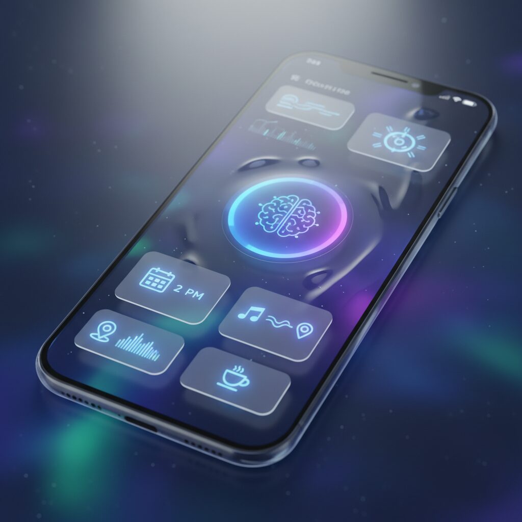
Focus Modes and Context Switching: Turning Your Home Screen into Adaptive Infrastructure
Focus Modes have evolved from simple notification filters into full-scale context engines that reshape your home screen in real time. In 2026, both iOS and Android allow different layouts, widgets, and app sets to appear depending on time, location, and activity. Instead of treating the home screen as a static grid, you can design it as adaptive infrastructure that responds to your cognitive state.
Context switching is not a minor inconvenience. Research on cognitive load and task switching consistently shows that even small interruptions degrade performance and increase mental fatigue. Studies on flow and mobile app behavior published on PubMed Central indicate that frequent app-checking fragments attention and disrupts deep work. By restructuring the home screen around Focus Modes, you reduce the frequency and cost of these switches.
A well-configured Focus Mode does not just silence noise. It reshapes visual priority, limits affordances, and protects your attentional bandwidth.
On iOS 19, Focus can be tied directly to specific home screen pages. When Work Focus activates at 9:00 AM, only a minimal page with Calendar, Reminders, and a Smart Stack appears. Social apps physically disappear from view. Apple’s documentation on Focus customization emphasizes that filters can extend to apps and system surfaces, reinforcing a single-task environment rather than relying on willpower alone.
Android 16 approaches this through profiles, Digital Wellbeing tools, and launcher-level customization. Combined with Live Updates in the notification shade, you can monitor delivery status or ride progress without opening the app itself. This design choice reduces unnecessary foreground app launches, minimizing disruptive context transitions.
| Mode | Visible Elements | Primary Goal |
|---|---|---|
| Work | Calendar, Tasks, Communication (limited) | Deep focus, low stimulus |
| Commute | Transit, Music, News widgets | One-handed efficiency |
| Private | Social, Camera, Personal dashboards | Relaxation and expression |
The key insight from cognitive psychology is that the brain builds spatial memory around stable environments. If each mode maintains internal consistency, your thumb and eyes learn the layout quickly. According to research on position-invariant icon mapping in foldable devices, preserving relative placement improves search speed and reduces cognitive strain. Even when switching modes, structural logic should remain predictable.
Automation strengthens this system. GPS-based triggers can activate Commute Mode when you enter a train station. Time-based rules can shift to Wind-Down Mode at night, combining grayscale filters with restricted app access. Studies on grayscale interventions suggest reduced screen time and weaker reward-driven app usage, making this pairing especially powerful for evening recovery.
Ultimately, adaptive home screens externalize self-control. Instead of asking yourself to resist distraction dozens of times per day, you engineer an environment where distraction is structurally inconvenient. Context-aware design turns your device from a source of fragmentation into a collaborator in attention management.
When configured deliberately, Focus Modes transform the home screen into living infrastructure—responsive, protective, and aligned with how your cognition actually works.
Gen Z and the Death of Folders: Search-First Behavior and Super Apps
For Gen Z, folders feel like relics of a desktop era. The idea of carefully nesting apps inside hierarchical trees mirrors the old PC directory structure, yet many digital natives have grown up in a world where search bars, not file paths, are the primary gateway to information.
Discussions in online communities frequently point out that younger users struggle less with “where is it stored?” and more with “what do I need right now?” This subtle shift reframes the home screen from a storage space into a launch interface.
Search-first behavior is not laziness. It is an optimization strategy. Swiping down to invoke Spotlight on iOS or the universal search bar on Android, typing one or two letters, and launching instantly often outperforms visually scanning multiple folders.
From a cognitive science perspective, this aligns with research on cognitive load. As design scholars note, recognition-based systems reduce mental effort compared to recall-based navigation. Typing “sp” to open Spotify bypasses the need to remember its spatial location.
| Approach | Mental Model | Cognitive Cost |
|---|---|---|
| Folder Navigation | Hierarchical memory | Visual scanning + recall |
| Search-First | Intent-based query | Keyword recognition |
The decline of folders is also accelerated by automated organization. iOS App Library and Android’s app drawer categorize applications dynamically, removing the burden of manual sorting. According to coverage of Gen Z device habits, many users simply abandon folder creation altogether.
At the same time, the rise of super apps compresses the need for breadth on the home screen. In Japan, LINE integrates messaging, payments, news, and entertainment into a single ecosystem. When one app becomes infrastructure, the home screen becomes a doorway rather than a dashboard.
The Guardian’s reporting on Japanese Gen Z users attempting to limit smartphone use highlights an interesting paradox. When screen time is consciously reduced, users become more selective about which apps deserve immediate visibility. Minimal surfaces support intentional behavior.
This does not mean customization disappears. Instead, the priority shifts from visual taxonomy to speed of invocation. A nearly empty home screen paired with powerful on-device search reflects confidence in the system’s indexing rather than reliance on visual clutter.
For gadget enthusiasts, the implication is clear. Optimizing for Gen Z behavior means investing in search fluency, predictive suggestions, and AI-driven surfacing. The death of folders is not chaos. It is the evolution from spatial memory to semantic intent.
Beyond the Phone: Universal Control, Phone Link, and the Extended Home Screen
In 2026, your home screen no longer lives inside your phone. It stretches across your desk, your laptop display, and even your peripheral vision. When Apple’s Universal Control allows a single keyboard and mouse to move seamlessly between Mac and iPad, and iPhone Mirroring brings your iPhone screen onto macOS, the phone stops being a separate device and becomes an extension of your desktop environment.
According to Apple Support documentation, Universal Control is designed to maintain continuous cursor and keyboard flow across devices without additional pairing steps each time. This continuity dramatically reduces context switching. Instead of picking up your phone to reply to a message, you type directly from your Mac. The physical gesture of “reaching for the phone” disappears, and with it, a subtle but measurable cognitive interruption.
The home screen, in this setup, transforms from a launch pad into an ambient control panel. When your iPhone is mirrored beside your main workspace, icons matter less than glanceable information.
| Environment | Primary Input | Role of Home Screen |
|---|---|---|
| Standalone Phone | Touch | App launcher and navigation hub |
| Mac + iPhone Mirroring | Keyboard & Mouse | Live dashboard and notification console |
| Windows + Phone Link | Keyboard & Mouse | Message center and app bridge |
Microsoft’s Phone Link extends a similar philosophy to Windows users. As Microsoft explains, users can read and respond to messages, access photos, and in some cases run mobile apps directly from a Windows PC. The behavioral shift is profound. If notifications, chats, and even app interactions are handled on a 27-inch monitor, the smartphone becomes a background node rather than the center of attention.
This shift has ergonomic consequences as well. Research on thumb reach and one-handed strain highlights the physical cost of repeated phone handling. By relocating high-frequency interactions to a full-size keyboard and mouse, you are not only saving time but also reducing micro-strain on your hands.
The most optimized home screen in a cross-device era is the one you rarely have to touch. Instead of densely packed icons, information-first widgets gain priority. Calendar blocks, task lists, and live status indicators become more valuable than rows of apps.
Consider pairing iPhone StandBy mode with a desk setup. Positioned on a MagSafe stand, the device functions as a persistent clock, calendar, or progress display while interaction happens elsewhere. In this configuration, the phone acts like an auxiliary instrument panel in a cockpit—always visible, rarely manipulated directly.
Android users leveraging Phone Link can apply the same principle. Keep essential communication apps pinned on the PC interface while simplifying the actual phone’s first page to core utilities only. The psychological effect mirrors findings in cognitive load research: fewer visible choices reduce decision fatigue.
For gadget enthusiasts, this is where optimization becomes strategic rather than cosmetic. The question is no longer “How beautiful is my layout?” but “Where should this interaction physically occur?” When typing, replying, browsing, and monitoring can happen on larger screens, the smartphone’s home screen evolves into a lightweight command surface within a broader digital ecosystem.
Physical Desk Setup and Digital Clarity: Why Environment Still Matters
Your digital clarity does not begin on the screen. It begins on your desk.
Even in 2026, when iOS 19 and Android 16 intelligently predict what you need next, the physical environment surrounding your device continues to shape cognitive performance in measurable ways.
According to cognitive load theory research summarized by UX scholars such as Marvel and Glance, attention is a finite resource. Visual clutter in the physical field competes with on-screen stimuli, increasing extraneous cognitive load and slowing decision-making.
Physical Order and Cognitive Impact
| Environment Factor | Cognitive Effect | Practical Adjustment |
|---|---|---|
| Cable clutter | Visual noise increases distraction | Use concealed cable trays |
| No fixed device position | Micro-search cost each interaction | Dedicated charging dock |
| Mixed device stacking | Task switching friction | Defined zones per device |
Every time you look for your phone on a messy desk, you pay a small cognitive tax. That tax accumulates across dozens of interactions per day.
Japanese productivity culture has long understood this principle. Minimal desk organizers from brands like 3COINS or Yamazaki are not merely aesthetic choices; they function as cognitive scaffolding. By assigning a fixed “home” to your smartphone—ideally a MagSafe or Qi charging stand—you reinforce spatial memory in the same way fixed app placement reinforces digital muscle memory.
This spatial consistency mirrors findings from position-invariant interface studies in foldable smartphones published in PubMed Central. When spatial relationships remain stable, search time decreases. The same rule applies in physical space.
Cross-device ecosystems further amplify this effect. Apple’s Universal Control and iPhone Mirroring, or Microsoft’s Phone Link for Android, reduce the need to physically pick up your device. When your phone remains docked in a stable visual position, it transforms from a distraction object into an ambient information panel.
The less you physically handle your phone, the fewer unconscious context switches you trigger.
There is also a postural dimension. Research on thumb zones and one-handed strain from Yonsei University shows that repeated reach-extension increases muscular fatigue. A properly angled stand at eye level reduces neck flexion and hand tension, indirectly supporting longer deep-work sessions.
Lighting matters as well. iOS 19’s translucent Liquid Glass layers and Android 16’s dynamic color system respond to ambient light. If your desk lighting produces glare or high contrast, you unintentionally increase visual strain. Diffused, indirect lighting allows adaptive UI elements to function as intended.
You can grayscale your icons and optimize widget stacks, but if your desk is chaotic, your brain still processes noise before it ever processes pixels.
Think of your desk as the outer layer of your interface stack. Screen layout is software optimization. Desk layout is hardware optimization. Together, they determine whether your device behaves like a precision instrument or a cognitive drain.
In 2026’s hyper-connected workflow, environmental discipline is not nostalgic analog romanticism. It is a measurable performance advantage.
参考文献
- Apple Newsroom:Apple introduces a delightful and elegant new software design
- ZDNET:My 7 favorite new Android 16 features include delights for every Pixel user
- Android Developers:Features and APIs | Android 16
- PubMed Central:Position-invariant icon remapping facilitates search performance in foldable smartphones
- MDPI Applied Sciences:The Effect of Icon Color Combinations in Information Interfaces on Task Performance under Varying Levels of Cognitive Load
- ResearchGate:True colors: Grayscale setting reduces screen time in college students
- The Guardian:‘It made my day more meaningful’: the Japanese gen Zers attempting to limit smartphone use
- Microsoft:Use Phone Link to Sync Your Android or iPhone to Your Windows Computer