
If you are passionate about gadgets and digital reading, 2026 is a turning point you cannot ignore.
The eBook market in Japan alone reached 6,703 billion yen in fiscal 2024, growing 3.9% year over year, with projections approaching 8,000 billion yen by 2029. Comics dominate the landscape, and smartphone-optimized vertical formats such as Webtoon are reshaping how people consume stories. At the same time, tablet hardware has evolved dramatically, led by Tandem OLED displays capable of up to 1,600 nits peak brightness and unprecedented contrast.
But specs alone do not guarantee a great reading experience. Eye fatigue, storage limitations, lighting environments, and software settings all play critical roles. In this article, you will discover how display technology, ergonomic settings, high-CRI lighting, and user behavior trends converge to create the most advanced digital reading environment ever. If you want to design a truly optimized reading setup in 2026, this guide will show you how to do it intelligently and effectively.
- The Global Shift in Digital Reading: Market Data and What 6,703 Billion Yen Tells Us
- Why Comics and Webtoon Are Redefining Tablet-Centric Reading
- Tandem OLED Explained: How 1,600-Nit Displays Transform Readability
- Nano-Texture Glass and Anti-Reflection Coatings: Beating Outdoor Glare
- Eye Fatigue Science: Brightness, Contrast, and Human Visual Ergonomics
- Blue Light, Melatonin, and Night Modes: What Actually Improves Sleep
- Typography Optimization: Font Size, Weight, and Accessibility Settings That Matter
- Storage Strategy in 2026: Why 128GB Is the New Baseline for Comic Readers
- Offline Access, Caching, and Network Optimization for Seamless Reading
- High-CRI Desk Lighting and Flicker-Free Design: The Overlooked Performance Upgrade
- Generational Usage Patterns: Free Models, Paid Power Users, and Platform Loyalty
- Beyond Visual Reading: The Rise of Audiobooks and Web Novels
- The Next Frontier: AI-Driven Adaptive Reading Environments
- 参考文献
The Global Shift in Digital Reading: Market Data and What 6,703 Billion Yen Tells Us
The global digital reading market is no longer in an experimental phase; it is entering structural maturity.
According to the Impress Research Institute’s “eBook Business Report 2025,” Japan’s eBook market reached 6,703 billion yen in fiscal 2024, a 3.9% year-on-year increase from 6,449 billion yen in 2023.
This figure signals not explosive expansion, but stable and sustainable growth.
What makes 6,703 billion yen significant is its composition.
Digital comics account for the overwhelming majority, far surpassing text-based books and magazines, reflecting a mobile-first consumption pattern.
The rise of Webtoon, optimized for vertical scrolling on smartphones, demonstrates how format innovation directly drives revenue.
| Fiscal Year | Market Size (Billion Yen) | Growth Rate |
|---|---|---|
| 2023 | 6,449 | — |
| 2024 | 6,703 | 3.9% |
| 2029 (Forecast) | Approx. 8,000 | — |
The projected expansion to nearly 8,000 billion yen by 2029 suggests that digital reading is embedding itself into everyday life.
At the same time, high free-usage rates indicate a shift from ownership to platform-based access models.
The market is evolving from volume-driven growth to value-driven optimization.
Globally, similar patterns appear as subscription ecosystems, IP diversification, and AI-powered recommendations deepen user engagement.
The 6,703 billion yen milestone therefore represents more than domestic revenue; it reflects a broader transformation in how content is produced, distributed, and monetized.
Digital reading is becoming infrastructure, not just an alternative to print.
Why Comics and Webtoon Are Redefining Tablet-Centric Reading
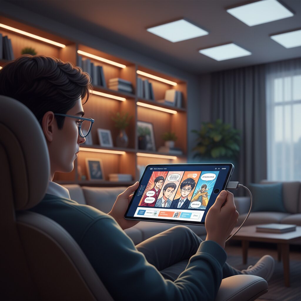
Comics and Webtoon are not just popular genres. They are fundamentally reshaping how people use tablets as their primary reading device.
According to the Digital Publishing Business Survey Report 2025 by Impress Research Institute, comics account for the overwhelming majority of Japan’s eBook market revenue, far surpassing text-based books and magazines. This dominance has shifted optimization priorities from “text clarity” to visual immersion, scrolling fluidity, and color accuracy.
In other words, tablets are no longer optimized only for reading paragraphs. They are optimized for experiencing panels.
Webtoon, in particular, has redefined reading as a continuous vertical experience rather than a page-turning one.
Traditional print manga relies on page structure, spreads, and deliberate panel turns. Webtoon, by contrast, is designed for vertical scrolling, aligning perfectly with the natural gesture behavior developed through smartphone and tablet usage.
This design shift has profound hardware implications. Smooth refresh rates, responsive touch sampling, and high-brightness OLED panels are no longer luxury specs. They are critical for preserving narrative pacing.
| Format | Interaction Model | Tablet Optimization Focus |
|---|---|---|
| Print-based Digital Manga | Page-by-page tap or swipe | Resolution and contrast for fine line art |
| Webtoon (Vertical) | Continuous scroll | Refresh rate, brightness, color depth |
High-end displays such as Tandem OLED panels, which deliver exceptional brightness and true blacks, enhance dramatic color scenes and gradient-heavy backgrounds. As noted in coverage of recent iPad Pro models, full-screen high brightness improves outdoor readability, which directly benefits mobile-first Webtoon consumption.
Another critical factor is behavioral economics. The same report indicates a very high free usage rate in digital comics, suggesting that readers increasingly “consume within services” rather than “own volumes.”
This shift encourages serialized, episodic, and binge-friendly formats. Tablets become portals to ecosystems rather than libraries.
Webtoon’s cinematic pacing also benefits from tablet screen size. Compared to smartphones, tablets allow greater spatial storytelling: elongated action scenes, gradual vertical reveals, and dramatic pauses created by intentional blank space.
The tablet is uniquely positioned between smartphone convenience and print-scale immersion.
For creators and platforms, this means storytelling is now partially engineered around device ergonomics. Panel spacing anticipates thumb movement. Color grading assumes OLED contrast. Cliffhangers are timed to scroll velocity.
As a result, comics and Webtoon are not simply adapting to tablets. They are actively influencing how tablets evolve—driving demand for higher refresh rates, better glare reduction, and stronger GPU performance.
The reading device is no longer neutral hardware. It has become a co-author in the storytelling experience.
Tandem OLED Explained: How 1,600-Nit Displays Transform Readability
In 2026, display quality has become the single most decisive factor in tablet readability. Tandem OLED, first introduced in Apple’s latest iPad Pro generation, represents a structural leap rather than a marginal upgrade. By stacking two OLED emission layers instead of one, the panel achieves dramatically higher brightness while improving efficiency and lifespan.
This dual-layer architecture directly addresses the historical weakness of OLED: limited sustained brightness. According to product analyses of recent iPad Pro models, Tandem OLED reaches up to 1,600 nits in HDR and significantly higher full-screen brightness than previous single-layer OLED tablets. For readers, that number is not marketing—it changes where and how you can read.
| Metric | Single-Layer OLED | Tandem OLED |
|---|---|---|
| Emission Structure | 1 OLED layer | 2 stacked OLED layers |
| Peak HDR Brightness | Lower ceiling | Up to 1,600 nits |
| Outdoor Legibility | Often compromised | Highly improved |
Under direct sunlight or near bright windows, traditional tablets struggle against reflections and ambient glare. Higher peak luminance allows text strokes and fine comic linework to maintain separation from the background. Instead of washing out, black characters remain perceptibly dense. This is particularly important for vertical-scrolling comics and detailed illustrations, where mid-tone contrast determines clarity.
Equally transformative is OLED’s ability to produce true black by turning off individual pixels. With Tandem OLED, that black depth coexists with extreme brightness headroom. The result is an expanded contrast envelope that reduces perceived haze around text edges. In practical reading terms, letters look etched rather than illuminated.
Display specialists frequently emphasize that readability is governed not only by resolution but by contrast ratio and luminance stability. By distributing load across two emissive layers, Tandem OLED reduces stress on each layer, contributing to brightness consistency over time. That stability matters for users who read several hours a day.
When paired with anti-reflective treatments such as nano-texture glass options, the improvement becomes cumulative. Reflections are diffused at the surface level, while internal brightness compensates for environmental light. This combination narrows the traditional gap between backlit displays and E Ink in bright conditions—without sacrificing color accuracy or refresh rate.
For HDR-enabled photo books and richly colored manga, 1,600-nit peak brightness also expands highlight detail. Bright skies, metallic reflections, and luminous effects are rendered with separation instead of clipping. Readers no longer choose between vivid color and comfortable text clarity; Tandem OLED delivers both simultaneously.
In short, Tandem OLED transforms readability from a situational advantage into a consistent experience. Whether indoors under controlled lighting or outdoors in harsh daylight, the display adapts through sheer dynamic range. For gadget enthusiasts who care about immersive, uncompromised reading, this is not incremental progress—it is a redefinition of what a tablet screen can achieve.
Nano-Texture Glass and Anti-Reflection Coatings: Beating Outdoor Glare

Outdoor readability has become a decisive factor for tablet users who read on balconies, in cafés, or during commutes. Even with high peak brightness from Tandem OLED panels, reflected sunlight can easily overpower on-screen content. That is why nano-texture glass and advanced anti-reflection coatings are now critical layers in the reading experience.
Nano-texture glass subtly etches the surface at a microscopic level, diffusing incoming light rather than allowing it to reflect directly back to your eyes. According to coverage of the latest iPad Pro models, this treatment significantly reduces glare under strong ambient light while preserving sharpness. The key advantage is glare diffusion without sacrificing contrast, which is essential for text-heavy content and detailed manga panels.
| Technology | Primary Function | Reading Benefit |
|---|---|---|
| Standard Glass | Glossy surface | Vivid colors, but strong reflections |
| Anti-Reflection Coating | Reduces surface reflectance | Clearer text near windows |
| Nano-Texture Glass | Light diffusion at micro level | Comfortable outdoor readability |
Anti-reflection coatings further enhance usability by minimizing mirror-like glare from overhead lighting. Combined with peak brightness levels reaching 1,600 nits in HDR on high-end tablets, as reported in recent device analyses, users can maintain legibility even under direct daylight.
For gadget enthusiasts who read extensively outdoors, surface treatment matters as much as panel technology. The difference is not just visual clarity, but reduced eye strain and sustained immersion in bright environments.
Eye Fatigue Science: Brightness, Contrast, and Human Visual Ergonomics
Digital reading comfort ultimately comes down to how light interacts with the human visual system. Brightness, contrast, and color temperature are not merely display specs; they directly influence pupil size, ciliary muscle tension, and neural adaptation. When these elements are misaligned with the surrounding environment, eye fatigue accumulates quickly, even on premium devices.
According to ophthalmological guidance frequently cited by device specialists in 2026 tablet optimization guides, excessive screen luminance relative to ambient light forces continuous pupil constriction. This increases strain over long sessions. The key principle is balance, not maximum brightness.
Brightness should adapt dynamically to the environment. In a bright room, higher luminance improves legibility and prevents squinting. In dark settings, however, high brightness creates glare and increases retinal light exposure. Experts therefore recommend enabling automatic brightness while slightly reducing it manually below the device’s default calibration for extended reading sessions.
Contrast plays an equally critical role. Tandem OLED panels, now a high-end benchmark, achieve deep blacks and strong contrast ratios. From a visual ergonomics perspective, this improves edge definition of text strokes, reducing micro-adjustments of focus. The clearer the boundary between text and background, the less effort the visual cortex expends interpreting character shapes.
| Factor | Too High | Optimized State |
|---|---|---|
| Brightness | Glare, pupil stress | Matched to ambient light |
| Contrast | Halation in dark rooms | Sharp text boundaries |
| Color Temperature | Sleep disruption (cool light at night) | Warmer tones after sunset |
Dark mode is often misunderstood as universally superior. In reality, its ergonomic advantage depends on lighting conditions. In low-light environments, white text on a black background reduces total emitted light, easing retinal stimulation. In bright daylight, however, light backgrounds may improve readability by aligning more naturally with environmental luminance.
The American Academy of Ophthalmology has noted that blue light from screens is not uniquely damaging at normal device levels, yet shorter wavelengths are associated with circadian rhythm regulation. This is why modern reading modes selectively shift color temperature in the evening. Warmer tones reduce circadian disruption while maintaining sufficient contrast for clarity.
Another overlooked element is contrast stability during page transitions. Rapid luminance shifts—such as switching from a bright comic panel to a dark scene—require constant retinal adaptation. High-end displays with precise brightness control and smoother transitions minimize these micro-adjustments, which cumulatively contribute to fatigue.
Ultimately, human visual ergonomics teaches us that comfort is systemic. It emerges when brightness harmonizes with the room, contrast enhances definition without glare, and color temperature respects biological rhythms. When these variables are tuned intentionally rather than left at factory defaults, digital reading becomes physiologically sustainable—even for hours at a time.
Blue Light, Melatonin, and Night Modes: What Actually Improves Sleep
Blue light has long been framed as the primary villain behind poor sleep, but the reality is more nuanced. What truly affects your rest is not just the presence of blue light, but the intensity, timing, and overall brightness of screen exposure. Understanding this distinction is essential if you read on a tablet before bed.
Melatonin, the hormone that regulates sleep-wake cycles, is secreted in darkness. According to sleep research referenced by institutions such as Harvard Medical School, short-wavelength blue light can suppress melatonin more strongly than warmer light. However, suppression is dose-dependent. A bright white screen at maximum luminance is far more disruptive than a dimmed display with reduced blue emission.
What Actually Impacts Melatonin at Night
| Factor | Impact on Sleep | Level of Control |
|---|---|---|
| Screen Brightness | High brightness delays melatonin release | Manual / Auto-adjust |
| Blue Wavelength Intensity | Short wavelengths increase alertness | Night mode / Warm filter |
| Exposure Duration | Long sessions amplify suppression | Reading habits |
| Viewing Distance | Closer distance increases retinal exposure | Ergonomic setup |
Many users rely solely on “Night Mode” or “Night Shift,” assuming it solves the problem entirely. These features shift color temperature toward warmer tones, reducing short-wavelength emission. This can meaningfully lower circadian stimulation, especially during the final one to two hours before sleep. However, color shift without brightness reduction is only a partial solution.
Dark mode introduces another variable. By switching to a black background with light text, total emitted light decreases significantly on OLED displays because black pixels emit little to no light. On advanced panels such as Tandem OLED, this results not only in energy efficiency but also in lower overall luminance hitting the eyes at night.
The American Academy of Sleep Medicine emphasizes that behavioral timing matters as much as spectral content. If you begin reading in bed at midnight with maximum brightness, even a strong blue light filter cannot fully prevent alertness. Conversely, a softly lit display used earlier in the evening may have minimal measurable impact.
Another overlooked factor is contrast adaptation. Extremely high contrast in a dark room can strain visual processing even if melatonin suppression is reduced. A slightly warm ambient light in the room, rather than total darkness, helps stabilize pupil size and reduces physiological stress while maintaining circadian alignment.
Modern operating systems now allow granular scheduling of color temperature transitions. Gradual warming that begins at sunset aligns more naturally with circadian biology than abrupt shifts at bedtime. This mirrors how natural daylight fades, allowing the body to transition smoothly.
It is also important to distinguish between sleep latency and sleep quality. Research shows that intense evening light exposure can delay sleep onset. However, once asleep, the impact may depend on cumulative exposure earlier in the evening. This means your entire nightly lighting environment matters, not just the final five minutes of reading.
Ultimately, blue light reduction is helpful but not magical. Brightness control is often the most powerful lever, followed by timing and duration. Night modes improve comfort and may reduce circadian disruption, yet they work best as part of a broader strategy that respects human biology.
If your goal is deeper sleep without sacrificing digital reading, focus on three practical adjustments: dim the display below daytime levels, activate a warm color filter at least one hour before bed, and avoid marathon sessions in complete darkness. When applied consistently, these refinements create a reading experience that supports both immersion and restorative sleep.
Typography Optimization: Font Size, Weight, and Accessibility Settings That Matter
Typography is not a cosmetic detail in digital reading; it is a performance factor that directly affects comprehension, fatigue, and retention. As the Japanese eBook market matures to 6,703 billion yen in 2024 with steady 3.9% year-on-year growth, readers are spending longer sessions inside apps, which makes micro-adjustments in font size, weight, and accessibility settings increasingly important according to the Electronic Publishing Business Report 2025 by Impress Research Institute.
Well-optimized typography reduces cognitive load and eye strain, especially on high-luminance OLED displays that are now common in 2026 tablets. On bright Tandem OLED panels capable of up to 1,600 nits peak brightness, thin default fonts can appear overly sharp, increasing visual tension. Slightly increasing weight and size softens perceived contrast without sacrificing clarity.
Font size is the first variable most users adjust, yet many stop at what “fits more text on screen.” From a visual ergonomics perspective, that approach is counterproductive. Ciliary muscles responsible for focus work harder when characters are small and densely packed. Experts in tablet optimization guides published in 2026 recommend setting text to roughly 120% of the default size for extended reading sessions.
| Setting | Recommended Adjustment | Expected Impact |
|---|---|---|
| Font Size | 110–130% of default | Reduced focusing strain, improved line tracking |
| Font Weight | Slightly bolder than standard | Improved legibility on bright OLED panels |
| Line Spacing | +5–15% | Lower visual crowding, better comprehension |
| Margins | Moderately expanded | Clearer visual hierarchy and pacing |
Font weight is often overlooked, yet it becomes critical on high-contrast displays. OLED technology renders true blacks, which intensifies edge definition. When strokes are too thin, letters can shimmer slightly against deep black backgrounds, especially in dark mode. Increasing weight by one step stabilizes character perception and reduces micro-adjustments of the eye.
Accessibility settings go beyond simple enlargement. Modern operating systems allow system-wide bold text toggles, per-app font overrides, and contrast enhancement modes. These tools were originally designed for users with low vision, but they are increasingly adopted by mainstream readers who consume Web novels or long-form essays for hours. With Web fiction usage at 15.5% according to industry data, customizable text rendering plays a measurable role in user retention.
Contrast ratio also interacts with typography. In dark mode, pure white text on pure black can create halation, where letters appear to glow. Switching to slightly off-white text and dark gray backgrounds reduces glare without diminishing readability. This subtle adjustment aligns with visual ergonomics principles that aim to minimize extreme luminance transitions.
Line length is another typographic lever. On large tablets, full-width paragraphs can exceed optimal reading width, forcing excessive horizontal eye movement. Reducing margins or enabling column-style layouts shortens line length to a more comfortable range, improving rhythm and preventing skipped lines. This is particularly effective for text-heavy genres such as practical books and literary fiction.
Accessibility features such as text reflow and dynamic type scaling also ensure consistency across orientations. When switching from portrait to landscape, properly optimized apps maintain proportional spacing and hierarchy rather than compressing paragraphs. This preserves reading flow and avoids cognitive interruption.
Typography optimization should be treated as a personal calibration process rather than a one-time tweak. Lighting conditions, time of day, and even genre influence ideal settings. Dense academic material may benefit from slightly larger fonts and wider spacing, while dialogue-heavy fiction can tolerate tighter layouts for pacing.
As reading sessions extend in a market increasingly driven by subscription consumption rather than single purchases, comfort directly influences engagement time. Fine-tuning font size, weight, spacing, and accessibility settings transforms a high-performance tablet display into a sustainable reading environment. The result is not only clearer text, but a measurable reduction in fatigue and a deeper sense of immersion.
Storage Strategy in 2026: Why 128GB Is the New Baseline for Comic Readers
In 2026, storage is no longer a secondary spec for comic readers. It directly defines how uninterrupted and immersive your reading life can be. As Japan’s eBook market reached 6,703 billion yen in 2024, up 3.9% year over year according to Impress Research Institute, the dominance of digital comics has reshaped what “enough storage” really means.
Comics account for the largest share of that market. Unlike text-based novels, modern digital comics are high-resolution, color-optimized, and often enhanced for vertical scrolling formats such as Webtoon. As a result, file sizes have grown steadily.
For regular comic readers, 128GB has effectively become the new baseline in 2026.
| User Type | Typical Comic Size | Recommended Storage |
|---|---|---|
| Casual reader | Several hundred MB per volume | 64GB (strict management required) |
| Series follower | Multiple GB per series | 128GB minimum |
| Collector / Offline-heavy user | Dozens of volumes stored locally | 256GB or more |
Recent buying guides for 2026 tablets emphasize that high-resolution comics frequently exceed several hundred megabytes per volume. When you follow multiple ongoing series, storage fills up faster than expected. A 64GB device, once considered generous, now forces constant deletion and re-download cycles.
This is not just about capacity. It is about time efficiency. If you commute underground or travel frequently, cloud-dependent access becomes unreliable. Keeping entire arcs stored locally ensures instant page loads and seamless transitions between volumes.
There is also a performance dimension. When internal storage approaches full capacity, many devices experience slower app launches and delayed page rendering. Comic apps cache large image data, and insufficient free space can degrade responsiveness. Maintaining healthy storage headroom directly protects reading smoothness.
Another factor is ecosystem lock-in. As noted in market analysis by Impress, users increasingly consume content within specific platforms rather than owning individual files. However, platform-based consumption still benefits from generous local storage because downloaded volumes reduce server dependence and data usage.
In practical terms, 128GB offers balance. It allows dozens of volumes to remain downloaded, preserves system performance, and accommodates system updates and other media without constant micromanagement. It is not luxury capacity; it is operational stability.
For comic enthusiasts in 2026, choosing 128GB or higher is less about future-proofing and more about aligning hardware with current content realities. Storage strategy has become part of the reading experience itself, shaping whether your digital bookshelf feels limitless or constrained.
Offline Access, Caching, and Network Optimization for Seamless Reading
For heavy digital readers in 2026, seamless access is no longer a luxury but a baseline expectation. As Japan’s eBook market reached 6,703 billion yen in fiscal 2024 with steady growth, according to Impress Research Institute, user behavior has shifted toward always-available, service-based consumption. To support this model, offline access, intelligent caching, and network optimization have become critical pillars of the reading experience.
Offline readiness directly determines whether reading feels immersive or fragile. Commuting through underground tunnels, traveling on high-speed trains, or reading during flights exposes the limits of unstable connectivity. Platforms now allow bulk pre-download of volumes, automatic updates over Wi-Fi, and background synchronization that minimizes user intervention.
For comic-heavy users, where a single high-resolution volume can exceed hundreds of megabytes, the download strategy must be deliberate rather than reactive.
| Optimization Layer | Function | User Benefit |
|---|---|---|
| Offline Download | Local storage of full volumes | No interruption in low-signal areas |
| Smart Caching | Temporary storage of recent pages | Faster page turns, reduced data usage |
| Wi-Fi Auto Sync | Background updates on stable networks | Energy and mobile data savings |
Smart caching plays a subtler but equally important role. Modern reading apps preload the next several pages while you read, predicting progression patterns. This reduces perceived latency to near zero, especially in image-dense Webtoon formats where vertical scrolling demands continuous data flow. Without effective caching, even high-end hardware cannot mask network jitter.
Network optimization is not just about speed but about stability and prioritization. On crowded public Wi-Fi, adaptive bitrate delivery and compressed image streaming maintain readability while preventing stalls. Some platforms dynamically adjust image resolution based on connection quality, preserving text clarity while scaling background detail.
Energy efficiency also intersects with connectivity. Automatic downloads restricted to Wi-Fi prevent unnecessary mobile data consumption and battery drain. Given that high-brightness displays such as Tandem OLED panels already manage power dynamically, aligning network activity with stable charging or Wi-Fi conditions creates a balanced ecosystem.
Cloud synchronization further enhances continuity. Reading progress, bookmarks, and highlights are mirrored across devices, enabling seamless switching between tablet and smartphone. This model reflects the broader market shift identified by Impress Research Institute: ownership is secondary to access within an ecosystem.
Ultimately, the smoothest reading experience is engineered before the first page opens. By combining deliberate offline preparation, intelligent cache management, and adaptive network control, users transform digital reading from a connection-dependent activity into a resilient, always-available habit.
High-CRI Desk Lighting and Flicker-Free Design: The Overlooked Performance Upgrade
When optimizing a digital reading setup in 2026, most enthusiasts focus on display panels and software tweaks. However, the real performance upgrade often comes from something outside the device: high-CRI desk lighting and flicker-free design.
Even the best Tandem OLED screen cannot compensate for poor ambient light. The quality of the light surrounding your tablet directly affects contrast perception, eye fatigue, and long-session comfort.
Why High-CRI Lighting Changes Everything
CRI (Color Rendering Index) measures how accurately a light source reproduces colors compared to natural daylight, which is defined as 100. According to product evaluations published by Yamada Denki’s home appliance media in 2026, many standard LEDs operate around Ra80, while reading-focused desk lamps now reach Ra90 to Ra97.
| Lighting Type | CRI (Ra) | Reading Impact |
|---|---|---|
| Standard LED | ~80 | Acceptable but flatter color perception |
| High-CRI LED | 90+ | More natural whites, reduced visual harshness |
| Premium Reading Lamp | Up to 97 | Daylight-like clarity, improved contrast stability |
For tablet readers, this matters more than it seems. A high-CRI environment reduces the perceptual gap between the bright display and the surrounding room. Whites appear cleaner, blacks feel deeper, and your eyes spend less effort constantly adapting.
This is particularly noticeable when reading manga, illustrated e-books, or photo-rich content where subtle tonal differences are critical.
The Hidden Enemy: Flicker
Flicker is another overlooked variable. Many low-cost LED lights use pulse-width modulation (PWM) to control brightness, rapidly turning the light on and off. Even when invisible to the naked eye, this micro-flicker can contribute to eye strain and headaches during long sessions.
In contrast, flicker-free driver circuits—highlighted in 2026 recommendations for eye-friendly desk lamps—maintain stable output across dimming levels. The difference becomes obvious during two-hour or longer reading blocks.
Stable illumination supports stable focus. When the ambient light fluctuates, your pupils constantly adjust, compounding the fatigue already induced by digital displays.
OLED Surface Lighting vs Point Sources
Another notable evolution is the adoption of OLED-based desk lamps with surface emission. Unlike traditional point-source LEDs, these distribute light evenly across a panel. Reviews of models such as high-CRI OLED desk lights emphasize reduced glare and softer shadow edges.
This uniform diffusion minimizes reflections on glossy tablet displays and reduces high-contrast hotspots on your desk. The result is a visually calm workspace that complements high-brightness tablets rather than competing with them.
For readers who use nano-texture or anti-reflective displays, pairing them with surface-emitting, high-CRI, flicker-free lighting creates a layered optimization strategy.
The upgrade is subtle but transformative: less squinting, fewer micro-breaks, and greater immersion in long-form content.
In an era where digital reading sessions often exceed several hours—especially among heavy e-book and manga users in Japan’s mature 2026 market—lighting quality becomes a productivity tool. Investing in Ra90+ illumination and verified flicker-free circuitry is not aesthetic refinement. It is performance engineering for your eyes.
Generational Usage Patterns: Free Models, Paid Power Users, and Platform Loyalty
Generational differences are now one of the most decisive factors shaping how eBook platforms compete in 2026. According to the Impress Research Institute’s “eBook Business Report 2025,” usage patterns clearly diverge between free-first young users and paying power users in their 30s and 40s. These differences are not marginal—they redefine monetization models, UI design, and long-term platform strategy.
Younger readers, especially teenagers and users in their 20s, overwhelmingly gravitate toward free models. The same report shows a remarkably high free eBook usage rate, while paid usage remains comparatively lower in these cohorts. For this generation, ownership is less important than frictionless access within an app ecosystem.
For Gen Z readers, “access beats ownership.” For users in their 30s and 40s, “curation beats convenience.”
Free-to-read campaigns, daily bonus tickets, and vertically scrolling Webtoon formats align perfectly with short attention spans and mobile-first habits. The appeal lies in immediacy: open the app, scroll, consume, exit. Platform switching costs are low unless loyalty mechanisms—points, streaks, or exclusive IP—are deeply embedded.
In contrast, users in their 30s and 40s demonstrate stronger monetization potential. Impress reports that paid usage rates peak among men in their 30s at 25.7%, the highest among all demographic segments. This group is more likely to subscribe, purchase volumes outright, and maintain digital libraries within a preferred ecosystem.
| Age Group | Primary Model | Behavioral Traits |
|---|---|---|
| Teens–20s | Free / Ad-supported | Mobile-first, short sessions, Webtoon preference |
| 30s–40s | Paid / Subscription | Series loyalty, collection building, stable ARPU |
This divergence directly impacts ARPU strategy. Even as the total market reached 6,703 billion yen in FY2024 with 3.9% year-on-year growth, the challenge is not scale but revenue quality. Platforms increasingly rely on heavy users who generate recurring payments rather than casual free readers.
Platform loyalty also differs structurally. Younger users exhibit “content loyalty” rather than “platform loyalty.” They follow trending IP wherever it appears. Meanwhile, older cohorts show stronger attachment to specific ecosystems such as Piccoma or LINE Manga, where accumulated purchases create psychological switching costs.
Interestingly, adjacent formats reinforce this segmentation. Audiobook usage increased year-on-year, with 21.0% expressing intent to use such services. This multitasking-friendly format resonates particularly with working adults, further strengthening paid engagement in older demographics.
The strategic implication is clear: free users drive reach and cultural momentum, but paid power users sustain profitability. Successful platforms in 2026 design dual-layer ecosystems—high-velocity free funnels for youth and premium retention mechanisms for established readers. Generational behavior is no longer a side metric; it is the central axis of platform competition.
Beyond Visual Reading: The Rise of Audiobooks and Web Novels
Digital reading in 2026 no longer means staring at a screen. It increasingly means listening, scrolling, and consuming stories in formats optimized for modern lifestyles.
According to the “E-book Business Report 2025” by Impress Research Institute, audiobook usage rose again in 2024, while the intention to use audiobooks reached 21.0%. This signals a structural shift in how users define reading itself.
Reading is evolving from a visual act into a multimodal experience, seamlessly integrated into commuting, exercising, and household routines.
| Format | Primary Use Context | User Motivation |
|---|---|---|
| Audiobooks | Commuting, chores, driving | Time efficiency, hands-free access |
| Web Novels | Smartphone reading, short breaks | Immediate access, serialized engagement |
Audiobooks in particular thrive on what many users call “hidden time”—moments when eyes and hands are occupied but ears remain free. The growth in adoption reflects broader lifestyle optimization trends, where productivity and entertainment merge.
Major platforms have improved narration quality, voice acting, and playback customization, making variable speed listening and offline downloads standard features. These refinements reduce friction and increase immersion.
Research cited in industry reports consistently shows that convenience is the dominant driver. The appeal lies not only in accessibility, but in cognitive flexibility—users can absorb stories while maintaining physical activity.
Web novels represent a different but equally powerful transformation. With a utilization rate of 15.5%, they function as both entertainment platforms and intellectual property incubators. Many hit manga and anime titles now originate from serialized online fiction.
Unlike traditional novels, web novels are designed for episodic consumption. Short chapters, cliffhangers, and comment-enabled ecosystems encourage daily engagement.
This interactive feedback loop reshapes storytelling itself, as authors often respond directly to reader reactions in real time.
The same industry data indicates that free digital content usage significantly exceeds paid usage, particularly among younger demographics. This reinforces the platform-centric model, where discovery and engagement matter more than physical possession.
For tech-savvy readers, the hardware ecosystem enhances these formats further. High-quality speakers, spatial audio support, and optimized headphone codecs elevate audiobook immersion. Meanwhile, adjustable fonts and dark mode improve long-form web novel reading comfort.
In this environment, reading is no longer confined to the eye. It expands across devices, senses, and contexts—transforming stories into continuous companions throughout the day.
The Next Frontier: AI-Driven Adaptive Reading Environments
As Japan’s eBook market shifts from rapid expansion to qualitative refinement, the next competitive edge is no longer hardware alone but intelligence embedded in the reading environment. According to the Impress Research Institute’s “eBook Business Report 2025,” the domestic market reached 6,703 billion yen in fiscal 2024, signaling steady maturation rather than explosive growth. In this phase, platforms are expected to differentiate themselves through AI-driven adaptive reading environments that respond to individual users in real time.
Adaptive reading systems build on existing technologies such as automatic brightness control, blue light reduction, and dynamic refresh rates, but elevate them through contextual awareness. Instead of requiring users to manually switch to dark mode at night or adjust font size when fatigued, AI analyzes ambient light, time of day, reading duration, and even content characteristics to optimize settings continuously. This represents a shift from static customization to responsive personalization.
For example, devices equipped with high-luminance Tandem OLED displays can reach peak brightness levels suitable for outdoor visibility. When combined with AI-based ambient sensing, the display can fine-tune luminance below environmental light levels to reduce pupil strain, a method already recommended in ergonomic best practices. The goal is not maximum brightness, but physiologically optimal brightness, calculated moment by moment.
| Adaptive Parameter | Input Data | Optimization Goal |
|---|---|---|
| Screen Brightness | Ambient light sensor | Reduce glare and eye strain |
| Color Temperature | Time of day | Support circadian rhythm |
| Font Size/Weight | Reading duration, zoom behavior | Lower accommodative stress |
| Refresh Rate | Content type | Balance smoothness and battery life |
Content-aware adaptation is particularly promising in Japan’s comic-dominated market. With digital comics representing the majority share of revenue, platforms increasingly handle high-resolution images and vertically scrolling Webtoon formats. AI can detect whether a user is reading dense text, grayscale manga, or full-color Webtoon panels, and adjust contrast curves or refresh rates accordingly. In visually complex scenes, enhanced contrast improves line clarity; in text-heavy passages, slightly increased font weight can enhance legibility without manual intervention.
Adaptive environments also integrate behavioral analytics. If a system detects frequent zooming or shortened reading sessions late at night, it can proactively suggest larger text or warmer color tones. This approach aligns with established knowledge about blue light and melatonin suppression, already reflected in features such as Night Shift and reading modes. The difference lies in automation guided by pattern recognition rather than user guesswork.
Subscription-based consumption models further accelerate this shift. As ownership gives way to access, platforms accumulate longitudinal usage data across thousands of sessions. Within privacy-compliant frameworks, anonymized trend analysis enables systems to refine default profiles for specific demographics. For instance, younger users who consume Webtoon rapidly may benefit from motion-optimized scrolling adjustments, while long-session readers in their 30s and 40s may prioritize fatigue reduction.
Another frontier involves synchronization between device and environment. Modern high-CRI desk lighting already supports adjustable color temperatures. In an adaptive ecosystem, tablet software could communicate with smart lighting systems to harmonize screen output with ambient illumination. When evening mode activates on the tablet, room lighting could shift simultaneously to warmer tones, reducing contrast imbalance between screen and surroundings.
Importantly, adaptive reading is not about replacing user control. It is about creating a baseline environment that continuously supports visual comfort, battery efficiency, and immersion. As the market moves toward the projected 8 trillion yen scale by 2029, differentiation will increasingly depend on how intelligently platforms translate hardware potential into personalized comfort.
The evolution from manual settings to AI-orchestrated optimization marks a structural transformation in digital reading. What began as simple screen customization is becoming a responsive ecosystem that senses, predicts, and adjusts. In a mature market where content abundance is guaranteed, the decisive innovation lies in how seamlessly technology disappears—allowing readers to focus entirely on the story unfolding before them.
参考文献
- Impress Research Institute:eBook Business Report 2025
- PR TIMES (Impress Holdings):Japan’s eBook Market Grows 3.9% to 670.3 Billion Yen in FY2024 – eBook Business Report 2025
- GooPass Magazine:iPad Pro 2026 Latest Model Explained and Compared
- DaiDai Diary:Best Tablets for eBooks in 2026
- Yamada Denki Web:Recommended Desk Lights That Prevent Shadows (2026 Edition)
- Yamada Denki Web:Best Eye-Friendly Desk Lights in 2026