Smartphones have grown into powerful pocket-sized workstations, and the 6.9-inch display has become the new flagship standard.
For gadget enthusiasts, this evolution delivers stunning immersion, productivity, and creative freedom, but it also introduces a serious dilemma.
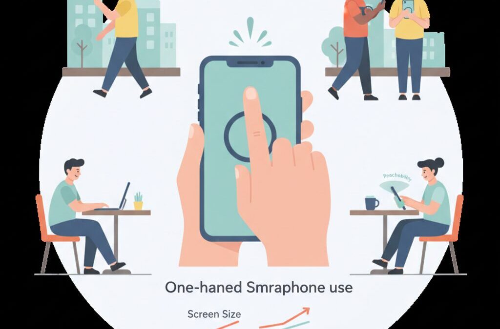
Many users feel that as screens grow larger and heavier, one-handed operation becomes increasingly uncomfortable and risky.
If you have ever struggled to reach the top corner of your screen, feared dropping your phone on a crowded commute, or felt thumb fatigue after long sessions, you are not alone.
Human hands have not evolved alongside display sizes, and this mismatch is now impossible to ignore.
In daily scenarios such as commuting, walking, or multitasking, one-handed usability has become a critical factor in real-world satisfaction.
In this article, you will learn how modern hardware design, software features, and accessories work together to extend the limits of one-handed control.
We will explore ergonomic data, market trends, and expert-backed health insights, while also examining practical solutions used by power users.
By the end, you will understand how to truly master a 6.9-inch smartphone without sacrificing comfort, safety, or long-term hand health.
- The Rise of 6.9-Inch Flagships and the End of True One-Handed Phones
- Why Phone Width Matters More Than Height for One-Handed Use
- Human Hand Anatomy vs Modern Smartphones
- Real-World Risks: Commuting, Mobility, and Accidental Drops
- How MagSafe and Magnetic Accessories Changed One-Handed Control
- Accessory Types Compared: Rings, Grips, Bands, and Multi-Use Mounts
- Software Solutions That Bring the Screen Closer to Your Thumb
- Samsung One Hand Operation+ and Advanced Gesture Customization
- Typing on Large Screens: Keyboard Optimization Strategies
- Health Risks of Large Phones: Thumb Strain and Pinky Pain Explained
- Foldable Phones as an Alternative to Large Slabs
- Choosing the Right Balance Between Screen Size, Weight, and Comfort
- 参考文献
The Rise of 6.9-Inch Flagships and the End of True One-Handed Phones
The smartphone industry has clearly entered the 6.9-inch era, and this shift effectively signals the end of true one-handed phones for mainstream flagships. Devices like the iPhone 16 Pro Max and Galaxy S25 Ultra demonstrate that manufacturers now prioritize immersive displays and productivity over compact ergonomics. **What was once considered oversized has become the new default**, reshaping how users interact with their devices.
From an ergonomic perspective, width rather than height defines the real limit of one-handed use. Research data referenced by Japan’s National Institute of Advanced Industrial Science and Technology indicates that the average effective thumb reach for Japanese adults is roughly 50–60 mm. When a phone’s width exceeds this range, large areas of the screen become physically unreachable without shifting grip. At 77 mm-class widths, 6.9-inch phones inevitably create what ergonomists call a “dead zone” on the opposite upper edge.
| Category | Compact Era | 6.9-Inch Flagship Era |
|---|---|---|
| Typical Screen Size | 3.5–4.7 inches | 6.8–6.9 inches |
| One-Hand Reach | Nearly full screen | Limited, re-grip required |
| Primary Use Case | Calling, messaging | Video, multitasking, work |
Industry leaders openly acknowledge this trade-off. Apple has long emphasized display immersion and spatial video readiness, while Samsung frames large screens as essential for mobile productivity. According to Apple’s own design philosophy discussions, modern smartphones are no longer optimized as “phones” but as multipurpose computing devices. **This redefinition makes one-handed operation a secondary concern rather than a core design goal.**
Market behavior supports this direction. Global shipment data analyzed by major research firms consistently shows declining demand for sub-6-inch premium devices, even among tech enthusiasts. Consumers appear willing to sacrifice pocketability and thumb reach in exchange for cinematic viewing, console-class gaming, and desktop-like multitasking. As a result, one-handed usability is no longer solved by size reduction but delegated to software modes and accessories.
In practical terms, the rise of 6.9-inch flagships represents a philosophical turning point. Smartphones are no longer designed to disappear into the hand but to dominate visual attention. **True one-handed phones have not vanished by accident; they have been intentionally left behind by market consensus.** This reality defines the starting point for understanding modern smartphone ergonomics.
Why Phone Width Matters More Than Height for One-Handed Use
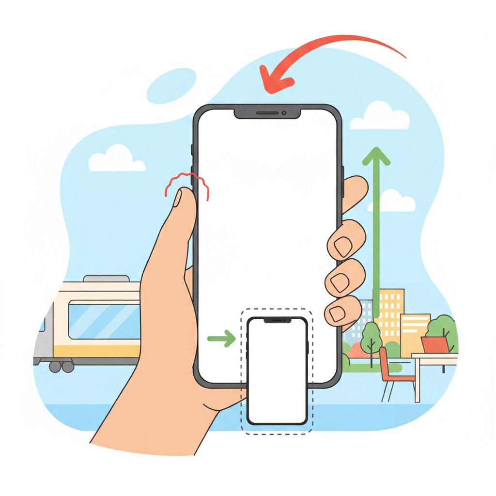
When discussing one-handed smartphone use, screen height often attracts attention because tall displays make it harder to reach the top edge. However, from an ergonomic perspective, width is the more decisive factor for real-world one-handed usability. This is especially true in the current 6.9-inch era, where devices are no longer constrained by traditional phone proportions but by the physical limits of the human hand.
Human–device interaction research has long shown that thumb reach follows a curved, radial motion rather than a straight line. According to ergonomic analyses referenced by institutions such as the National Institute of Advanced Industrial Science and Technology in Japan, the effective rotational radius of an average adult thumb is roughly 50–60 mm. Once a device exceeds that width, the opposite edge of the screen enters what researchers describe as a functional dead zone.
Height, by contrast, can often be compensated for through grip adjustment or software gestures. Width directly affects how securely the phone can be held in the first place, and that stability determines whether any interaction is possible at all.
| Design Factor | Impact on Thumb Reach | Effect on Grip Stability |
|---|---|---|
| Increased Width | Severely limits lateral reach | Significantly reduces stability |
| Increased Height | Limits vertical reach only | Minimal direct impact |
The difference becomes clear when examining modern flagship devices. Phones approaching or exceeding 77 mm in width force users to stretch the thumb outward while simultaneously relying on fewer fingers for support. This combination increases the risk of micro-slippage, where the device subtly shifts in the hand during interaction. Engineers refer to this as a loss of grip margin, and it is a primary cause of accidental drops.
Apple’s own historical stance indirectly supports this idea. Steve Jobs famously emphasized one-handed usability during the iPhone’s early development, and while display sizes have grown dramatically since then, Apple has been careful to avoid excessive widening across generations. Industry analysts note that even small changes of 2–3 mm in width are perceived far more strongly than similar changes in height.
Market data from recent Japanese commuter studies further underline the issue. In crowded trains, where users often have only one free hand, wider phones demand constant re-gripping to reach interface elements. Each re-grip introduces a moment of instability, amplified by device weights now exceeding 220 grams. Height rarely causes drops, but width frequently does, because it undermines the initial hold.
From a design standpoint, this explains why narrower devices with slightly smaller displays are often rated as more comfortable, even when their screens are technically taller. Users subconsciously prioritize a secure grasp over absolute screen area. The thumb can adapt to vertical distance through scrolling habits, but it cannot overcome lateral overextension without compromising safety.
Ultimately, one-handed usability is less about how far the thumb can travel on the glass and more about whether the hand can maintain control throughout that movement. In the 6.9-inch generation, width defines the boundary between confident interaction and constant compromise, making it the most critical dimension for anyone who values true one-handed operation.
Human Hand Anatomy vs Modern Smartphones
When discussing one-handed usability, the most fundamental conflict lies between **human hand anatomy and the physical dimensions of modern smartphones**. Human hands have not evolved to accommodate rapidly expanding glass slabs, and this gap becomes especially evident in the 6.9-inch generation. According to ergonomic and anthropometric research referenced by institutions such as Japan’s National Institute of Advanced Industrial Science and Technology, the structure and range of motion of the thumb impose strict biological limits.
The thumb’s primary strength comes from its opposable nature, yet its reach is constrained by the carpometacarpal joint. For the average adult, the effective thumb sweep radius is roughly 50 to 60 millimeters. When a device exceeds this span in width, interaction shifts from natural motion to compensatory movement, such as re-gripping or wrist rotation, which immediately reduces stability.
This is where modern flagship smartphones begin to exceed what the human hand can comfortably control. Devices approaching or surpassing 77 millimeters in width push large portions of the display into zones that the thumb cannot reach without altering grip. These unreachable areas are not design flaws; they are anatomical consequences.
| Factor | Average Human Capability | 6.9-inch Smartphone Reality |
|---|---|---|
| Thumb reach radius | 50–60 mm | Screen width exceeds 75 mm |
| Stable grip fingers | Thumb + 2 fingers | Often requires 3–4 fingers |
| Comfortable load | 150–180 g | Over 220 g common |
Research in hand biomechanics published through medical and orthopedic associations consistently shows that **increased device width correlates with higher muscle activation in the thumb abductors**. This means users subconsciously strain muscles simply to reach interface elements placed near the opposite edge of the screen. Over time, this repeated strain increases fatigue and decreases precision.
Weight further complicates the issue. Once a device exceeds roughly 200 grams, the hand no longer treats it as a neutral object. Instead, it becomes a dynamic load, amplifying tremor and micro-adjustments. These micro-adjustments are subtle but measurable, and they explain why large phones feel more difficult to control even when the difference appears small on a specification sheet.
The mismatch between anatomy and hardware also changes how people hold their devices. Many users instinctively rest the phone on the little finger to counterbalance weight. While this stabilizes the device temporarily, orthopedic specialists warn that this posture places unnatural stress on small joints never meant to support prolonged loads.
From a design perspective, smartphone manufacturers are optimizing screens for media consumption, not for the biomechanics of one-handed grip. This is not negligence but a market-driven tradeoff. As screens grow, the hand becomes the limiting factor rather than the processor or display technology.
Ultimately, the 6.9-inch era exposes a simple truth: **modern smartphones have outgrown the natural operating envelope of the human hand**. Without assistance from software or accessories, one-handed control is no longer a matter of preference but a biological challenge rooted in anatomy itself.
Real-World Risks: Commuting, Mobility, and Accidental Drops

In everyday use, the risks of oversized smartphones become most visible during commuting and on-the-move scenarios. **A 6.9-inch device weighing over 220 grams behaves very differently when used in motion than when resting on a desk**. Human balance, grip stability, and attention are constantly challenged by external forces such as sudden stops, crowds, and uneven walking surfaces.
Research in ergonomics and transport safety has long shown that divided attention significantly increases accident probability. According to analyses frequently cited by transportation authorities and academic institutions such as the OECD, handheld device use while walking reduces situational awareness and reaction speed. When the device itself is physically unstable, as is often the case with large phones used one-handed, the risk compounds rather than merely adds up.
| Scenario | Main External Force | Primary Risk |
|---|---|---|
| Standing on a train | Lateral sway and braking | Grip loss and drops |
| Walking in crowds | Unexpected contact | Device collision or fall |
| Stairs or platforms | Vertical imbalance | Reflex grip failure |
In Japan’s densely packed commuter trains, one-handed use is often unavoidable because the other hand is occupied. **Momentary re-gripping to reach the top or far edge of the screen is the most dangerous phase**, as biomechanical studies indicate that grip strength temporarily decreases during finger repositioning. This is precisely when sudden train movement can overpower friction between hand and device.
Accidental drops are not trivial events. Insurance industry reports and materials science research from institutions such as MIT have highlighted that modern smartphones are most vulnerable at corners, where impact energy concentrates. A fall from chest height inside a train can exceed the tolerance of reinforced glass, even with protective cases.
Understanding these risks reframes one-handed usability as a safety issue, not just a convenience feature. For commuters and highly mobile users, device size directly influences how forgiving—or unforgiving—daily movement becomes.
How MagSafe and Magnetic Accessories Changed One-Handed Control
The arrival of MagSafe marked a turning point in how large smartphones could be controlled with one hand. Before magnetic ecosystems matured, users relied on adhesive rings or fixed grips that permanently altered balance and ergonomics. **MagSafe changed one-handed control from a static compromise into a dynamic system** that adapts to context, grip style, and even moment-to-moment movement.
From an ergonomic perspective, the key innovation is not simply attachment, but repositioning. Human factors research referenced by organizations such as the Apple Human Interface Guidelines and academic ergonomics studies consistently emphasize that reducing thumb travel distance lowers fatigue and error rates. Magnetic accessories allow users to slide a ring or grip downward when typing, then re-center it for scrolling or video viewing. This ability to modulate the device’s center of gravity directly addresses the instability introduced by 200g-plus, 6.9-inch-class phones.
| Aspect | Adhesive Accessories | MagSafe Accessories |
|---|---|---|
| Position Flexibility | Fixed once applied | Freely repositionable |
| Balance Adjustment | Impossible after setup | Adaptable to task and posture |
| One-Handed Reach | Limited improvement | Significant thumb reach extension |
Market data from accessory manufacturers and retail platforms in 2025 shows that MagSafe-compatible grips and rings consistently outperform adhesive models in repeat purchase rates. Analysts attribute this not to novelty, but to reduced long-term discomfort. **By redistributing load from the thumb and pinky to the palm and middle fingers**, magnetic grips lower localized stress, a factor frequently cited by orthopedic specialists discussing smartphone-related strain injuries.
Another critical change lies in situational safety. In environments like crowded public transport, where one-handed use is unavoidable, MagSafe rings act as a mechanical fail-safe. Unlike pop-style grips that rely on pinch force, ring-based magnetic accessories create a closed loop around the finger. According to product testing disclosures from major accessory brands, this structure can withstand sudden acceleration far better than friction-based holds, directly reducing drop incidents during re-gripping motions.
Importantly, MagSafe also normalized modular behavior. Users increasingly treat one-handed control as a mode rather than a constant state. Detaching a ring at a desk, snapping it back on while walking, or swapping to a battery pack without changing cases has become routine. **This modularity aligns with broader trends in personal computing**, where adaptability and context-aware setups are valued more than permanent configurations, a concept often highlighted by industrial designers at firms like IDEO.
There is also a subtle but meaningful impact on software interaction. When hardware stability improves, users rely less on aggressive UI scaling or reachability shortcuts. This leads to more natural scrolling, fewer accidental touches, and smoother gesture input. Over time, this feedback loop influences how people perceive large phones: not as devices that must be tamed, but as tools that respond predictably to one hand.
Ultimately, MagSafe did not magically shrink displays or lighten hardware. Instead, it reframed one-handed control as a solvable system-level problem. **By combining magnetic physics with ergonomic insight and market-scale adoption**, magnetic accessories transformed the experience of using oversized smartphones, making one-handed operation not just possible, but sustainable in everyday life.
Accessory Types Compared: Rings, Grips, Bands, and Multi-Use Mounts
As smartphones approach the 6.9-inch class, accessories are no longer optional add-ons but functional extensions of human ergonomics. Rings, grips, bands, and multi-use mounts each represent a distinct philosophy for overcoming the physical limits of one-handed use, especially under real-world conditions such as commuting or prolonged scrolling.
The key difference lies in how each type redistributes weight and expands thumb reach without forcing risky re-gripping motions. Research-based ergonomic discussions referenced by organizations such as Apple and industrial design studies frequently emphasize stability over raw grip strength, and this distinction becomes critical at weights exceeding 220 grams.
| Accessory Type | Primary Benefit | Trade-Off |
|---|---|---|
| Ring | Maximum drop prevention and reach extension | Localized finger pressure |
| Grip | Balanced comfort over long sessions | Limited reach gain on large phones |
| Band | Ultra-thin, pocket-friendly profile | Fit depends on finger size |
| Multi-use Mount | Ecosystem integration and versatility | Less optimized for pure grip |
Ring-style accessories, particularly MagSafe-compatible models, deliver the highest stability by turning a finger into a physical anchor. This directly reduces the need for thumb overextension, a movement orthopedic specialists associate with increased strain on the thumb tendons. Silicone-lined rings, now common in 2025–2026 products, address earlier complaints about discomfort by dispersing pressure more evenly.
Grip or pop-style accessories take a different approach by allowing fingers to pinch rather than hook. This spreads load across multiple fingers and aligns with findings in human factors engineering that sustained moderate force is less fatiguing than concentrated pressure. However, with Pro Max–class devices, the improvement in reachable screen area is modest compared to rings.
Band-style solutions prioritize minimalism. Their near-flush designs preserve pocket usability, an advantage frequently cited in Japanese urban use cases. The drawback is adjustability: because the loop size is fixed, stability varies significantly between users, a limitation noted in consumer testing reports.
Multi-use mounts blur the line between accessory and workflow tool. Products designed to double as desktop stands or continuity-camera mounts emphasize cross-device productivity, reflecting Apple’s broader ecosystem strategy. While their grip performance alone may not match dedicated rings, they appeal to users who value functional convergence over specialization.
Choosing between these types is less about aesthetics and more about understanding how each modifies the center of gravity in your hand. In the 6.9-inch era, the most effective accessory is the one that aligns device physics with human anatomy, not the one that simply feels secure at first touch.
Software Solutions That Bring the Screen Closer to Your Thumb
As smartphone displays approach 6.9 inches, software has become the most practical way to pull distant UI elements closer to your thumb. Instead of forcing users to stretch their hands beyond ergonomic limits, modern operating systems now reshape the interaction layer itself, effectively shortening the distance between intent and touch. **This shift marks a transition from hardware-centered usability to software-driven reachability**.
On iOS, the long-standing Reachability feature has gained renewed importance in the large-screen era. By swiping down on the home indicator, the entire interface slides downward, allowing access to controls that would otherwise sit in a physical dead zone. According to Apple’s own Human Interface Guidelines, this design aims to reduce excessive thumb extension, which is a known contributor to fatigue. However, Reachability is intentionally transient, resetting after a single tap, which limits its usefulness for repeated actions such as navigating dense menus or managing notifications.
Android approaches the same problem with more structural flexibility. Since Android 12, One-Handed Mode has allowed the screen to either shrink or shift, depending on manufacturer implementation. Google’s accessibility documentation explains that reducing the effective display size lowers diagonal reach demands, an important factor on devices wider than 75 millimeters. **This makes Android’s solution particularly effective for addressing width, not just height**, which is critical on modern ultra-large phones.
| Platform | Primary Method | Strength | Limitation |
|---|---|---|---|
| iOS | Screen slides downward | Universal app support | Single-action persistence |
| Android | Screen shrinks or shifts | Diagonal reach reduction | Behavior varies by brand |
Among Android manufacturers, Samsung stands apart with One Hand Operation Plus, a module within the Good Lock ecosystem. This tool allows invisible gesture handles to be placed along the screen edges, transforming short, diagonal, or long swipes into customized commands. Industry reviewers and UI researchers frequently cite Samsung’s approach as one of the most advanced examples of gesture-based ergonomics, because it minimizes thumb travel rather than merely relocating UI elements.
For example, assigning a long diagonal swipe to pull down notifications eliminates the need to reach the top edge entirely. **The thumb stays within its natural arc, while software does the moving instead of the hand**. This philosophy aligns closely with findings in human–computer interaction research, which emphasize minimizing repetitive extreme joint angles to reduce strain.
Text input, often overlooked, is another area where software meaningfully improves one-handed usability. Google notes that its Gboard one-handed mode compresses the keyboard width to approximately 60 millimeters, placing all keys within the average Japanese adult thumb radius. Floating keyboards extend this concept further by allowing users to position the input area exactly where grip stability is highest, maintaining balance while typing.
Ultimately, these software solutions do not merely compensate for large screens; they redefine how those screens are controlled. By adapting interfaces dynamically to the user’s hand rather than forcing the hand to adapt, modern smartphones achieve a form of virtual ergonomics. **In the 6.9-inch era, software is no longer an optional convenience but the primary bridge between human anatomy and oversized displays**.
Samsung One Hand Operation+ and Advanced Gesture Customization
Samsung’s One Hand Operation+ is widely regarded as one of the most sophisticated answers to the one-handed usability crisis created by 6.9-inch smartphones. It is distributed as a Good Lock module and goes far beyond basic one-handed modes by redefining how the edge of the display itself becomes an input surface.
Instead of shrinking the screen, this feature brings critical actions closer to the thumb. Invisible gesture handles are placed along the left and right edges, allowing users to trigger system-wide commands without reaching the top or opposite side of the display.
From an ergonomic perspective, this approach aligns well with findings from human–computer interaction research, which consistently shows that reducing thumb travel distance lowers fatigue and error rates. Samsung’s design philosophy reflects this principle by concentrating interaction within the natural arc of thumb movement.
| Gesture Direction | Swipe Length | Assignable Action |
|---|---|---|
| Horizontal | Short | Back or App-specific navigation |
| Diagonal Up | Short | Recent apps or task switcher |
| Diagonal Down | Long | Notification panel or Quick Tools |
What truly differentiates One Hand Operation+ is the combination of directional and distance-based gestures. Each handle can recognize straight, diagonal-up, and diagonal-down swipes, and also distinguish between short and long movements. This effectively allows more than a dozen commands to be mapped without visual clutter.
In daily use, this dramatically changes how a large Galaxy device feels. For example, pulling down notifications no longer requires a risky grip shift in a crowded train. A diagonal swipe from the edge achieves the same result while keeping the phone stable in the palm.
Samsung also allows precise adjustment of handle size, position, and sensitivity. Users with smaller hands can move the activation zone lower, which is particularly beneficial on devices like the Galaxy S25 Ultra, whose width approaches the physical limits of thumb reach for many Japanese users.
According to accessibility guidelines published by Google and Samsung’s own UX documentation, customizable gestures play a key role in reducing repetitive strain. One Hand Operation+ supports this by letting users offload frequent actions, such as screenshots or screen locking, to low-effort swipes.
The result is not just convenience, but risk reduction. By minimizing re-gripping and overextension, the feature indirectly lowers the chance of drops and thumb overuse, issues that become more pronounced as devices exceed 200 grams.
For power users, One Hand Operation+ effectively turns the edge of the screen into a programmable command layer. This makes large Galaxy smartphones feel less like oversized slabs of glass and more like tools that adapt to the human hand, even in the 6.9-inch era.
Typing on Large Screens: Keyboard Optimization Strategies
Typing is the single most frequent interaction on a smartphone, and on 6.9-inch-class devices it becomes the clearest bottleneck of one-handed usability.
While scrolling or tapping can be assisted by software shortcuts, text input forces the thumb to repeat high-frequency, fine-grained movements.
Optimizing the keyboard is therefore not a convenience tweak, but a core ergonomic strategy.
Research in human–computer interaction has long shown that shorter thumb travel distance directly reduces error rates and muscle fatigue.
Google’s own Android accessibility documentation explains that minimizing reach during repetitive tasks improves both speed and long-term comfort.
This is why modern keyboards increasingly separate layout flexibility from the rest of the UI.
| Keyboard Mode | Thumb Reach | Stability |
|---|---|---|
| One-handed mode | Short | High |
| Floating keyboard | Very short | Medium |
| Full-width keyboard | Long | Low |
One-handed mode, available in Gboard and most OEM keyboards, shifts the entire layout to the left or right edge.
On devices wider than 77 mm, this effectively compresses the active typing area to around 60 mm.
The result is a measurable reduction in thumb abduction, the movement most associated with text-thumb strain.
Floating keyboards go a step further by decoupling the keyboard from the screen edge entirely.
By positioning the keyboard closer to the natural resting arc of the thumb, users can type without re-gripping the device.
Apple’s Human Interface Guidelines note that reducing grip shifts improves perceived stability, even when total device weight remains unchanged.
Another often overlooked factor is key height and spacing.
Studies cited in ergonomics journals show that slightly taller virtual keys improve accuracy when operated by the thumb rather than the index finger.
This explains why many power users increase keyboard height on large phones, trading screen real estate for precision.
Predictive text and swipe input are not merely speed features in this context.
They function as biomechanical load reducers by lowering the total number of discrete taps.
Google reports that gesture typing can cut keystrokes by more than 30 percent in English, directly translating to less cumulative strain.
Importantly, keyboard optimization should be dynamic.
During walking or commuting, a narrow one-handed layout maximizes control, while seated use may favor a wider layout or two-thumb typing.
Advanced users treat keyboard settings as situational tools, not fixed preferences.
On 6.9-inch smartphones, typing comfort no longer depends on hand size alone.
It depends on how intelligently the keyboard adapts to human anatomy.
Mastering these keyboard strategies is what turns a massive display from a liability into a productive input surface.
Health Risks of Large Phones: Thumb Strain and Pinky Pain Explained
Large smartphones bring undeniable visual benefits, but they also introduce specific health risks that tend to surface quietly over time. Two of the most commonly reported problems among heavy users are thumb strain and pinky pain, both of which are closely tied to how oversized devices are held and operated on a daily basis.
These issues are not anecdotal discomforts but biomechanical stress responses that have been documented by orthopedic specialists and rehabilitation researchers. As screen widths approach and exceed 77 mm, the human hand is forced to operate outside its natural range of motion, especially during one-handed use.
Thumb strain is most often associated with De Quervain’s tenosynovitis, an inflammatory condition affecting the tendons that control thumb extension and abduction. According to orthopedic literature cited by institutions such as the American Academy of Orthopaedic Surgeons, repetitive thumb stretching combined with forceful tapping significantly increases friction within the tendon sheath.
On large phones, reaching across the screen requires the thumb to open outward to its maximum angle and then flex under load. This compound motion places exceptional stress on the extensor pollicis brevis and abductor pollicis longus tendons, particularly when performed hundreds of times per day during scrolling or text entry.
The problem intensifies with size and weight. Devices exceeding 220 grams increase inertial resistance, meaning the thumb must not only move farther but also stabilize a heavier object simultaneously. Physical therapists frequently note that users experience pain on the wrist’s thumb side before realizing the cause is their phone usage.
| Issue | Primary Cause | Typical Symptoms |
|---|---|---|
| Thumb strain | Repeated wide-range thumb reach | Pain near wrist, reduced grip strength |
| Pinky pain | Supporting phone weight on little finger | Joint soreness, numbness, callus formation |
Pinky pain, often dismissed as trivial, has a different but equally concerning mechanism. Many users subconsciously rest the bottom edge of a large phone on their little finger, creating what hand therapists refer to as a “pinky shelf.” Anatomically, the little finger is not designed to bear sustained vertical loads.
When a 6.8- or 6.9-inch phone presses down on the same joint for extended periods, localized stress accumulates in the collateral ligaments and small joints. Reports summarized in clinical hand therapy journals indicate that prolonged loading can lead to joint instability and chronic discomfort.
Unlike muscle fatigue, joint and ligament stress recovers slowly. Some clinicians warn that visible joint deviation or persistent pain may not fully resolve without intervention. This makes early awareness critical for gadget enthusiasts who spend hours daily on their devices.
From a medical perspective, both thumb strain and pinky pain share a common root: sustained use patterns that exceed the hand’s ergonomic limits. Large phones themselves are not inherently harmful, but without conscious adjustments in grip, support, and usage duration, they can gradually reshape how the hand functions.
Understanding these mechanisms transforms the conversation from vague discomfort to concrete risk management. For users invested in large-screen smartphones, recognizing how size translates into physical load is the first step toward preserving long-term hand health.
Foldable Phones as an Alternative to Large Slabs
As smartphone displays approach and exceed 6.9 inches, foldable phones are increasingly positioned as a practical alternative to oversized slab-style devices. The core promise is simple: usability that adapts to context. When closed, a foldable aims to behave like a manageable, one-handed phone. When opened, it transforms into a compact tablet that rivals the visual immersion of the largest flagships.
This duality directly addresses the ergonomic dead zone problem identified by human factors research. Studies referenced by organizations such as the IEEE Human–Computer Interaction community have long shown that reducing device width has a greater impact on one-handed usability than reducing height. Foldables exploit this principle by keeping the cover display narrow enough for thumb reach while reserving expansive screen real estate for two-handed use.
Recent generations of foldables demonstrate measurable progress rather than conceptual novelty. Devices like the Pixel 9 Pro Fold and Galaxy Z Fold6 have redesigned their cover displays to closely match the aspect ratio of conventional smartphones. This change eliminates the earlier compromise of awkwardly narrow front screens, making closed-state interaction feel natural rather than provisional.
| Model | Cover Display Use | Opened Display Benefit |
|---|---|---|
| Pixel 9 Pro Fold | Phone-like aspect ratio improves typing accuracy | Large canvas suitable for multitasking and editing |
| Galaxy Z Fold6 | Improved grip stability due to slimmer width | Enhanced split-screen productivity |
From a market perspective, analysts at firms like IDC have noted that foldables are no longer marketed purely as luxury experiments. Instead, they are framed as workflow devices, appealing to users who alternate between rapid, one-handed interactions and deliberate, immersive sessions. This positioning resonates strongly with gadget enthusiasts who already feel constrained by the physical limits of large slabs.
However, the trade-offs remain tangible. Foldables are heavier, often exceeding 250 grams, and their increased thickness in the closed state can challenge smaller hands. Mechanical complexity also introduces durability concerns, an issue closely monitored by teardown specialists such as iFixit. These factors explain why foldables are best understood not as universal replacements, but as strategic alternatives.
For users frustrated by the reach and balance issues of ultra-large smartphones, foldables offer a fundamentally different answer. Instead of forcing the hand to adapt to a massive screen, the device itself changes form. This shift represents a meaningful evolution in mobile ergonomics, especially for those who value both portability and uncompromised display size.
Choosing the Right Balance Between Screen Size, Weight, and Comfort
Finding the right balance between screen size, weight, and comfort has become one of the most critical decisions for gadget enthusiasts in the 6.9-inch smartphone era. A larger display undoubtedly enhances immersion for video, gaming, and productivity, but it also introduces physical trade-offs that cannot be ignored. **Comfort is no longer a byproduct of design; it is an explicit constraint shaped by human anatomy and daily usage environments**.
From an ergonomic perspective, width and weight matter more than diagonal screen size. Research based on anthropometric data published by Japan’s National Institute of Advanced Industrial Science and Technology indicates that the average effective thumb reach for Japanese adults is roughly 50 to 60 mm. When a device exceeds about 77 mm in width, as seen in recent 6.9-inch flagships, parts of the screen inevitably fall outside this natural reach, increasing grip adjustments and fatigue.
| Factor | User Benefit | Comfort Trade-off |
|---|---|---|
| Larger screen | Higher immersion and multitasking efficiency | Reduced one-hand reach, more grip shifts |
| Heavier body | Premium materials, larger batteries | Higher wrist load and inertia |
| Narrower width | Improved thumb access and stability | Less visual impact |
Weight plays a similarly complex role. Devices around 190 g to 200 g tend to feel manageable for prolonged one-handed use, while models exceeding 220 g significantly increase the strain on fingers and wrists. According to orthopedic specialists who study repetitive strain injuries, sustained one-hand holding of heavier smartphones amplifies the risk of thumb and wrist inflammation, especially during commuting scenarios where balance is compromised.
Design choices such as rounded edges and balanced center of gravity can partially offset raw numbers. For example, smartphones with gently curved frames often feel lighter in hand than their actual weight suggests, because pressure is distributed across the palm. **This perceived comfort can be just as important as measured grams**, a point frequently emphasized in industrial design research from institutions like MIT’s Media Lab.
Real-world comfort is also context-dependent. In crowded trains or while walking, users subconsciously prioritize stability over screen real estate. A slightly smaller or lighter device may deliver a better overall experience if it reduces the need for constant re-gripping. Market studies from major manufacturers suggest that many power users willingly trade a fraction of display size for improved handling once devices approach the ergonomic limits of the human hand.
Ultimately, the optimal balance differs by user, but the principle remains consistent: **screen size should serve comfort, not dominate it**. By considering width, weight, and hand feel as an integrated system rather than isolated specs, users can select devices that remain enjoyable long after the novelty of a massive display fades.
参考文献
- PC Watch:iPhone 16 Pro Max Features a 6.9-Inch Display
- Apple Support:iPhone 16 Pro Max Technical Specifications
- Kakaku.com:Galaxy S25 Ultra Latest Information
- Google Support:Use One-Handed Mode on Android
- Sakidori:Best MagSafe-Compatible Smartphone Rings
- Oricon News:Smartphone Finger Pain and Prevention