Have you ever picked up a brand-new flagship phone and wondered why the screen looks slightly yellow? You are not alone. In 2026, as displays reach 3,000 to 3,300 nits of peak brightness and refresh rates up to 165Hz, the real competition is no longer just about sharpness or speed—it is about visual engineering and human comfort.
Apple, Samsung, Google, and Sony are now redesigning smartphone displays around circadian science, AI-driven color management, and adaptive brightness algorithms. Features like True Tone, AI Gamma, and advanced anti-reflective coatings are intentionally shifting white balance in real time, sometimes making screens appear warmer than users expect.
At the same time, peer-reviewed research shows that lower illuminance and warmer color temperatures at night can improve subjective sleep quality, reduce visual fatigue, and even lower cognitive error rates. Understanding why your display looks “yellow” in 2026 means understanding the intersection of OLED physics, manufacturing tolerances, blue light research, and next-generation OS-level controls. This article breaks down what is really happening—and how you can optimize your screen for both accuracy and well-being.
- The 2026 Shift: From Spec Wars to Visual Engineering
- Flagship Display Specs Compared: iPhone 17 Pro Max, Galaxy S26 Ultra, Pixel 10 Pro, Xperia 1 VII
- Peak Brightness vs Power Efficiency: Why 3,000+ Nits Changes Everything
- Why New Phones Look Yellow: Adhesives, UV Curing, and Manufacturing Tolerances
- Supplier Variations in OLED Panels: Samsung, LG, and BOE Differences
- True Tone, AI Gamma, and Adaptive White Balance Explained
- OLED Aging and Blue Subpixel Degradation: The Physics of Color Drift
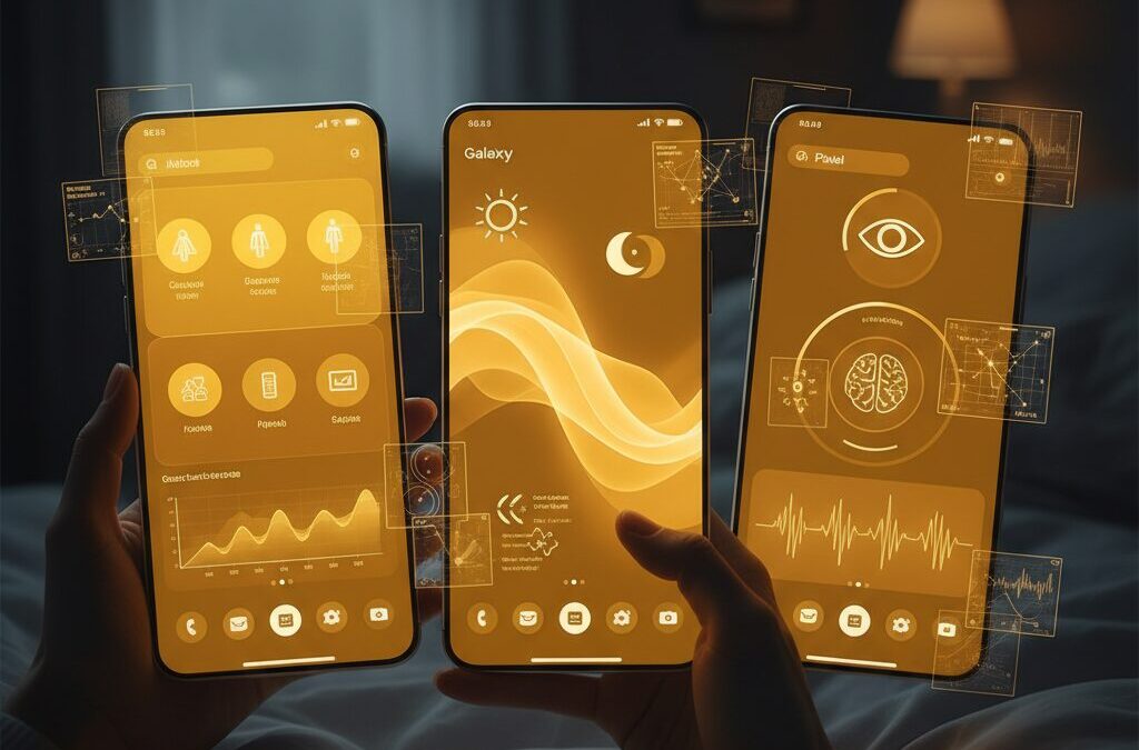
- Circadian Rhythm, Melatonin, and Color Temperature: What 2026 Research Shows
- Low Illuminance vs High CCT: Impact on Sleep Quality and Cognitive Error Rates
- Samsung’s Glare-Free and AI Gamma vs Apple’s Ceramic Shield 2 and iOS 20 APIs
- Android 16 and iOS 19/20: Pro-Level Color Controls Go Mainstream
- How to Fix a Yellowish Display: Step-by-Step Optimization Guide
- Blue Light Glasses vs Night Mode: What Evidence Actually Supports
- The Future of Autonomous Displays: Biometric Feedback and MicroLED Advances
- 参考文献
The 2026 Shift: From Spec Wars to Visual Engineering
For more than a decade, flagship smartphones competed on easily quantifiable metrics: resolution, refresh rate, peak brightness, and panel type. In 2026, that logic has fundamentally changed. The battlefield is no longer about who reaches 3,000 nits or 165Hz first, but about who engineers the most adaptive, human-centric visual experience.
The industry has shifted from spec wars to visual engineering. Apple, Samsung, Google, and Sony now design displays as dynamic optical systems that respond to biology, environment, and context in real time. Resolution has plateaued at levels beyond perceptual limits for typical viewing distances, and 120Hz–165Hz refresh rates are already perceptually smooth. The new differentiator is how intelligently the screen behaves.
| Old Paradigm | 2026 Paradigm | Primary Goal |
|---|---|---|
| Higher resolution (QHD+ vs FHD+) | Adaptive color temperature | Physiological comfort |
| Peak brightness race | Context-aware luminance control | Energy-efficient visibility |
| Static factory calibration | AI-driven real-time calibration | Consistency across environments |
According to industry interviews published by Samsung Newsroom, recent OLED development focuses on optimizing gamma and perceived contrast in both bright and dark rooms rather than merely increasing luminance. This is why technologies like AI Gamma and glare-reduction coatings matter more than another incremental nit increase.
Apple’s evolution of True Tone and its tighter integration with iOS rendering frameworks illustrate the same direction. The display continuously samples ambient light and subtly shifts white balance and tone mapping. What used to be criticized as a “yellow tint” is now understood as deliberate chromatic adaptation designed to mimic how paper reflects warm indoor lighting.
Google pushes this further with high-frequency environmental analysis, dynamically tuning different screen regions based on ambient conditions. The result is not just visibility under sunlight, but perceptual continuity when moving between lighting zones.
Even Sony, which prioritizes D65 accuracy in Creator Mode, represents the same shift. The emphasis is no longer on headline specs but on reference-grade color management and calibration integrity. Precision, not exaggeration, defines premium.
This transformation aligns with emerging research. A 2026 study in Building and Environment demonstrates that illuminance and spectral composition significantly affect circadian rhythm, visual fatigue, and cognitive performance. That means display tuning is no longer cosmetic; it intersects with measurable biological outcomes.
Visual engineering in 2026 treats the smartphone display as a physiological interface, not a static panel. Manufacturers are competing to deliver adaptive systems that understand context, preserve sleep cycles, reduce accommodation stress, and maintain color fidelity simultaneously.
For gadget enthusiasts, this marks a more sophisticated era. The true innovation is no longer visible on a spec sheet. It is experienced in how naturally the screen blends into your environment, how little your eyes strain after hours of use, and how consistently colors behave across lighting conditions.
The 2026 shift is clear: the smartest display is not the brightest or fastest, but the one that disappears into human perception while continuously optimizing it.
Flagship Display Specs Compared: iPhone 17 Pro Max, Galaxy S26 Ultra, Pixel 10 Pro, Xperia 1 VII
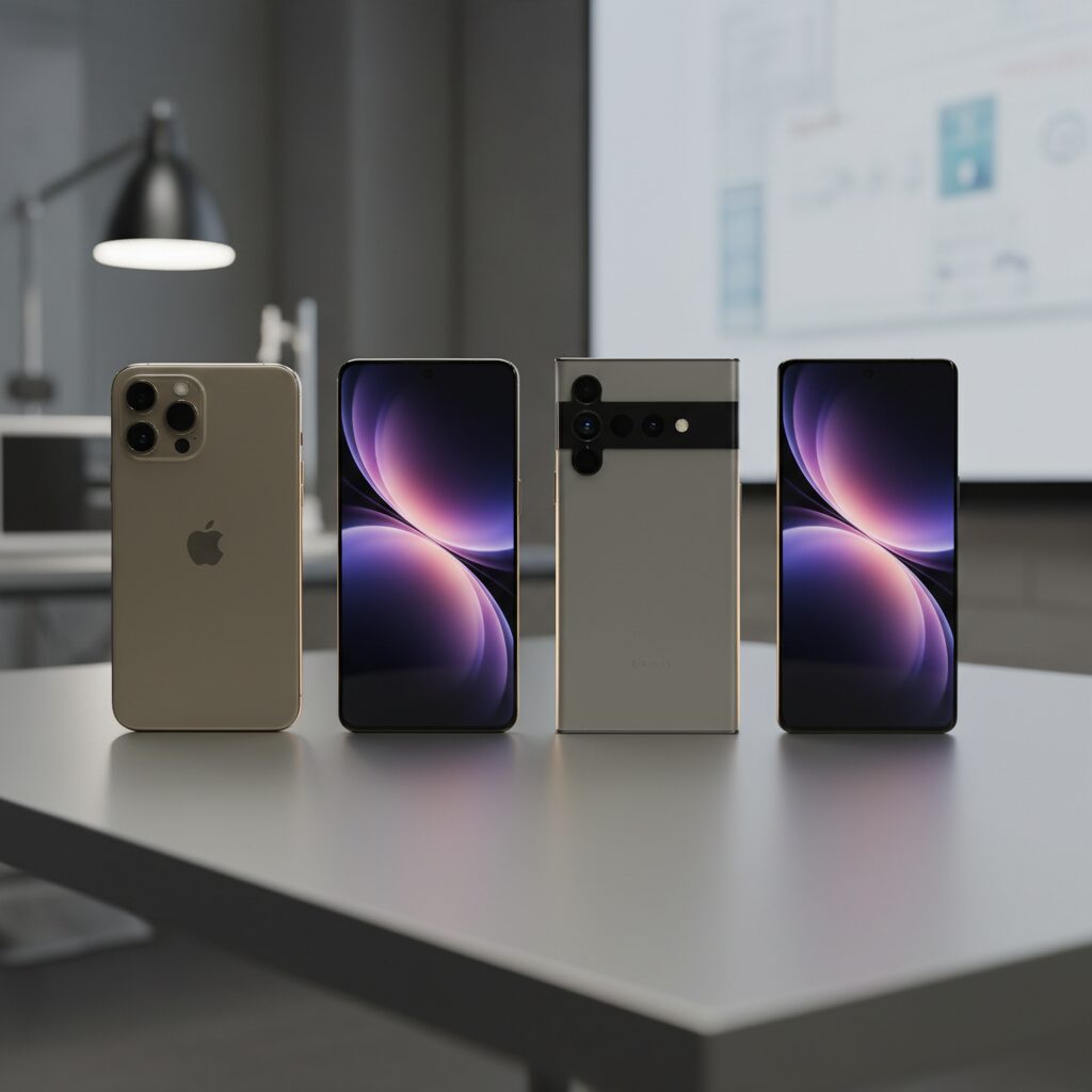
The 2026 flagship race is no longer about resolution alone. It is about how intelligently each display adapts to light, content, and human perception. iPhone 17 Pro Max, Galaxy S26 Ultra, Pixel 10 Pro, and Xperia 1 VII all use advanced OLED architectures, yet their philosophies differ in measurable ways.
Peak brightness, refresh flexibility, and coating technology now define real-world usability more than pixel density. According to comparative lab tests reported by Tom’s Guide and PhoneArena, brightness sustainability and glare control increasingly determine outdoor readability.
| Model | Panel & Size | Peak Brightness | Adaptive Tech |
|---|---|---|---|
| iPhone 17 Pro Max | 6.9″ LTPO OLED | Up to 3,000 nits | True Tone (Gen 4), iOS adaptive rendering |
| Galaxy S26 Ultra | 6.9″ Dynamic AMOLED 2X | 2,800+ nits | AI Gamma, Glare-Free coating |
| Pixel 10 Pro | 6.3″ LTPO OLED | Up to 3,300 nits | Per-zone adaptive control |
| Xperia 1 VII | 6.5″ LTPO OLED | 1,500+ nits | Creator Mode, BT.2020 |
Pixel 10 Pro leads in raw peak brightness at 3,300 nits, dramatically improving visibility under direct sunlight. However, brightness alone increases power draw and thermal load, so Google pairs it with rapid sensor-driven adaptation that reportedly samples environmental data up to 120 times per second.
Samsung focuses on contrast preservation rather than brute luminance. Its AI Gamma dynamically adjusts tonal curves scene by scene, preventing black crush in bright environments without globally raising brightness. The Glare-Free layer reduces reflections by more than 25%, directly addressing perceived color shift caused by ambient light.
Apple takes a balance-first approach. The 6.9-inch LTPO panel scales from 1Hz to 120Hz, and the upgraded Ceramic Shield 2 improves both durability and outdoor contrast. Fourth-generation True Tone no longer shifts only white balance; it also fine-tunes saturation and luminance to avoid the “over-warm” look users sometimes report.
Sony stands apart with color fidelity as its priority. Xperia 1 VII supports BT.2020 color space and 10-bit processing in Creator Mode, calibrated to D65 at shipment. While its peak brightness is lower than rivals, Notebookcheck notes that its tonal accuracy is closer to professional reference monitors.
All four models use LTPO technology for dynamic refresh scaling, improving efficiency during static viewing. Yet their identities diverge: Pixel pushes luminance extremes, Samsung refines contrast intelligence, Apple harmonizes adaptation and durability, and Sony defends reference-grade accuracy.
For display enthusiasts, the real comparison lies in how each device balances measurable specs with perceptual engineering. That balance ultimately defines which flagship display feels superior in daily use.
Peak Brightness vs Power Efficiency: Why 3,000+ Nits Changes Everything
In 2026, peak brightness is no longer a vanity metric. When flagship smartphones such as the Pixel 10 Pro reach 3,300 nits and the iPhone 17 Pro Max hits 3,000 nits, the conversation fundamentally shifts from “Is it bright?” to “How intelligently is that brightness delivered?”
Crossing the 3,000-nit threshold changes outdoor usability, HDR realism, and even how AI manages power at the pixel level. But it also raises a critical engineering tension: every additional nit demands energy, generates heat, and stresses organic materials.
According to comparative lab testing reported by Tom’s Guide, devices exceeding 3,000 nits demonstrate markedly improved readability under direct sunlight compared to panels in the 1,500–2,000 nit class. This is particularly evident when viewing high-contrast content such as maps, camera previews, or HDR video outdoors.
However, peak brightness is typically activated only in small display windows under specific conditions. Sustained full-screen brightness remains far lower to protect battery life and panel longevity.
| Brightness Tier | Typical Use Case | Power Impact |
|---|---|---|
| 1,000–1,500 nits | Indoor HDR, bright office | Moderate |
| 2,000–2,800 nits | Outdoor shade | High (short bursts) |
| 3,000+ nits | Direct sunlight, HDR highlights | Very high (micro-targeted) |
This is where LTPO technology and AI-driven gamma control become decisive. Samsung’s AI Gamma system, as described in its display engineering interviews, dynamically adjusts scene brightness to preserve shadow detail without raising overall luminance unnecessarily. In practical terms, the phone avoids blasting the entire panel at maximum output.
Apple approaches the same problem differently. With iPhone 17 Pro Max reaching 3,000 nits, iOS 20 uses adaptive rendering pipelines to selectively boost highlight regions while maintaining efficient average picture levels. The result is HDR specular highlights that feel dramatically brighter without proportional battery drain.
The breakthrough is not brute force brightness. It is brightness orchestration.
Power efficiency becomes even more critical when considering OLED material physics. Higher luminance accelerates organic material aging, particularly in blue subpixels. By limiting extreme brightness to brief, localized bursts, manufacturers reduce long-term degradation while still delivering headline specifications.
Google’s Pixel 10 Pro illustrates another layer of optimization. Its Tensor-driven display control reportedly analyzes environmental data up to 120 times per second, ensuring that 3,300 nits are triggered only under genuine high-ambient-light scenarios. This prevents unnecessary energy waste in transitional lighting.
There is also a thermal dimension. Sustained 3,000+ nit output would quickly increase surface temperature, affecting user comfort and system throttling. Intelligent brightness ramping mitigates this by balancing luminance spikes with rapid normalization once extreme visibility is no longer required.
From a marketing standpoint, 3,000+ nits signals technological dominance. From an engineering standpoint, it represents a sophisticated negotiation between visibility, thermals, battery capacity, and panel durability.
In real-world usage, what changes everything is not that your screen can hit 3,300 nits. It is that your display now understands when not to.
This intelligent restraint defines the 2026 generation of mobile displays. Peak brightness has become a precision instrument rather than a blunt specification, and that evolution is what truly separates flagship-tier visual engineering from incremental upgrades.
Why New Phones Look Yellow: Adhesives, UV Curing, and Manufacturing Tolerances
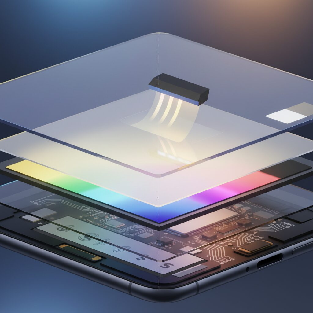
When a brand-new phone looks slightly yellow out of the box, many enthusiasts immediately suspect calibration errors or software settings. In reality, one of the most overlooked causes lies deep inside the manufacturing process itself. The lamination layer that bonds the OLED panel to the cover glass can subtly shift the perceived white point during the first days of use.
Modern flagship devices in 2026 use optically clear adhesives (OCA) or liquid optically clear adhesives (LOCA) to eliminate air gaps and improve contrast. These adhesives are cured using ultraviolet light, a process designed to harden the material rapidly while preserving optical transparency. However, curing is not always perfectly uniform in large-scale launch production.
According to discussions documented in Apple’s official community forums and repair analyses referenced by industry technicians, early production batches sometimes exhibit this transient warm cast. The phenomenon is typically temporary and resolves as residual curing completes through normal device heat cycles.
The mechanism is straightforward. Before full polymerization, certain adhesive compounds exhibit a faint amber tone. When layered across a 6.5–6.9 inch display at microscopic thickness, that tone becomes perceptible—especially to users comparing multiple units side by side.
| Manufacturing Factor | Impact on Color | User Perception |
|---|---|---|
| Incomplete UV curing | Slight warm shift in white point | Screen looks yellowish |
| Adhesive material variance | Minor spectral transmission change | Warmer or cooler whites between units |
| Panel supplier differences | Calibration deviation within tolerance | Noticeable when devices are compared |
Manufacturing tolerances also play a significant role. In 2026, major brands source OLED panels from multiple suppliers such as Samsung Display, LG Display, and BOE. While all panels meet strict internal specifications, small deviations in organic material composition or factory calibration can produce measurable differences in correlated color temperature.
These differences remain within acceptable industry tolerance ranges. However, human vision is highly sensitive to white balance discrepancies. When two devices are placed side by side, even a few hundred Kelvin of variation can appear dramatic, especially to photographers, designers, or display enthusiasts.
It is important to understand that manufacturing tolerance does not equal defect. International display calibration practices accept a defined white-point window around targets such as D65. Units may cluster at slightly warmer or cooler ends of that window while still meeting quality standards.
Heat further accelerates stabilization. As the phone operates—charging, gaming, or streaming at high brightness—the internal temperature rises modestly. This promotes continued adhesive curing and optical settling, gradually neutralizing the yellow cast reported in early usage.
Repair specialists and service documentation frequently note that genuine adhesive-related tint typically fades within days to weeks. Persistent discoloration localized to specific areas, by contrast, may indicate pressure marks or panel irregularities rather than adhesive curing.
For enthusiasts evaluating a new device, patience is often warranted before requesting a replacement. What appears to be a color flaw can instead be a temporary phase in the material science of ultra-thin display bonding. Understanding UV curing dynamics and production tolerances helps separate genuine defects from the subtle realities of high-volume, high-precision manufacturing.
In the era of ultra-slim 6.9-inch flagships with micron-level layering, even invisible materials matter. The warmth you see may not be a software trick or calibration failure—it may simply be chemistry finishing its job.
Supplier Variations in OLED Panels: Samsung, LG, and BOE Differences
In 2026 flagship smartphones, OLED panels are no longer sourced from a single manufacturer. To diversify risk and stabilize supply, brands such as Apple adopt panels from Samsung Display, LG Display, and BOE for the same product line. According to industry reports and user discussions in Apple Community threads, even when devices share identical specifications, subtle differences in white balance and color tone can still appear between units.
This does not mean one supplier is “good” and another is “bad.” Rather, each company uses slightly different materials, calibration workflows, and yield management strategies within the tolerance defined by the device maker.
Panel Supplier Characteristics in 2026 Flagships
| Supplier | Typical Strength | Observed User Perception |
|---|---|---|
| Samsung Display | High brightness, mature LTPO integration | Often perceived as slightly cooler or higher contrast |
| LG Display | Stable mass production, balanced color tuning | Neutral to slightly warm tone in some batches |
| BOE | Cost-efficient scaling, rapid capacity expansion | Occasional reports of warmer white points |
For example, iPhone 17 Pro and Pro Max models reportedly source OLED panels from all three suppliers. Although Apple applies strict factory calibration targeting a defined white point range, manufacturing tolerance still allows minor delta variations. To color-sensitive users, especially photographers and designers, these deviations can be noticeable when comparing two units side by side.
Material science also plays a role. Each supplier uses proprietary organic emissive stacks and compensation algorithms to manage subpixel aging. Since blue subpixels degrade at different rates, the compensation logic embedded at the panel driver level may vary slightly. Over time, this can influence how the display maintains color balance under identical software settings.
According to display evaluations conducted by media such as Tom’s Guide, brightness and color accuracy measurements between flagship devices can differ marginally despite similar advertised specs. These differences often reflect panel supplier tuning rather than brand-level intent.
Another often overlooked factor is lamination and optical bonding. Slight differences in adhesive curing and polarizer treatment can shift perceived warmth, particularly in early production batches. Community reports frequently attribute a “yellowish tint” to supplier differences, but in many cases, it falls within standard manufacturing tolerance rather than a defect.
For enthusiasts, the practical implication is clear: supplier variation is part of modern large-scale OLED manufacturing. Software features like True Tone or Android 16’s fine-grained white balance controls allow users to compensate for subtle shifts. Instead of viewing supplier differences as flaws, it is more accurate to see them as micro-variations inside a tightly controlled industrial ecosystem that balances scale, cost, and visual engineering precision.
True Tone, AI Gamma, and Adaptive White Balance Explained
Modern flagship smartphones no longer display a fixed white point. Instead, they continuously reinterpret color based on your environment, content, and even usage patterns. True Tone, AI Gamma, and Adaptive White Balance are not marketing buzzwords—they are real-time visual engineering systems designed to optimize comfort and perceived accuracy.
Each technology approaches color adaptation from a different technical layer: sensor-driven white point control, AI-based gamma optimization, and system-level spectral balancing.
| Technology | Primary Function | Adjustment Target |
|---|---|---|
| True Tone (Apple) | Ambient light color matching | White point & saturation |
| AI Gamma (Samsung) | Scene-based brightness optimization | Gamma curve & shadow detail |
| Adaptive White Balance (Android ecosystem) | System-wide color temperature correction | CCT & tint compensation |
True Tone, now in its fourth generation on devices like the iPhone 17 series, uses multi-channel ambient light sensors to measure surrounding color temperature in real time. If you are under warm indoor lighting, the display shifts toward a warmer white to prevent the screen from appearing unnaturally blue. Apple explains that newer iterations adjust not only color temperature but also saturation and luminance independently, reducing the “overly yellow” effect earlier implementations sometimes produced.
This matters because human vision constantly performs chromatic adaptation. When your room lighting is around 3000K, a static 6500K display appears harsh. By dynamically aligning the display closer to ambient conditions, perceived contrast improves without increasing brightness.
Samsung’s AI Gamma works differently. Instead of primarily tracking ambient color temperature, it analyzes on-screen content in real time. According to Samsung’s display research interviews, AI Gamma evaluates scene brightness distribution and adjusts the gamma curve to preserve shadow detail in bright environments. In practical terms, this prevents “black crush” outdoors without pushing overall luminance higher, which would increase power consumption.
Gamma correction is not about color warmth—it is about tonal mapping precision. By dynamically reshaping the luminance response curve, AI Gamma ensures that midtones and shadows remain visible even when glare competes with screen output.
Adaptive White Balance, expanded significantly in Android 16, takes a hybrid approach. The system allows more granular Kelvin-level and tint adjustments, enabling compensation for subtle panel variances. Unlike earlier blue-light filters that simply applied a uniform warm overlay, adaptive systems adjust correlated color temperature and green–magenta balance with numerical precision.
This shift reflects broader findings in visual science. A 2026 study published in Building and Environment found that lower circadian stimulus and warmer display conditions improved subjective comfort and reduced visual fatigue at night, even when physiological markers like melatonin were more strongly influenced by brightness than color temperature alone. In other words, perceived comfort is not purely spectral—it is contextual.
When these systems function correctly, you rarely notice them. When you disable them, however, the difference becomes obvious: whites appear colder, shadows flatter, and screen glare more intrusive. That contrast highlights the purpose of adaptive color management—not to change reality, but to align digital light with biological expectations.
Ultimately, True Tone aligns the screen with your room, AI Gamma aligns tone with your content, and Adaptive White Balance aligns spectral output with both system intelligence and user preference. Together, they represent a move away from static calibration toward living displays that continuously negotiate between accuracy, efficiency, and human comfort.
OLED Aging and Blue Subpixel Degradation: The Physics of Color Drift
OLED panels deliver perfect blacks and pixel-level control, but they also age in ways that LCD users rarely experience. One of the most discussed phenomena among power users is long-term color drift—especially the subtle yellowing that appears after extended use. At the heart of this shift lies a well-known physical constraint: blue subpixels degrade faster than red and green.
An OLED pixel consists of independent red, green, and blue organic emitters. Each emitter is a self-luminous organic compound that gradually loses efficiency as electrical current passes through it. According to materials research cited in industry documentation and Sony’s display technical guides, blue organic materials historically exhibit shorter operational lifetimes due to their higher photon energy and lower intrinsic stability.
| Subpixel | Relative Photon Energy | Typical Aging Tendency | Visual Impact Over Time |
|---|---|---|---|
| Red | Lower | Slow degradation | Minor luminance drop |
| Green | Medium | Moderate degradation | Slight balance shift |
| Blue | Highest | Fastest degradation | Yellow/red tint drift |
Because blue light corresponds to higher photon energy, the organic compounds must operate under greater electrical and thermal stress to achieve comparable brightness. Over thousands of hours, this accelerates chemical breakdown and reduces luminous efficiency. As the blue channel weakens relative to red and green, the white point gradually shifts warmer. Users perceive this as a yellow or slightly reddish tint.
The Society for Information Display and multiple OLED lifetime studies have documented that differential aging is cumulative and content-dependent. Static UI elements—navigation bars, status icons, video player controls—can cause localized blue depletion. This is not merely “burn-in” as a single ghost image; it is a spectral imbalance created by uneven subpixel wear.
High-brightness operation intensifies the effect. Modern flagship devices now reach peaks above 3,000 nits, as seen in recent Pixel and iPhone testing reports from Tom’s Guide. To achieve such brightness, blue subpixels often carry a disproportionate electrical load. Sustained HDR playback or outdoor max-brightness usage therefore accelerates aging compared to moderate indoor use.
Manufacturers mitigate this through compensation algorithms. The display driver tracks cumulative pixel usage and dynamically boosts aging subpixels to maintain color balance. However, compensation has limits. Once emissive efficiency declines beyond a threshold, software correction increases power draw and heat, which in turn may accelerate further degradation.
Recent advances in blue phosphorescent materials aim to address this bottleneck. Industry roadmaps referenced in Xperia and OLED technical documentation suggest dramatic lifetime improvements compared to earlier fluorescent blue emitters. Even so, the fundamental physics remain unchanged: higher-energy emission stresses organic bonds more severely.
For enthusiasts concerned about long-term accuracy, usage patterns matter. Lower sustained brightness, varied content, and system-level pixel shifting reduce uneven wear. While 2026 panels are far more resilient than early-generation OLEDs, color drift is not a defect but an intrinsic consequence of emissive organic physics. Understanding that mechanism transforms a perceived flaw into a predictable, manageable characteristic of the technology.
Circadian Rhythm, Melatonin, and Color Temperature: What 2026 Research Shows
In 2026, the conversation around display color temperature has shifted from “Which looks better?” to “Which setting supports your biology?”. Research over the past year has clarified how circadian rhythm, melatonin secretion, and correlated color temperature (CCT) interact—especially during nighttime smartphone use.
The circadian system is highly sensitive to light, particularly short-wavelength blue light. According to the Sleep Foundation and multiple sleep research reviews, exposure to higher color temperatures in the evening can suppress melatonin, the hormone that signals the body it is time to sleep.
A 2026 study published in Building and Environment provides some of the most detailed mobile-specific data to date. Researchers examined how display background illuminance and spectrum affect circadian markers, visual fatigue, and cognitive performance over a 25-day controlled experiment.
| Condition | Color Temperature | Observed Impact at Night |
|---|---|---|
| Low CS (Circadian Stimulus) | ~4500K, lower brightness | Earlier melatonin onset, better subjective sleep quality |
| High CS | ~7000K, higher brightness | Delayed melatonin onset, increased visual fatigue |
The most important finding was that circadian stimulus (linked to illuminance and spectral composition) had a stronger effect than color temperature alone. Lower CS conditions accelerated DLMO (Dim Light Melatonin Onset), meaning participants’ bodies prepared for sleep earlier.
Interestingly, while 4500K did not always produce dramatically different physiological markers compared with 7000K, participants consistently rated the warmer setting as more comfortable and more suitable before sleep. This distinction between measurable hormone response and perceived comfort is critical for display engineering in 2026.
The same study also reported that under lower CS conditions, error rates in the d2 attention test were significantly lower. In other words, a properly balanced warm, lower-brightness display at night did not impair performance—in fact, it improved accuracy compared to bright, cool conditions.
Complementary findings from research on dynamic sleep lighting show that environments above 4000K can significantly suppress melatonin compared to warmer 3000K lighting. Meanwhile, neuroscience analyses highlighted by Polytechnique Insights suggest that brightness contrast and overall light intensity may contribute more to visual strain than blue wavelength alone.
This nuance matters. Reducing color temperature to a warmer tone does more than cut blue light—it softens perceived glare and lowers accommodation stress when used in dark rooms. The result is reduced subjective eye fatigue and a smoother transition toward sleep.
For power users and night-time creators, the takeaway from 2026 research is clear: brightness management and spectral balance together define circadian impact. A 4500K screen at low luminance behaves very differently from a 4500K screen at maximum brightness.
As mobile displays now exceed 3,000 nits in peak brightness, the biological implications are more significant than ever. The science no longer supports a simplistic “warm is good, cool is bad” narrative. Instead, it points to a layered model where timing, intensity, and spectrum collectively determine how your screen influences sleep, alertness, and long-term well-being.
For readers deeply invested in display quality, this represents a paradigm shift: color temperature is no longer just an aesthetic choice—it is a physiological input.
Low Illuminance vs High CCT: Impact on Sleep Quality and Cognitive Error Rates
When using a smartphone at night, many users assume that lowering brightness is enough to protect sleep. However, recent evidence shows that the interaction between illuminance and correlated color temperature (CCT) is far more complex.
A 2026 study published in Building and Environment examined how low versus high circadian stimulus (CS), combined with different CCT levels (4500K vs 7000K), affected sleep markers and cognitive performance over 25 days. The findings provide practical insight for anyone who regularly uses high-end displays before bed.
| Condition | Sleep Impact | Cognitive Error Rate |
|---|---|---|
| Low Illuminance + 4500K | Earlier DLMO, better subjective sleep quality | Lower error rate (d2 test) |
| High Illuminance + 7000K | Delayed melatonin onset, poorer sleep ratings | Higher error rate |
Low illuminance had the strongest physiological effect on circadian timing. Participants exposed to low CS conditions experienced earlier dim light melatonin onset (DLMO) and improved subjective sleep quality. In contrast, high illuminance—even more than high CCT alone—delayed circadian phase.
This means that brightness intensity plays a more decisive biological role than color temperature alone. Even a warm display can disrupt sleep if it is too bright in a dark environment.
Color temperature, however, significantly influenced comfort perception. The 4500K condition was consistently rated as more comfortable and “sleep-appropriate” compared to 7000K. While CCT showed less statistical impact on melatonin than illuminance, it shaped how relaxed users felt before bed.
The cognitive findings are especially relevant for late-night productivity. Under low CS settings, participants showed a significantly lower error rate on the d2 attention test, with CS influence reaching η2 = 0.359. In other words, excessive brightness not only harms sleep—it measurably increases cognitive mistakes.
Additional research cited by Sleep Foundation and Polytechnique Insights supports this mechanism. Exposure to light above roughly 4000K, particularly at higher intensities, suppresses melatonin more strongly and can shorten total sleep duration compared to warmer 3000K environments.
Importantly, current scientific consensus suggests blue light does not directly “damage” the eyes in typical device use. Instead, its primary impact is circadian disruption and alertness signaling. High-CCT, high-brightness displays mimic daytime spectral cues, keeping the brain in a vigilance state.
From a visual ergonomics standpoint, high illuminance in dark surroundings also increases accommodative stress. The strong luminance contrast between a bright 7000K screen and a dim room forces continuous pupil and focus adjustments, which users perceive as fatigue.
Practically speaking, the optimal night setting combines three factors: reduced brightness, moderate-to-warm CCT, and controlled ambient lighting. Simply activating a blue light filter without lowering luminance is insufficient.
The data clearly indicates that illuminance is the dominant variable for biological sleep timing, while CCT modulates comfort and perceived relaxation. Together, they influence not only how well you sleep, but also how accurately you think and perform tasks during late-night use.
For gadget enthusiasts who push their devices to peak brightness during nighttime gaming, streaming, or work, this distinction matters. A high-CCT, high-brightness display may look crisp and vibrant—but it subtly shifts circadian phase and increases cognitive error probability.
In the era of adaptive AI displays, understanding this interplay empowers users to tune their screens scientifically rather than aesthetically. The goal is not simply a “warmer” screen, but a biologically aligned luminance and spectral balance.
Samsung’s Glare-Free and AI Gamma vs Apple’s Ceramic Shield 2 and iOS 20 APIs
When comparing Samsung’s Glare-Free and AI Gamma technologies with Apple’s Ceramic Shield 2 and iOS 20 APIs, the real difference lies in philosophy. Samsung primarily tackles visibility through optical engineering and real-time gamma intelligence, while Apple integrates material science with deep OS-level color management.
Both approaches respond to the 2026 shift toward visual ergonomics, but they optimize different layers of the display stack. Samsung focuses on how light behaves on and within the panel. Apple concentrates on how light is interpreted and rendered through software abstraction.
| Technology | Primary Focus | User Impact |
|---|---|---|
| Samsung Glare-Free | Reflection reduction (25%+) | Improved outdoor clarity, less color washout |
| Samsung AI Gamma | Scene-based gamma optimization | Better shadow detail without excess brightness |
| Apple Ceramic Shield 2 | Durability + enhanced contrast | Stronger surface, doubled outdoor contrast |
| iOS 20 Color APIs | Adaptive white point control | Consistent color across apps and lighting |
Samsung’s Glare-Free layer, introduced on high-end Galaxy models, reduces external reflections by more than 25% according to company interviews published on Samsung Newsroom. This matters because ambient reflections often introduce a perceived yellow or gray cast. By physically minimizing reflected light, Samsung preserves perceived neutrality before software correction even begins.
AI Gamma then analyzes on-screen luminance in real time. Instead of raising overall brightness in sunlight, it selectively adjusts gamma curves to prevent black crush. This approach maintains power efficiency while enhancing micro-contrast in bright environments.
Apple’s strategy starts with material resilience. Ceramic Shield 2 not only improves scratch resistance by up to three times compared to earlier generations, as Apple states in its newsroom release, but also enhances outdoor contrast performance. Reports indicate contrast visibility outdoors has doubled compared to prior models.
However, Apple’s most consequential move is in iOS 20. The new adaptive color APIs allow developers to access refined white-point controls aligned with ambient sensing. Rather than a system-wide blunt shift, apps such as photo editors can maintain calibrated color intent regardless of surrounding light.
This is particularly relevant for creators. While Samsung dynamically optimizes perception, Apple enables controlled consistency. In professional workflows, predictable D65 alignment often matters more than adaptive punch.
Critics cited in broader industry commentary warn that aggressive AI tuning may blur the line between accurate and “AI-enhanced” color. In that context, Apple’s API transparency offers a developer-governed path, whereas Samsung’s AI Gamma remains largely system-managed.
The core distinction is control versus automation. Samsung’s system invisibly adapts to maximize legibility and comfort. Apple provides structural durability and granular software hooks to maintain chromatic integrity.
For gadget enthusiasts, the choice depends on environment and intent. Outdoor-heavy users may appreciate Samsung’s reflection suppression and intelligent gamma shaping. Color-critical users may value Apple’s tighter integration between material engineering and OS-level rendering logic.
Both represent the 2026 reality: displays are no longer passive panels. They are adaptive optical systems where physics, AI, and APIs intersect in real time.
Android 16 and iOS 19/20: Pro-Level Color Controls Go Mainstream
With Android 16 and iOS 19/20, pro-level color control is no longer reserved for photographers and video editors. It is now embedded at the operating system level, accessible to anyone who cares about display accuracy, eye comfort, or creative precision.
According to the official Android Developers documentation, Android 16 expands advanced color management beyond isolated camera or gallery apps and makes it system-wide. Apple, as detailed by AppleInsider and Apple’s own platform updates, positions color adjustment as a core accessibility and personalization feature in iOS 19/20.
This marks a structural shift: color calibration is becoming a mainstream user setting, not a hidden developer tool.
| Feature | Android 16 | iOS 19/20 |
|---|---|---|
| Manual color temperature control | Kelvin-based fine adjustment | Enhanced sliders via Display & Accessibility |
| Tint correction | Green–Magenta numeric tuning | Color filters & tint overlays |
| App-level adaptation | MediaQuality dynamic profiles | Per-app text & background overrides |
| AI-based optimization | System-wide adaptive rendering | Eye-tracking assisted contrast tuning |
On Android 16, users can directly input or fine-tune color temperature values rather than relying on a vague “warm–cool” slider. This Kelvin-level adjustment, combined with green–magenta tint correction, allows users to neutralize subtle panel variations or compensate for ambient lighting conditions with professional precision.
The newly introduced MediaQuality API also enables streaming platforms to dynamically switch display profiles depending on content type. A cinematic drama can trigger a warmer, contrast-optimized mode, while live sports can shift toward a brighter, high-saturation profile. This happens at the OS level, not just within individual apps.
In practice, your phone now behaves more like a calibrated reference monitor that adapts to content in real time.
On the Apple side, iOS 19/20 deepens integration between accessibility and color science. Users can override text color, background warmth, and contrast on a per-app basis. This is particularly useful for late-night reading or for users with visual sensitivity, but it also benefits creators who demand consistency across workflows.
More notably, early implementations of eye-tracking integration on supported devices allow dynamic contrast and color temperature adjustments based on where you are looking. Instead of globally shifting the entire display, the system can subtly optimize the focal area while reducing peripheral intensity.
This aligns with findings published in Building and Environment in 2026, which suggest that lower circadian stimulus and warmer display conditions at night significantly reduce visual fatigue and improve subjective sleep quality. OS-level automation ensures these scientifically supported adjustments are no longer manual chores.
What makes this evolution remarkable is not just technical depth but democratization. Ten years ago, achieving D65 calibration or correcting a slight yellow tint required external hardware tools and professional knowledge. Today, those capabilities sit inside your settings menu.
Pro-level color control has effectively gone mainstream, blending visual engineering, health research, and AI into a single user-facing interface.
For gadget enthusiasts who obsess over white balance shifts or subtle warmth differences between devices, Android 16 and iOS 19/20 represent the moment when mobile displays stopped being fixed panels and became intelligent, customizable visual systems.
How to Fix a Yellowish Display: Step-by-Step Optimization Guide
If your display suddenly looks warm or yellowish, do not assume it is defective. In 2026, most flagship smartphones intentionally adjust color temperature in real time to optimize comfort and circadian health. The key is to isolate whether the shift is software-driven, environmental, or hardware-related.
Follow the sequence below to identify and correct the root cause efficiently.
| Step | What to Check | Expected Outcome |
|---|---|---|
| 1 | Disable adaptive color (True Tone / Adaptive mode) | Returns to factory white point |
| 2 | Turn off Night Shift / Night Light | Removes scheduled warm tint |
| 3 | Manually adjust Kelvin & tint (Android 16) | Fine-tuned neutral white |
| 4 | Test without screen protector | Eliminates physical color cast |
First, temporarily disable adaptive color technologies such as Apple’s True Tone or Samsung’s adaptive display mode. These systems use multi-channel ambient light sensors to match your environment. Under warm indoor lighting, they intentionally shift toward yellow to mimic paper-like reflectance. Turning them off lets you see the panel’s calibrated baseline.
Next, confirm that Night Shift or Android’s Night Light is not scheduled. Many users forget automated sunset triggers. Research published in Building and Environment (2026) shows that lower circadian stimulus and warmer tones improve subjective sleep quality, which explains why devices default to warmer evening profiles. However, during daytime editing or content creation, this may distort perceived color accuracy.
If you are using Android 16, open the advanced color controls. Unlike earlier versions, you can now adjust color temperature in precise Kelvin values and fine-tune green–magenta tint balance. A slight shift toward cooler Kelvin values can neutralize mild yellow bias caused by panel variance.
Hardware factors should also be evaluated. Remove any blue-light blocking or low-cost tempered glass protector. Many contain built-in warm filters that permanently alter the display spectrum. Testing the bare panel for 24 hours provides clarity.
If the device is brand new, allow several days of normal use. Industry discussions, including reports from Apple user communities, indicate that adhesive curing during early production batches can temporarily introduce a slight warm cast. Heat from regular operation often stabilizes this over time.
Finally, assess your ambient lighting. Neuroscience research summarized by Polytechnique Insights suggests that visual discomfort is often driven by contrast imbalance rather than blue light alone. A cool white display in a warm 3000K room can appear excessively blue, making your brain adapt and perceive neutral white as yellowish afterward.
By systematically isolating software automation, manual calibration, physical overlays, and environmental context, you can restore accurate color reproduction while preserving the ergonomic benefits modern AI-driven displays provide.
Blue Light Glasses vs Night Mode: What Evidence Actually Supports
Blue light glasses and built-in night mode features are often treated as interchangeable solutions, but the scientific support behind them is not identical. If you care about measurable impact rather than marketing claims, it is crucial to separate eye strain myths from circadian biology facts.
According to the Sleep Foundation and multiple sleep research reviews, short-wavelength blue light in the evening can suppress melatonin and delay sleep onset. However, this does not automatically mean every blue light exposure causes eye damage or that glasses are the most effective countermeasure.
| Aspect | Blue Light Glasses | Night Mode (Software) |
|---|---|---|
| Melatonin impact | May reduce short-wavelength exposure | Reduces blue spectrum at source |
| Evidence for eye strain | Limited strong clinical proof | Indirect benefit via brightness & contrast control |
| Adaptability | Static filter | Dynamic, time-based or sensor-based |
| User compliance | Requires wearing glasses | Automatic once enabled |
Research summarized by Polytechnique Insights indicates that screens affect sleep primarily through circadian disruption rather than direct retinal harm. Evidence for permanent eye damage from consumer screens remains insufficient, while evidence for sleep phase delay from high-intensity, blue-enriched light is considerably stronger.
A 2026 study published in Building and Environment found that lower circadian stimulus conditions significantly improved melatonin timing and reduced cognitive error rates at night. Importantly, the intensity of light had a stronger physiological effect than color temperature alone. This suggests that simply wearing blue light glasses without reducing brightness may not fully address the problem.
Night Mode and similar OS-level features reduce blue spectrum emission directly at the display source and often lower luminance simultaneously. Because they integrate with ambient light sensors and scheduling systems, they align better with circadian timing research. In contrast, glasses apply a constant spectral filter regardless of environment.
Eye care providers such as West Broward Eyecare Associates report that while some users experience subjective comfort with blue light lenses, large-scale clinical consensus does not confirm dramatic reductions in digital eye strain. Much of eye fatigue is linked to accommodation stress and prolonged focus rather than spectrum alone.
For gadget enthusiasts evaluating what actually works, the hierarchy of evidence is clear. Reducing brightness, limiting late-night usage, and enabling adaptive night mode features have stronger scientific backing for sleep health than relying solely on passive blue light glasses. Glasses may add incremental benefit, but software-driven spectral and luminance control aligns more closely with current circadian research.
Ultimately, neither tool replaces behavioral changes. The most evidence-supported intervention remains simple: decrease screen exposure in the two hours before sleep. Technology can help, but biology still sets the rules.
The Future of Autonomous Displays: Biometric Feedback and MicroLED Advances
Autonomous displays are entering a new phase in 2026, where panels no longer react only to ambient light but begin responding to the user’s biological state. Major manufacturers are experimenting with biometric feedback loops that connect eye tracking, blink rate analysis, and pupil dilation data to real-time color and contrast adjustments.
Apple’s integration of Eye Tracking in the iPhone 17 Pro series demonstrates the technical foundation for this shift. While originally positioned as an accessibility feature, the same gaze-detection pipeline enables dynamic local contrast tuning based on where the user is actually looking. When fixation time increases and blink frequency drops—two established indicators of visual strain in ophthalmologic research—the system can subtly warm the color temperature and reduce peak luminance in peripheral regions.
Research published in 2026 in Building and Environment confirms that lower circadian stimulus (CS) and warmer correlated color temperature (CCT) settings reduce visual fatigue and cognitive error rates at night. Autonomous displays translate these findings into code, adjusting spectral output not by schedule alone, but by physiological signals in real time.
| Biometric Signal | Detected Change | Display Response |
|---|---|---|
| Blink Rate | Decrease (fatigue) | Lower contrast, warmer tone |
| Pupil Dilation | Prolonged constriction | Reduce peak brightness |
| Gaze Fixation | Extended focus area | Local sharpness boost |
This marks a transition from environment-adaptive displays to user-adaptive displays. Instead of assuming that nighttime equals warm mode, the system evaluates whether the user is actually experiencing strain. Such closed-loop calibration aligns with broader digital wellness trends highlighted by sleep researchers and the Sleep Foundation, who emphasize that light intensity and timing matter more than blanket blue-light reduction claims.
Parallel to biometric intelligence, hardware is evolving through MicroLED development. Unlike OLED, where blue subpixels historically degrade faster and contribute to long-term yellow shift, MicroLED uses inorganic emitters with significantly longer operational lifespans. Industry analysis and manufacturer roadmaps consistently point to improved luminance stability and reduced burn-in risk compared with traditional OLED architectures.
MicroLED also enables higher peak brightness with finer per-pixel control. That granularity allows AI-driven gamma systems, such as Samsung’s AI Gamma approach, to operate more efficiently because brightness adjustments occur at microscopic zones without globally raising power consumption. In practice, this means outdoor readability exceeding 3,000 nits can coexist with lower average panel stress indoors.
The convergence of biometric sensing and MicroLED precision creates a self-optimizing visual system. Sensors interpret human signals, AI determines optimal spectral output, and durable inorganic emitters deliver that output without rapid aging. The long-standing trade-off between brightness, color accuracy, and longevity begins to narrow.
Looking ahead, autonomous displays may incorporate additional physiological markers—such as heart rate variability from wearable integration—to anticipate fatigue before the user consciously notices it. The display would not merely show content but actively manage cognitive load, subtly balancing luminance, gamma, and color temperature in response to real-time human data.
In this emerging model, the screen is no longer a passive surface. It becomes a responsive optical interface engineered around the biology of the viewer, supported by next-generation MicroLED materials designed for stability, efficiency, and long-term chromatic consistency.
参考文献
- PhoneArena:Samsung Galaxy S26 vs Apple iPhone 17 Pro: Main differences to expect
- Apple Newsroom:Apple debuts iPhone 17
- Tom’s Guide:Which phone display is best? I ran 5 tests on iPhone, Galaxy S and Pixel devices to find out
- ResearchGate:Impact of mobile display background illuminance and spectrum on circadian rhythms, visual fatigue and cognitive performance in nighttime environments
- Sleep Foundation:Blue Light: What It Is and How It Affects Sleep
- Samsung Newsroom:[Interview] Unmatched Picture Quality in Both Bright and Dark Rooms: The 2025 Samsung OLED TVs’ Game-Changing Innovations
- Android Developers:Android 16 features and changes list