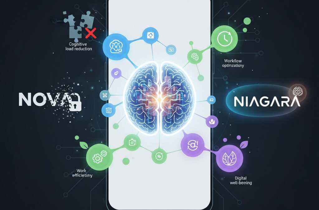
Android customization is no longer just about changing icons or adding flashy animations. In 2026, the real battleground has shifted toward cognitive load reduction, workflow optimization, and digital well-being. As smartphone hardware performance plateaus, your launcher choice increasingly defines how efficiently you think, work, and interact with your device.
The once-dominant Nova Launcher has undergone ownership changes and sparked privacy debates, triggering a wave of migration among power users. At the same time, minimalist launchers like Niagara are gaining traction, backed by cognitive science research showing how visual clutter impacts decision-making speed and mental fatigue.
If you care about performance benchmarks, gesture navigation limitations in Android 15 and 16, battery efficiency on Snapdragon 8 Gen 3 devices, or open-source alternatives without trackers, this guide will give you a strategic, evidence-based roadmap. By the end, you will understand not just which launcher is “best,” but which one is optimal for your brain, your workflow, and your hardware.
- The Post-Standard Era of Android Customization
- Nova Launcher’s Ownership Changes and the Economics of Trust
- Privacy Concerns: Data Access, Analytics, and User Behavior Tracking
- Cognitive Science and UI Design: How Visual Clutter Impacts Your Brain
- Niagara Launcher Case Study: Fitts’s Law, Wave Alphabet, and One-Handed Efficiency
- Smart Launcher 6: Automation, Smart Search, and Adaptive Theming
- Microsoft Launcher and Cross-Device Productivity Integration
- Open-Source Sanctuaries: Kvaesitso, Octopi, and Tracker-Free Alternatives
- Android Gesture Navigation vs Third-Party Launchers: Why Flickering Still Exists
- Shizuku, QuickSwitch, and Advanced Gesture Workarounds
- Battery Benchmarks 2025–2026: Efficiency Groups and CPU Load Comparisons
- Chipset Evolution: Why Snapdragon 8 Gen 3 Masks Launcher Inefficiencies
- Icon Packs, Theming Engines, and Solving the Inconsistency Problem
- Strategic Decision Framework: Choosing the Optimal Launcher for Your Use Case
- 参考文献
The Post-Standard Era of Android Customization
Between 2025 and 2026, Android customization has entered what can only be described as a post-standard era. For more than a decade, power users treated certain launchers as the de facto default. That assumption no longer holds true.
Hardware performance has plateaued at the high end, and Android itself has matured. As a result, the battlefield has shifted from raw features to something more subtle yet more important: how effectively a launcher manages attention, trust, and workflow.
Customization is no longer about how much you can change, but about how intelligently your interface reduces friction.
The turning point came when long-dominant players experienced ownership changes and strategic shifts. Industry coverage from outlets such as PhoneArena and How-To Geek reported acquisitions and potential advertising integrations that unsettled loyal communities. What changed was not just feature direction, but perceived alignment with user interests.
A launcher has access to deeply personal behavioral signals: which apps you open, how often, and at what time. In an ecosystem increasingly sensitive to data governance, that access transforms the launcher from a cosmetic layer into a trust-sensitive infrastructure component.
Reddit discussions across r/Android and r/androidapps show a clear pattern: migration conversations are now driven as much by privacy posture as by animation smoothness. This signals a structural shift in user priorities.
| Old Standard Era | Post-Standard Era |
|---|---|
| Feature maximalism | Cognitive load reduction |
| Deep manual customization | Context-aware automation |
| Brand loyalty | Trust and transparency |
At the same time, cognitive science has reframed what a “good” home screen means. Research published in journals indexed by MDPI demonstrates that visually complex interfaces increase cognitive load and slow task completion. Yale News reported in 2024 that visual clutter measurably alters information flow in the brain, reinforcing the cost of chaotic layouts.
This matters because the launcher is the most frequently viewed screen on any Android device. Every notification badge, widget animation, and icon inconsistency compounds micro-decisions throughout the day.
When multiplied by hundreds of daily interactions, small inefficiencies become systemic mental fatigue.
Therefore, the post-standard era is defined by three forces converging at once. First, trust economics: who owns the software and how it monetizes attention. Second, cognitive ergonomics: how layout structure influences mental energy. Third, workflow optimization: how quickly intent translates into action.
For advanced users, this means the question has evolved. It is no longer “Which launcher has the most features?” but “Which launcher aligns with my behavioral patterns and risk tolerance?”
In this new landscape, diversity replaces dominance. Multiple philosophies coexist—minimalist, automated, business-centric, open-source—each optimized for a different definition of efficiency. The era of a single unquestioned standard has ended, and in its place stands a more complex but ultimately more empowering ecosystem.
Nova Launcher’s Ownership Changes and the Economics of Trust

For more than a decade, Nova Launcher was not just an app but a default choice for Android power users. The unspoken consensus was simple: if you cared about customization, you used Nova. That perception began to shift dramatically after its 2022 acquisition by analytics firm Branch Metrics, followed by workforce reductions in 2024–2025 and a subsequent buyout by Instabridge in 2025, as reported by outlets such as PhoneArena and How-To Geek.
What changed was not merely ownership on paper. The economic logic behind the product fundamentally evolved. Nova had long operated on a premium unlock model, where users paid once for Nova Prime. Under companies whose core business revolves around data analytics and advertising, however, the incentive structure differs. Sustainable growth is often tied to recurring monetization and data-driven optimization.
| Phase | Owner | Primary Revenue Logic |
|---|---|---|
| Pre-2022 | Independent (Kevin Barry) | One-time premium upgrade |
| 2022–2025 | Branch Metrics | Data analytics ecosystem alignment |
| Post-2025 | Instabridge | Ad-supported sustainability model |
Instabridge publicly emphasized the need for a “sustainable business model,” and multiple reports indicated the potential introduction of ads, possibly even in paid tiers in the form of recommended apps. For a launcher, this is not a trivial adjustment. A launcher sits at the center of the user’s digital life. It sees which apps you open, how often, and at what time of day.
According to discussions across Reddit communities such as r/androidapps, the backlash was not primarily about UI regressions or missing features. It was about trust. Threads titled “Saying Goodbye to Nova” illustrate a migration driven less by performance metrics and more by perceived misalignment of values.
Trust in software is an economic asset. When users believe a tool operates solely in their interest, they tolerate imperfections and even slower updates. When ownership shifts to firms whose revenue depends on behavioral data, the psychological contract changes. Even if privacy policies remain compliant, the asymmetry of information creates doubt.
This dynamic reflects a broader pattern in the software industry. As platforms mature and hardware innovation plateaus, recurring revenue becomes attractive. Yet for utilities embedded deeply into personal workflows, monetization strategies can erode brand equity faster than they generate cash flow. In Nova’s case, the very depth of integration that once made it indispensable now amplifies scrutiny.
The result is a textbook example of the economics of trust: once shaken, restoration costs more than initial acquisition. Power users, who once evangelized Nova, now diversify or explore open-source alternatives—not because Nova stopped functioning, but because ownership signals changed the perceived future trajectory. In the post-standard era of Android customization, governance and incentives matter as much as features.
In launcher markets, control over data equals control over trust—and trust ultimately determines retention.
Nova’s transformation therefore represents more than corporate reshuffling. It marks a shift from feature supremacy to credibility competition, where transparency, ownership structure, and monetization philosophy directly influence user loyalty.
Privacy Concerns: Data Access, Analytics, and User Behavior Tracking
When discussing Android launchers in 2025–2026, performance and aesthetics often dominate the conversation. However, for power users, privacy concerns around data access, analytics, and behavioral tracking have become equally critical decision factors.
A launcher is not just another app. It sits at the center of your device experience, mediating every app launch, search query, and notification glance. This structural position gives it potential visibility into highly sensitive behavioral patterns.
Understanding what level of access is technically possible—and what business incentives exist behind the scenes—is essential for making an informed choice.
| Data Category | Launcher Access Scope | Privacy Sensitivity |
|---|---|---|
| App usage frequency | Detectable via default home role | High (behavior profiling) |
| Search queries | Via integrated search bars | Very High (intent signals) |
| Widget interactions | Indirect usage inference | Moderate to High |
Following the acquisition of Nova Launcher by analytics-focused companies such as Branch Metrics and later Instabridge, community discussions intensified. As reported by PhoneArena and How-To Geek, concerns were not limited to ads themselves but to the broader question of data monetization models.
Branch Metrics is known for mobile attribution and analytics infrastructure. When such a company owns a launcher, users reasonably ask whether aggregated behavioral data could inform advertising ecosystems, even if anonymized.
The issue is not necessarily confirmed misuse, but structural capability combined with commercial incentive.
Academic research helps explain why this matters. According to studies indexed in PubMed Central on problematic smartphone use, behavioral data such as frequency and timing of app interaction can reveal patterns of habit formation, impulse control, and even stress cycles.
If a launcher has visibility into when you open messaging apps late at night, how often you check finance apps, or which shopping apps you prioritize, that metadata becomes an extremely rich behavioral fingerprint.
Even without message content access, metadata alone can construct detailed user models.
Yale research on visual clutter demonstrates how interface environments influence cognitive processing. From a privacy standpoint, this intersects with analytics because UI experiments—layout adjustments, recommendation placements, suggested apps—can be A/B tested to optimize engagement.
Engagement optimization often relies on telemetry. The more granular the tracking, the more precisely user behavior can be shaped.
When a launcher begins recommending apps or surfacing “suggested” content, analytics pipelines are typically operating in the background.
By contrast, open-source launchers distributed via platforms like F-Droid explicitly avoid proprietary trackers. Community discussions on Reddit frequently highlight Kvaesitso and Octopi as alternatives precisely because their codebases are auditable.
Open-source does not automatically guarantee perfect privacy, but transparency reduces asymmetry. Users and developers can inspect whether telemetry libraries or third-party SDKs are embedded.
This transparency shifts trust from corporate promises to verifiable architecture.
It is also important to distinguish between three different privacy layers:
First, on-device data access: what the launcher can technically observe due to system permissions.
Second, telemetry transmission: what is actually sent to remote servers.
Third, data retention and monetization: how long it is stored and for what commercial purpose.
Many users focus only on visible ads, but invisible analytics often represent the deeper concern. A clean interface without banners does not necessarily mean zero tracking.
Conversely, some analytics are used for legitimate crash reporting or performance optimization, which improve stability without building behavioral ad profiles.
The critical question is proportionality and disclosure.
In the post-standard era of Android customization, trust has become a competitive differentiator. Reddit migration threads such as “Saying Goodbye to Nova” illustrate that privacy perception alone can drive large-scale user movement, regardless of feature parity.
For advanced users, reviewing privacy policies, checking network activity via firewall tools, and preferring transparent development models are increasingly standard practice.
In a launcher market where UI design is converging, data ethics may ultimately become the true battleground.
Cognitive Science and UI Design: How Visual Clutter Impacts Your Brain

Every time you unlock your smartphone, your brain begins filtering, prioritizing, and suppressing visual information within milliseconds. When your home screen is packed with colorful icons, badges, widgets, and animated elements, that filtering process becomes heavier than you might expect.
Visual clutter is not just an aesthetic problem; it is a cognitive one. Cognitive science defines this burden as cognitive load, the amount of mental effort required to process information. In interface design, unnecessary complexity directly increases that load.
Research published in Behavioral Sciences by MDPI shows that higher visual complexity in mobile interfaces significantly increases task completion time and perceived mental effort. Users exposed to dense layouts made more errors and reported greater fatigue, even when the actual task was simple.
Yale University researchers further demonstrated that visual clutter alters information flow in the brain. Their findings suggest that clutter reduces the precision with which the brain processes peripheral visual information, a phenomenon related to visual crowding. On a smartphone, that means icons placed too closely or styled inconsistently can literally become harder to distinguish at a neural level.
| UI Condition | Brain Response | User Impact |
|---|---|---|
| High icon density | Increased visual competition | Slower app recognition |
| Inconsistent colors/shapes | Higher processing demand | Decision fatigue |
| Clear hierarchy & spacing | Efficient signal prioritization | Faster task completion |
This has direct implications for launcher design. A chaotic grid filled with mismatched icon packs, notification dots, and multiple widgets forces the prefrontal cortex to work harder to identify targets. Over dozens or hundreds of daily unlocks, this micro-strain accumulates.
There is also a behavioral dimension. A narrative review on problematic smartphone use indexed in PubMed Central highlights how constant notifications and visual stimuli reinforce compulsive checking behavior. When badges and dynamic elements constantly demand attention, your attentional system remains in a low-level state of alert.
The brain treats every red badge as a potential priority signal. Even if you intend to ignore it, attentional resources are momentarily allocated. Multiply that by dozens of micro-interruptions per day, and you create measurable mental fatigue.
Minimalist UI approaches reduce this tax by limiting simultaneous stimuli. By simplifying color palettes, increasing spacing, and reducing on-screen choices, designers lower extraneous cognitive load. This does not remove functionality; it restructures when and how options appear.
From a cognitive load theory perspective, effective launcher design separates essential actions from optional ones. Primary apps remain immediately visible, while secondary tools require deliberate gestures or searches. This staged disclosure aligns with how working memory operates, which is known to be capacity-limited.
For gadget enthusiasts optimizing their home screen, the key question is not “How much can I fit?” but “How little does my brain need to see?” When you reduce visual noise, you shorten recognition time, minimize decision friction, and preserve mental energy for tasks that actually matter.
In a post-hardware-saturation era, performance gains increasingly come from cognitive efficiency rather than processor speed. A cleaner interface does not just look modern; it allows your neural circuitry to operate with less resistance, turning your launcher into a tool that supports focus instead of fragmenting it.
Understanding this cognitive foundation transforms launcher customization from a cosmetic hobby into a neuroscience-informed optimization strategy. When you design your UI with your brain in mind, every unlock becomes slightly faster, slightly calmer, and significantly more intentional.
Niagara Launcher Case Study: Fitts’s Law, Wave Alphabet, and One-Handed Efficiency
Niagara Launcher is often described as minimal, but its real innovation lies in how rigorously it applies human–computer interaction theory. At the core is Fitts’s Law, a predictive model formulated by Paul Fitts in 1954, which states that the time to acquire a target depends on the distance to and size of that target. In simple terms, closer and larger targets are faster to tap.
Traditional grid-based launchers scatter icons across the screen, forcing your thumb to travel diagonally and vertically. Niagara inverts this logic. By aligning apps in a vertical list along the screen edge, it reduces average thumb travel distance and turns the entire edge into an effectively infinite target, a well-known optimization in interface design.
| Design Element | Traditional Grid | Niagara Approach |
|---|---|---|
| App Layout | Multi-row grid | Single vertical list |
| Thumb Travel | Wide, multi-directional | Edge-aligned, linear |
| Target Acquisition | Tap small icon | Slide + release gesture |
The Wave Alphabet feature operationalizes this principle. By sliding your thumb along the right or left edge, you reveal an alphabetical index and jump instantly to the desired app. What would normally require opening an app drawer and scrolling becomes a single continuous motion. According to Google Play documentation, this interaction is designed specifically for one-handed use, minimizing discrete taps.
This reduction from multi-step navigation to a fluid edge gesture is not cosmetic; it directly lowers motor and cognitive effort. The gesture transforms the edge into both navigation rail and selection tool, effectively compressing interaction time.
Beyond motor efficiency, Niagara also addresses cognitive load. Research highlighted by Yale News shows that visual clutter alters information flow in the brain, degrading peripheral processing. By limiting visible elements to a focused list and contextual notifications, Niagara reduces competing stimuli, which in turn accelerates decision-making.
The Adaptive List reinforces one-handed efficiency. Media controls or active notifications surface at the top of the list, within the natural thumb zone. Instead of stretching to reach a widget or notification shade, you act within a predictable, ergonomically optimized area.
Niagara’s efficiency emerges from three converging factors: edge-based infinite targets, linear information architecture, and context-aware prioritization.
Even its Anycon theming system contributes indirectly. By unifying icon shapes and tones, it reduces micro-delays caused by visual inconsistency. Studies on interface complexity, such as those published in Behavioral Sciences, indicate that consistent visual patterns decrease search time and mental fatigue.
In practice, the learning curve is short but meaningful. Users report that after several days, the muscle memory of sliding to a letter becomes automatic. At that point, the launcher feels less like a customizable skin and more like a finely tuned input instrument.
Niagara Launcher is therefore best understood not as a minimalist aesthetic experiment, but as a case study in applied ergonomics. It demonstrates how classical interaction theory, when implemented with discipline, can turn a 6-inch touchscreen into a genuinely one-handed, high-efficiency tool.
Smart Launcher 6: Automation, Smart Search, and Adaptive Theming
Smart Launcher 6 is designed around a clear philosophy: reducing setup time while maximizing daily efficiency. Instead of asking users to manually build folders and organize dozens of apps, it analyzes app metadata and automatically categorizes them into logical groups such as Communication, Games, and Media. This automation shifts the launcher’s role from a visual tool to a workflow optimizer.
According to its Google Play description and official updates, the categorization engine continuously adapts as new apps are installed. In practice, this means your app drawer evolves without manual maintenance. For users who frequently test new apps or switch devices, this alone can save hours of configuration.
Smart Launcher 6 minimizes cognitive friction by automating structure, accelerating search, and harmonizing visual design in real time.
Automation That Learns Your Usage
The automatic app sorting is not static. When you install a finance app, it is placed into a relevant category without intervention. When you remove or replace apps, the structure updates accordingly. This dynamic classification reduces the visual clutter that cognitive research—such as studies published by MDPI on interface complexity—associates with increased mental load.
For power users, manual overrides are still available. You can reassign categories or hide apps entirely, creating a hybrid system where automation handles 80% of organization and you fine-tune the remaining 20%.
Smart Search as a Command Center
At the core of the experience is Smart Search, positioned prominently for immediate access. It goes far beyond web lookup. You can search apps, contacts, and even perform calculations or unit conversions directly from the same field. The 6.6 update in 2025 focused specifically on improving responsiveness and accuracy, making search results feel nearly instantaneous.
| Function | Integrated in Smart Search | User Benefit |
|---|---|---|
| App & Shortcut Search | Yes | Faster deep-link access |
| Contact Lookup | Yes | Direct calling or messaging |
| Calculator | Yes | No need for separate app |
| Unit Conversion | Yes | Instant contextual answers |
This convergence transforms the launcher into a lightweight command interface. Instead of navigating through multiple apps, you execute intent from a single entry point. For productivity-focused users, this reduces interaction steps and shortens task completion time.
Adaptive Theming with Icon Pack Studio
Visual coherence is another pillar. Smart Launcher 6 integrates tightly with Icon Pack Studio, developed by the same team. Rather than downloading static icon packs, you can generate icons that automatically adapt to your wallpaper’s dominant colors and preferred shapes.
This adaptive theming solves a long-standing issue in Android customization: inconsistency. Many icon packs lack support for niche or regional apps, resulting in mismatched icons. Icon Pack Studio algorithmically reshapes and recolors every installed app icon, preserving uniformity across the home screen.
As highlighted by Android Authority, this balance between automation and aesthetic control is what differentiates Smart Launcher 6 from traditional customization-heavy launchers. You spend less time tweaking grids and more time actually using your device. The result is a launcher that feels curated without demanding constant attention.
Microsoft Launcher and Cross-Device Productivity Integration
Microsoft Launcher stands out not for radical visual reinvention, but for how deeply it connects your Android phone to the broader Microsoft ecosystem.
For users who live inside Outlook, Teams, OneDrive, and Windows PCs, this launcher functions as a productivity bridge rather than just a home screen replacement.
The core value is cross-device continuity—reducing friction between mobile and desktop workflows.
Core Integration Features
| Feature | Integrated Service | Practical Benefit |
|---|---|---|
| Glance Feed | Outlook, Calendar, To Do, Sticky Notes | Unified daily dashboard on home screen |
| Microsoft Account Sync | Windows PC + Edge | Cross-device continuity |
| Search Bar | Bing + Device Search | Web and local search in one field |
The “Glance” feed is the centerpiece. According to Microsoft’s official support documentation, users can access calendar events, recent documents, tasks, and notes directly from the home screen without opening individual apps.
This reduces context switching, a factor cognitive science research—including studies cited by Microsoft Research—has long associated with productivity loss.
Instead of jumping between five apps, you scroll once and act immediately.
Cross-device integration becomes even more powerful for Windows users. By signing in with a Microsoft account, your wallpaper preferences, app layout backup, and certain browsing activities can sync across devices.
When paired with Edge and Microsoft 365, you can move from drafting a document on your PC to reviewing it on your phone with minimal friction.
This continuity minimizes the mental overhead of switching hardware environments.
Unlike highly experimental launchers, Microsoft Launcher prioritizes reliability and enterprise-grade stability.
Its design language aligns closely with Microsoft’s Fluent principles, creating visual familiarity for users already embedded in Windows 11 and Microsoft 365 workflows.
For business professionals, that consistency matters more than extreme customization.
Another overlooked strength is work-profile compatibility. In corporate environments where Android Enterprise or Microsoft Intune is deployed, Microsoft Launcher integrates cleanly with managed accounts.
This makes separation between personal and professional data more intuitive at the home screen level.
For remote and hybrid workers, that structural clarity reduces operational confusion.
Importantly, Microsoft Launcher does not attempt to dominate the entire UI philosophy of Android.
Instead, it layers productivity services on top of familiar paradigms—app drawer, folders, gestures—while offering subtle enhancements like customizable gestures and icon packs.
The result is a launcher that feels conservative on the surface, yet strategically powerful underneath.
In a market increasingly focused on minimalism or extreme customization, Microsoft Launcher represents a third path.
It treats the home screen as a command center for cloud-connected work rather than a design canvas.
For users whose digital life revolves around Microsoft services, this integration-first philosophy can translate directly into measurable workflow efficiency.
Open-Source Sanctuaries: Kvaesitso, Octopi, and Tracker-Free Alternatives
As trust becomes the primary currency in the launcher market, open-source alternatives are emerging as true sanctuaries for privacy-conscious users.
Unlike ad-driven ecosystems, these projects are built in the open, with source code publicly auditable and community governance at their core.
For power users wary of trackers, telemetry, and opaque ownership changes, open-source launchers represent structural transparency rather than marketing promises.
According to community discussions on Reddit’s r/androidapps and r/Android, interest in F-Droid-distributed launchers has risen notably after concerns surrounding commercial acquisitions.
Platforms like GrapheneOS have also emphasized the importance of minimizing privileged apps with broad behavioral access, and a launcher—by definition—sits at the center of user interaction.
Choosing an open-source launcher therefore reduces the risk surface associated with behavioral analytics embedded at the UI layer.
| Launcher | Core Philosophy | Tracking/Ads | Primary Audience |
|---|---|---|---|
| Kvaesitso | Search-first minimalism | None | Keyboard-driven organizers |
| Octopi | Nova-style familiarity | None | Customization migrants |
Kvaesitso stands out as a radical reinterpretation of what a launcher should be.
Instead of grid-based icon layouts, it centers the experience around unified search, blending local apps, shortcuts, and optionally web queries into a single streamlined interface.
This approach aligns with cognitive load research published in Behavioral Sciences (MDPI), which suggests that reducing visual complexity improves task efficiency and lowers mental strain.
Power users often describe Kvaesitso as “tag-driven productivity.”
Apps can be grouped and accessed through semantic organization rather than spatial memory, which shifts interaction from muscle-based tapping to intent-based retrieval.
It rewards users who think in systems rather than screens.
Octopi, by contrast, occupies a different strategic niche.
Positioned as a fully open-source alternative inspired by Nova’s traditional layout paradigm, it preserves familiar customization mechanics without embedding proprietary analytics layers.
For users migrating away from commercial uncertainty, this continuity reduces friction while restoring transparency.
Open-source does not automatically mean feature-poor. In many cases, it means the roadmap is shaped by contributors rather than shareholders.
Another overlooked advantage is verifiability.
Because the codebases are publicly accessible, security researchers and independent developers can audit data flows directly.
In an era where launcher ownership can change twice within three years, that auditability becomes a long-term stability asset.
There are trade-offs, of course.
Open-source projects may update more slowly, and advanced animation integrations—particularly with Android’s gesture navigation stack—can lag behind proprietary implementations.
However, for users prioritizing sovereignty over spectacle, these compromises are often acceptable.
Ultimately, Kvaesitso and Octopi are not merely apps; they are ideological statements.
They assert that the home screen—arguably the most intimate layer of the smartphone experience—should remain under user control.
In the post-standard era of Android customization, open-source launchers redefine freedom as inspectability, not just configurability.
Android Gesture Navigation vs Third-Party Launchers: Why Flickering Still Exists
Even in 2026, the flickering issue between Android’s gesture navigation and third-party launchers has not been fully resolved. If you have ever swiped up to return home and noticed a brief flash, delayed icon redraw, or a stutter before the home screen settles, you are experiencing a structural limitation rather than a simple bug.
The root cause lies in how Android handles system gestures. Since Android 10, the gesture navigation system has been deeply integrated with the default system launcher through a component known as Quickstep. This component controls the Recents animation and the transition from apps back to the home screen.
Third-party launchers do not have the same level of privileged access to Quickstep, which means they cannot fully replicate the seamless animation pipeline used by Pixel Launcher or One UI Home. As a result, the system briefly falls back, redraws the UI, and produces the visible flicker.
| Element | System Launcher | Third-Party Launcher |
|---|---|---|
| Quickstep integration | Native, full access | Restricted API access |
| Recents animation | Seamless icon morphing | Limited transition control |
| Home swipe behavior | Smooth, continuous | Possible redraw or flicker |
Niagara Launcher’s official feedback documentation openly acknowledges these gesture navigation issues, emphasizing that the limitation originates from Android’s system architecture rather than from launcher-side inefficiency. Discussions on the GrapheneOS forum and Reddit’s Android beta community similarly confirm that even Android 15 has not eliminated the animation inconsistency.
Community reports from OnePlus and OPPO users further illustrate that OEM skins do not fundamentally solve the issue. While some manufacturers slightly tune animation timing, the underlying restriction remains tied to how Android delegates the Recents provider.
This explains why flickering tends to be most visible when using swipe-up-and-hold gestures. That gesture triggers the system-level overview animation, which expects tight coordination between the running app and the launcher. When that handshake is imperfect, a visual discontinuity appears.
Importantly, this is not primarily a performance problem. On modern chipsets such as Snapdragon 8 Gen 3 devices, raw processing power is more than sufficient. The issue persists because it is architectural, not computational.
Some advanced users attempt workarounds such as Shizuku-based gesture overlays or root-level tools like QuickSwitch. These methods can reduce perceived lag by redirecting gesture handling or replacing the Recents provider. However, as documented in GitHub discussions and Reddit threads, stability can vary across Android versions, especially after major updates.
In practical terms, flickering still exists because Android prioritizes system launcher integrity over third-party extensibility. Until Google fully decouples gesture animation from the default launcher or expands privileged APIs, third-party launchers will continue operating within a constrained framework.
For enthusiasts who demand both customization and flawless gesture animation, this remains the single most persistent friction point in the Android ecosystem.
Shizuku, QuickSwitch, and Advanced Gesture Workarounds
For power users who refuse to give up gesture navigation, workarounds such as Shizuku-based tweaks and QuickSwitch have become essential tools. As documented in community threads and Niagara Launcher’s own support notes, the root cause lies in Android’s Quickstep component, which tightly integrates system gestures with the stock launcher. Third-party launchers cannot fully hook into this layer, resulting in flickering or animation lag when returning home.
Instead of waiting for Google to open deeper APIs, advanced users are building parallel solutions. These approaches differ significantly in complexity, stability, and risk profile.
| Method | Root Required | Animation Quality | Maintenance Cost |
|---|---|---|---|
| Shizuku + Gesture App | No | Moderate | Low–Medium |
| QuickSwitch (Magisk) | Yes | Near-native | High |
Shizuku leverages Android’s wireless debugging framework to grant apps elevated privileges via ADB without permanent root access. According to curated GitHub lists tracking Shizuku-compatible apps, it acts as a permission bridge rather than a system modification layer. When paired with gesture tools like Vivid Navigation or UbikiTouch, users can hide the stock navigation bar and recreate edge-swipe gestures through overlay detection.
This method does not truly replace Quickstep. Instead, it intercepts touch input and triggers system actions such as “Home” or “Back.” The animation pipeline remains separate, which explains why transitions may feel slightly less fluid than Pixel Launcher. However, Reddit reports in Android 15 environments suggest that lag can be significantly reduced compared to default third-party behavior.
QuickSwitch takes a fundamentally different approach. Distributed as a Magisk module, it reassigns the system’s Recents provider to a supported third-party launcher such as Lawnchair. By doing so, it integrates the launcher directly into the gesture animation stack, enabling near-native swipe-to-home and overview transitions.
The trade-off is operational complexity. Rooting introduces SafetyNet and Play Integrity considerations, and community discussions in Lawnchair forums indicate that Android 15 updates can temporarily break compatibility until the module is patched. Each OS upgrade may require revalidation, making this path suitable primarily for enthusiasts comfortable with flashing modules and debugging boot loops.
From a strategic perspective, these workarounds illustrate a broader shift in Android customization culture. Instead of surface-level theming, power users are now modifying interaction architecture itself. As discussions on GrapheneOS and other security-focused forums highlight, the gesture-launcher conflict is not a bug but an architectural boundary.
Choosing between Shizuku and QuickSwitch is therefore less about performance and more about philosophy: permission-based augmentation versus system-level replacement. Both methods push Android beyond its default constraints, but each demands a clear understanding of risk, maintenance, and long-term sustainability.
Battery Benchmarks 2025–2026: Efficiency Groups and CPU Load Comparisons
Battery efficiency is no longer a secondary concern when choosing a launcher. In 2025–2026, benchmarks show that launcher architecture, animation handling, and background process design directly influence daily endurance, especially on mid-range and aging devices.
Recent comparative testing referenced by SmartBuy and echoed in community measurements highlights three clear efficiency tiers. The gap is not dramatic on flagship silicon, but it becomes measurable under constrained RAM and sustained CPU load.
| Efficiency Group | Representative Launchers | Observed Impact |
|---|---|---|
| High Efficiency | Niagara, Olauncher | Up to 1.5–2 hours longer daily use on older devices |
| Balanced | Smart Launcher 6, Lawnchair | ~35% lower CPU usage vs. Nova in comparable setups |
| High Load (Custom-heavy) | Nova (extensive widgets/live wallpapers) | 8–12% higher battery drain on 4GB RAM devices |
The high-efficiency group achieves gains through minimal animation layers, limited background listeners, and reduced redraw frequency. Niagara, for example, avoids dense grid rendering and complex transition effects, which lowers GPU wakeups and short CPU bursts during navigation.
In contrast, Nova itself is not inherently inefficient. The issue appears under heavy customization. Multiple KWGT widgets, live wallpapers, notification counters, and gesture overlays create cumulative CPU interrupts. On devices with 4GB RAM or less, this often triggers more aggressive garbage collection cycles, which indirectly increase power draw.
Balanced launchers such as Smart Launcher 6 demonstrate how optimization offsets feature richness. According to 2025 update notes and third-party comparisons, CPU utilization during idle home screen states remains significantly below older Nova configurations. Intelligent app categorization and optimized search indexing reduce background scanning overhead.
This hardware masking effect is important. Modern big.LITTLE architectures dynamically park efficiency cores for lightweight UI tasks. When a launcher is well-threaded, it runs primarily on low-power cores, minimizing thermal impact. As a result, high-end users may perceive no difference at all.
However, under sustained CPU load scenarios such as rapid app switching, search indexing, and heavy widget refresh cycles, differences become visible in thermal graphs. Community tests discussed on Reddit and summarized in buyer guides show smoother frame pacing and fewer micro-stutters on minimalist launchers during stress cycles.
For power users, the real takeaway is strategic configuration. Even a feature-rich launcher can enter the “efficient” zone if you limit live elements, reduce widget refresh frequency, and disable unnecessary background integrations. Conversely, any launcher can become power-hungry when overloaded.
Battery benchmarks in 2025–2026 therefore do not crown a universal winner. They instead confirm a principle: efficiency scales with visual simplicity and process discipline, while customization depth scales with CPU wake frequency. Your usage pattern ultimately determines which side of that equation matters most.
Chipset Evolution: Why Snapdragon 8 Gen 3 Masks Launcher Inefficiencies
On paper, third-party launcher inefficiencies should be visible immediately. Yet on devices powered by Snapdragon 8 Gen 3, many users report that “it feels smooth anyway.” This perception gap is not accidental. It is the direct result of chipset evolution outpacing UI-layer optimization.
Snapdragon 8 Gen 3 integrates a high-performance CPU cluster, advanced Adreno GPU, and improved memory bandwidth designed for AI workloads and high-refresh gaming. When such headroom is applied to comparatively lightweight home screen rendering, performance bottlenecks are often brute-forced away.
The problem is not that launchers became perfectly efficient. It is that the hardware became powerful enough to hide their flaws.
| Scenario | Mid-range SoC | Snapdragon 8 Gen 3 |
|---|---|---|
| Heavy widgets + animations | Noticeable frame drops | Mostly stable at 120Hz |
| Gesture return-to-home | Visible redraw delay | Delay masked by faster GPU compositing |
| Background process load | RAM pressure triggers reloads | Large memory pool prevents refresh |
As benchmark observations in 2025 launcher comparisons indicate, battery consumption differences shrink to under 3% on flagship devices. That narrowing gap does not necessarily mean software efficiency improved. It means the SoC absorbs inefficient redraw cycles, excessive widget polling, and background listeners without user-visible slowdown.
The Adreno GPU’s stronger frame pacing and higher sustained throughput reduce micro-stutters during home transitions. Combined with LPDDR5X memory bandwidth, icon re-rendering and live wallpaper compositing complete fast enough to avoid perceptible jank.
However, masking is not optimization. When the same launcher configuration runs on a 4GB or older mid-tier device, inefficiencies reappear immediately as dropped frames or reload flicker.
There is also a psychological dimension. Research on visual complexity shows users equate smooth motion with quality. If a 120Hz panel maintains frame consistency, users assume structural efficiency—even if CPU cycles spike unnecessarily in the background.
This creates a dangerous feedback loop. Developers may deprioritize deep optimization because performance complaints decrease among flagship users. Meanwhile, energy waste persists silently, only becoming visible under thermal throttling or prolonged standby drain.
For power users evaluating launchers in 2026, the key question is not “Does it feel smooth on Snapdragon 8 Gen 3?” but rather “Would it still be efficient without excess silicon headroom?” True optimization reveals itself under constraint, not abundance.
In the post-standard era, chipset evolution has shifted the evaluation baseline. High-end devices forgive architectural inefficiencies. That forgiveness should not be mistaken for technical excellence.
Icon Packs, Theming Engines, and Solving the Inconsistency Problem
Icon packs are no longer just cosmetic add-ons. In the post-standard era of Android launchers, they function as cognitive alignment tools that directly influence how quickly and comfortably you process visual information.
When every app ships with its own branding logic, color palette, and shape language, the home screen becomes a collage of competing design systems. According to research highlighted by Yale News on visual clutter, inconsistent visual stimuli can alter information flow in the brain and reduce processing efficiency.
This is the true inconsistency problem: not ugliness, but cognitive friction.
Why Inconsistency Hurts Usability
Icon inconsistency manifests in three measurable dimensions. Each affects recognition speed and perceived order.
| Dimension | Typical Issue | Impact on UX |
|---|---|---|
| Shape | Mixed circles, squircles, free-form logos | Slower visual scanning |
| Color | Highly saturated brand clashes | Increased visual noise |
| Style | Flat vs. skeuomorphic mixing | Reduced aesthetic coherence |
MDPI-published research on interface visual complexity shows that higher visual density correlates with increased cognitive load. A home screen filled with mismatched icons unintentionally raises that density, even if the layout itself is minimal.
In other words, even a “clean” grid can feel mentally busy if its iconography lacks harmony.
Icon Packs as Cognitive Filters
Traditional icon packs such as Whicons or Japes Ink aim to normalize color and line weight. By enforcing a monochrome or hand-drawn system, they compress visual variability into a single aesthetic language.
However, the long-standing weakness has been coverage. Many Japan-specific apps, regional banking tools, or niche services are not included, creating the so-called missing icon problem where default icons break the theme.
One inconsistent icon is enough to disrupt perceived uniformity.
Theming Engines: Dynamic Consistency at Scale
This is where theming engines like Icon Pack Studio redefine the workflow. Instead of relying solely on pre-designed assets, the engine analyzes installed app icons and algorithmically applies rules for shape, color, shadow, and texture.
According to its Google Play documentation, Icon Pack Studio can generate customized packs based on user-defined parameters and even adapt to wallpaper tones. Smart Launcher integrates this system deeply, enabling near real-time visual harmony.
The shift is strategic: from static design libraries to procedural design generation.
Niagara Launcher approaches the same problem differently. Its Anycons system and recent theming updates, discussed in Android community threads, allow automatic adaptation to avoid clashing with the home screen background. Rather than maximizing customization depth, it minimizes the risk of visual conflict.
The practical implication for power users is significant. Instead of spending hours hunting for the “perfect” icon pack, you can define design constraints: muted palette, uniform rounded mask, low shadow depth. The engine handles the rest.
This procedural consistency becomes especially powerful in ecosystems where new apps are installed frequently. Every addition automatically conforms to your chosen design system.
In a landscape where trust, efficiency, and mental bandwidth matter more than ever, solving the inconsistency problem through intelligent theming is not aesthetic indulgence. It is interface optimization at a neurological level.
Strategic Decision Framework: Choosing the Optimal Launcher for Your Use Case
Choosing the right launcher in 2026 is no longer about chasing the longest feature list. It is about aligning interface philosophy with your cognitive style, device constraints, and risk tolerance regarding privacy and platform limitations.
The optimal launcher is the one that reduces friction in your specific daily workflow. To make that decision rationally, you need a framework grounded in usage patterns, not hype.
| Primary Priority | Recommended Direction | Key Trade-off |
|---|---|---|
| Cognitive simplicity | Minimal / list-based launcher | Reduced visual customization |
| Automation & aesthetics | Smart categorization launcher | Less granular manual control |
| Deep customization | Legacy-style power launcher | Higher setup time & resource use |
| Privacy transparency | Open-source launcher | Fewer polished integrations |
Start with cognitive load. Research published in Behavioral Sciences (MDPI) shows that visually complex mobile interfaces increase mental effort and task time. Yale News further reports that visual clutter alters information flow in the brain, reducing processing efficiency in peripheral vision. If you unlock your phone more than 80–100 times per day, even small inefficiencies compound into measurable fatigue.
In that case, a minimalist launcher is not an aesthetic choice but a neurological optimization strategy.
Next, evaluate workflow density. Do you actively manage folders, gestures, widgets, and icon packs? Or do you prefer intelligent defaults? If you enjoy curating every pixel, a highly customizable launcher remains powerful. However, remember that configuration time is a hidden cost. Power users often spend hours fine-tuning layouts that automated categorization systems can generate in seconds.
Time invested in setup must be justified by long-term efficiency gains.
Third, consider system-level friction. Gesture navigation inconsistencies with third-party launchers persist into Android 15 and 16, as discussed in community forums and developer documentation. If seamless animations and stock-like transitions matter to you, test gesture performance before committing. On mid-range devices, animation glitches may outweigh customization benefits.
Fourth, factor in hardware tier. Benchmark comparisons in 2025 show that lightweight launchers extend battery life noticeably on older devices, while differences shrink to under 3% on flagship chipsets. If you use a 4GB RAM device, efficiency should rank higher in your framework than visual experimentation.
Finally, assess trust. Ownership changes and monetization shifts in major launchers have demonstrated that long-term stability is not guaranteed. If behavioral data sensitivity concerns you, open-source transparency may outweigh feature depth.
The strategic choice is not about which launcher is “best” in general. It is about which launcher creates the lowest cumulative friction across cognition, performance, privacy, and daily habit loops.
When evaluated through this structured lens, your decision becomes deliberate rather than emotional, and your home screen transforms from decoration into an optimized command interface.
参考文献
- PhoneArena:Nova Launcher is back from the dead, but you may not like what’s changed
- How-To Geek:Nova Launcher Has a New Owner, but It’s Not Looking Good
- Yale News:‘Visual clutter’ alters information flow in the brain
- MDPI:Research on the Influence of Interface Visual Design Features of Mobile News on Cognitive Load
- Niagara Launcher:Gesture Navigation Issues
- Tom’s Guide:Best Android launchers in 2025
- Android Authority:Smart Launcher 6 is my favorite Android launcher