One-Handed Mode in 2026: How Android, iOS, and AI Are Reinventing Big-Screen Smartphone Usability
2026年3月5日
Team tech X
Smartphone displays have grown from 3.5 inches to nearly 6.7 inches in just over a decade, delivering immersive video, richer apps, and desktop-class multitasking in your pocket. Yet your hand has not evolved at the same speed. This widening gap between screen size and human ergonomics has created a quiet usability crisis for millions of users worldwide.
Observational research by Steven Hoober shows that nearly half of smartphone interactions still happen with a single hand, even on large devices. At the same time, ergonomics studies on thumb reach demonstrate that as screens exceed 5.2 inches, hard-to-reach zones expand dramatically—especially in the upper corners. In other words, the modern smartphone is bigger than your natural thumb zone.
In this article, you will explore how Android’s One-Handed Mode, Samsung’s advanced gesture systems, Sony’s AI-powered Side Sense, third-party cursor apps, foldable hardware, and even emerging desktop modes are reshaping human-computer interaction. If you care about cutting-edge gadgets and real usability—not just specs—this deep dive will help you rethink what truly makes a smartphone “smart” in 2026.
The Big-Screen Paradox: Why Larger Displays Clash with Human Ergonomics
Over the past decade, smartphone displays have expanded from around 3.5–4 inches to approximately 6.7 inches in today’s flagship models. While larger screens deliver richer media experiences and more on-screen information, they also expose a fundamental tension between technology and the human body. The size of our hands has not evolved alongside our displays.
This mismatch creates what can be described as a big-screen paradox: the very feature that enhances immersion simultaneously undermines one-handed usability. In markets like Japan, where many users operate smartphones on crowded public transport while holding a strap, this ergonomic gap becomes more than an inconvenience—it becomes a daily friction point.
According to research by MMD Laboratory, 31.1% of users still prefer a compact, one-hand-friendly smartphone size. The preference is even stronger among users in their 40s and older. Despite this demand, the supply of high-end compact devices continues to shrink, as manufacturers prioritize global trends toward larger displays.
Era
Typical Screen Size
One-Hand Reachability
Early 2010s
3.5–4.0 inches
Most areas reachable
Mid 2010s
5.0–5.5 inches
Upper corners difficult
Mid 2020s
6.5–6.9 inches
Upper half largely unreachable
Human-Computer Interaction research reinforces this reality. Steven Hoober’s large-scale observational studies, frequently cited in interaction design literature such as A List Apart, found that approximately 49% of users operate their phones with one hand. Even as screens have grown, users have not abandoned one-handed interaction. Instead, they stretch their thumbs further.
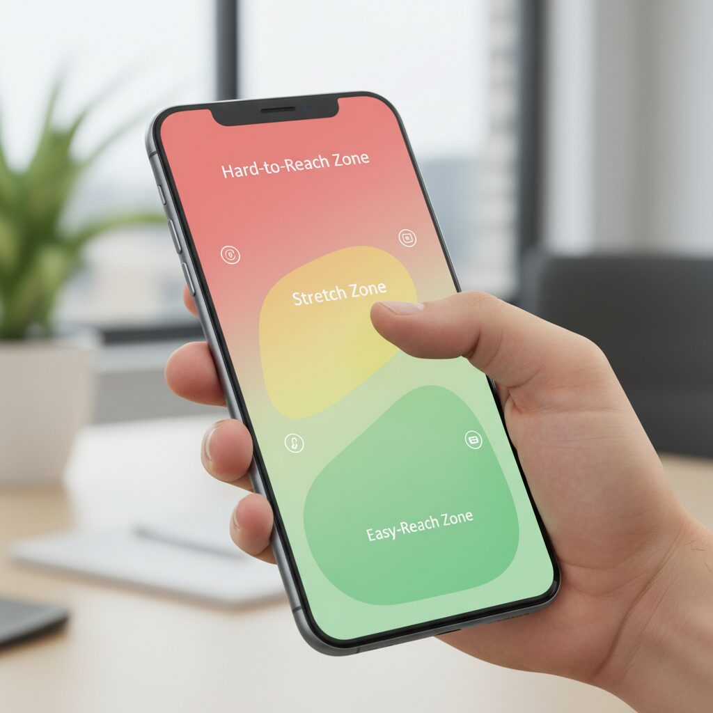
Hoober’s “Thumb Zone” model maps the screen into natural, stretch, and hard-to-reach areas. As screen height increases—particularly with modern 20:9 or 21:9 aspect ratios—the hard zone expands dramatically. A study published in ergonomics research on one-handed interaction further shows that devices above 5.2 inches significantly enlarge unreachable areas, especially the top-left corner for right-handed users.
The paradox is clear: larger screens optimize content consumption but penalize input ergonomics. The top of the display often houses critical controls—search bars, menus, navigation elements—yet these are precisely the regions most distant from the thumb’s natural arc.
Another overlooked factor is context switching. Although about 90% of the population is right-handed, Hoober observed that only around 67% consistently use their right hand for phone interaction. Users frequently switch hands depending on whether they are holding a bag, drinking coffee, or stabilizing themselves. This variability compounds the ergonomic challenge of oversized displays.
In essence, the industry has optimized for visual impact rather than biomechanical harmony. Screen expansion increases viewing pleasure, but it pushes interactive elements beyond comfortable reach. Until hardware dimensions realign with human anatomy—or interfaces adapt dynamically—the clash between bigger displays and fixed human ergonomics will remain one of the defining tensions of modern mobile design.
Inside the Thumb Zone: What Observational and Ergonomic Studies Reveal
As smartphones have grown from 4-inch displays to today’s 6.7-inch flagships, the geometry of the human hand has not changed. This mismatch is at the core of what researchers call the Thumb Zone problem. Observational and ergonomic studies reveal that most users still attempt one-handed interaction, even when devices exceed the natural reach of the thumb.
Steven Hoober’s large-scale field observations, widely cited in HCI discussions and published in A List Apart, analyzed thousands of real-world usage moments. The results are striking: about 49% of users operate their phones with a one-handed grip, 36% cradle the device and tap with the other hand, and only 15% consistently use both hands with both thumbs. Even in the era of large screens, one-handed use remains the dominant behavior.
Grip Type
Approximate Share
Main Input Method
One-handed
49%
Thumb of holding hand
Cradled
36%
Opposite hand finger
Two-handed
15%
Both thumbs
Another important insight from Hoober’s data is contextual switching. Although roughly 90% of the population is right-handed, only about 67% of one-handed interactions are performed with the right hand. This suggests users frequently switch hands depending on situational constraints such as holding a bag or standing in transit. Designing only for the dominant hand ignores a significant portion of real-world behavior.
The Thumb Zone framework visualizes reachable areas as three regions: a natural zone (comfortable arc near the bottom center), a stretch zone (reachable with thumb extension), and a hard zone (requiring grip adjustment). Ergonomic research published in proceedings on design and human factors shows that once screen sizes exceed around 5.2 inches, the hard zone expands dramatically. On tall 20:9 or 21:9 displays, the entire upper half effectively becomes a hard zone during one-handed use.
Interestingly, studies examining thumb length and screen size interactions indicate that not only the top-left corner but also areas near the lower right edge can become constrained. The base of the thumb limits lateral flexion, creating micro dead zones even within visually “near” areas. Reachability is not simply about distance but about joint mechanics and grip stability.
The paradox is clear: larger displays increase visual immersion, yet simultaneously reduce biomechanical accessibility. The more content we can see, the less of it we can comfortably touch with one hand.
For gadget enthusiasts and UI designers alike, these findings shift the conversation from preference to physiology. The Thumb Zone is not a trend but a structural constraint grounded in anatomy and observed behavior. Any serious approach to one-handed usability must begin with this empirical reality.
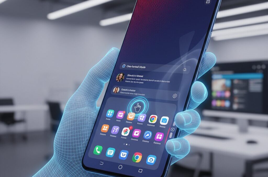
Android Before and After Android 12: The Evolution of Native One-Handed Mode
Before Android 12, native one-handed mode was not part of stock Android at all. If you were using a Pixel or any device close to AOSP, there was simply no system-level solution prepared by Google. As screen sizes expanded beyond 6 inches, this absence became increasingly noticeable for users who relied on single-hand operation.
During that period, one-handed usability was largely driven by OEM innovation rather than platform standardization. Most manufacturers adopted what is commonly called the screen shrinking approach. The entire display would be scaled down to roughly 70–80% of its original size and repositioned toward one bottom corner, effectively simulating a smaller phone inside a larger one.
From a functional perspective, this method guaranteed full reachability. Every UI element remained accessible because the entire canvas was reduced. However, the trade-offs were clear: smaller text, tighter tap targets, and unused blank space around the shrunken window. For productivity-focused users, it felt like a compromise rather than a refined interaction model.
Period
Implementation
Key Characteristics
Pre-Android 12 (AOSP)
No native feature
OEM-dependent solutions
OEM Era
Screen shrinking
Full reach, reduced UI scale
Android 12+
Screen pull-down
Top area slides down, UI size preserved
The real turning point came with Android 12. Google officially introduced a native one-handed mode, but instead of adopting the shrinking paradigm, it implemented a pull-down style interaction similar to Apple’s Reachability. When activated, the top half of the screen slides downward, bringing upper interface elements into the thumb’s natural reach zone.
This shift reflected a deeper HCI philosophy. Research on thumb ergonomics, such as the thumb zone observations discussed in design literature like A List Apart, shows that the upper portion of modern tall displays increasingly falls into the hard-to-reach area. Google’s solution directly targeted that vertical gap without altering horizontal scale.
The most important difference is that Android 12 preserves UI size. Buttons, keyboards, and text remain at their original scale, reducing mis-taps that were common in shrinking implementations. For tasks like replying to messages or interacting with dense UI elements, this design maintains visual clarity and motor precision.
However, the pull-down model introduced its own limitations. When the top slides down, content originally located at the bottom may temporarily move off-screen. In scenarios where users need to reference both top and bottom elements simultaneously, the interaction becomes sequential rather than parallel.
Android 12 also added timeout behavior. By default, the system automatically exits one-handed mode after several seconds of inactivity, as documented in Android Police’s coverage of early developer previews. This reinforces the idea that Google sees the feature as a transient assist rather than a persistent layout state.
In essence, the evolution from pre-Android 12 fragmentation to a standardized pull-down mechanism marks a platform-level acknowledgment of the large-screen paradox. Google moved from ignoring the ergonomic gap to formally addressing vertical reachability as a core UX issue. The change was not merely cosmetic; it signaled that one-handed interaction had become a structural design requirement in the era of 6.7-inch smartphones.
Samsung’s One UI Strategy: Screen Shrinking, Gesture Depth, and One Hand Operation+
Samsung’s One UI approaches one-handed usability from a fundamentally different angle than Google’s stock Android. Instead of merely pulling the top of the screen downward, it embraces full screen shrinking as a persistent, adjustable state, combined with deep gesture customization through One Hand Operation+. This is not a temporary accessibility aid, but a structural design philosophy.
According to Samsung’s official support documentation, One UI’s One-handed mode reduces the entire display area and repositions it to the lower left or right corner. Unlike Android 12’s pull-down method, every UI element remains visible within the reduced frame. This matters in real-world multitasking scenarios where users need simultaneous access to both top and bottom UI layers.
Screen Shrinking vs. Pull-Down Reachability
Feature
One UI
Stock Android
Display behavior
Full screen shrinks
Top half slides down
Element size
Scaled smaller
Original size maintained
Simultaneous top/bottom view
Possible
Limited
One UI goes further by allowing users to manually resize and reposition the shrunken window. By dragging the corner, the usable area can be fine-tuned to match thumb length and grip posture. This aligns closely with Steven Hoober’s “Thumb Zone” theory, which shows that reachability differs dramatically depending on hand size and device width. Samsung effectively lets users redraw their own thumb zone in real time.
The real strategic depth appears when One Hand Operation+ is added. As part of the Good Lock suite, it transforms the screen edges into programmable gesture panels. Users can assign short swipes, long swipes, and diagonal swipes to different actions. This multiplies command density without increasing finger travel distance.
One UI does not just shrink the screen. It shrinks the required movement.
For example, a short diagonal swipe from the right edge can trigger notifications, while a long horizontal swipe can launch split-screen view. The thumb no longer needs to stretch toward the top bezel at all. Human–Computer Interaction research emphasizes minimizing motor movement to reduce fatigue and error rates. Samsung operationalizes that principle at the OS level.
Another distinctive element is persistence. Unlike Google’s implementation, which automatically times out after several seconds unless adjusted, Samsung’s shrunken mode can remain active continuously. This makes it suitable for extended browsing sessions on 6.7-inch class devices, where upper-screen reach would otherwise fall into the “hard zone” identified in ergonomics studies.
In practical terms, One UI treats large displays not as a compromise to be temporarily corrected, but as a canvas that can dynamically adapt to the user’s hand. By combining geometric resizing with gesture-layer abstraction, Samsung turns the paradox of screen growth into a customizable ergonomic system.
For power users who demand control rather than simplification, this layered strategy positions One UI as one of the most technically ambitious approaches to one-handed interaction in the Android ecosystem.
Sony’s Side Sense and AI-Based App Prediction on 21:9 Displays
Sony’s approach to one-handed usability on its 21:9 Xperia displays is fundamentally different from simple screen shrinking. Instead of only resizing the UI, Sony introduces Side Sense, a contextual shortcut layer designed specifically for ultra-tall screens where vertical reach becomes the primary ergonomic challenge.
The 21:9 aspect ratio keeps the device relatively narrow and easier to grip, but it dramatically increases thumb travel distance toward the top edge. According to ergonomic findings on thumb zones published in HCI research, taller displays expand the “hard zone” vertically, making top-corner access particularly demanding during one-handed use. Side Sense is Sony’s answer to this structural constraint.
Challenge on 21:9
Side Sense Solution
User Benefit
Long vertical reach
Edge double-tap menu
Top actions near thumb
Frequent app switching
AI app prediction
Reduced navigation steps
Accessing quick settings
Contextual shortcut panel
Faster one-handed control
Side Sense is activated by double-tapping the side of the display. A floating panel appears near the thumb, showing predicted apps and frequently used toggles such as Wi-Fi or Bluetooth. Because this menu appears at the device’s edge rather than the top, it respects the natural thumb arc identified in mobile interaction studies such as those referenced by A List Apart and other UX research communities.
The AI-based app prediction component is particularly important. Sony states that the system learns from usage patterns, including time of day and behavioral history. For example, a music app may surface during commuting hours, while a messaging app appears in the evening. This reflects a broader shift in HCI from static layouts to adaptive interfaces.
Instead of forcing the thumb to travel upward, Side Sense brings likely actions downward.
Importantly, Side Sense does not distort the screen layout. Unlike pull-down reachability modes that temporarily shift content, the core interface remains intact. This preserves visual continuity during video playback or multitasking, which is particularly relevant on Xperia devices optimized for cinematic viewing.
Sony also allows customization of trigger sensitivity and position, accommodating both left- and right-handed use. This ambidextrous consideration aligns with observational research showing users frequently switch hands depending on context.
In essence, Sony’s 21:9 strategy acknowledges the vertical paradox of tall displays and addresses it not by shrinking the world inside the screen, but by intelligently predicting what the user needs next. It is a context-driven mitigation of physical limits rather than a purely geometric workaround.
OPPO and Xiaomi: Gesture Innovation Beyond Standard One-Handed Modes
OPPO and Xiaomi approach one-handed usability from a different angle. Instead of simply shrinking the entire screen or sliding it downward, they redesign specific high-frequency actions through gesture innovation. This task-oriented philosophy is particularly visible in OPPO’s ColorOS and Xiaomi’s HyperOS, where the goal is not to move the whole UI, but to bring only what matters closer to your thumb.
OPPO’s Icon Pull-down Gesture is one of the most distinctive examples. When you swipe upward from the left or right edge of the home screen, all app icons temporarily condense toward the lower portion of the display, within thumb reach. Without lifting your finger, you can slide directly to the desired app and release to launch it.
This mechanism optimizes the “app launch” moment rather than the entire interface. According to Sony and Google’s accessibility documentation, most one-handed modes focus on top-of-screen reachability. OPPO instead identifies the home screen grid itself as a friction point and solves it with a dynamic spatial rearrangement.
Brand
Primary Innovation
Design Focus
OPPO (ColorOS)
Icon Pull-down Gesture
Thumb-centered app access
Xiaomi (HyperOS)
Flexible one-handed mode + UI adjustments
System-wide reachability tuning
Xiaomi, on the other hand, combines configurable one-handed modes with broader UI-level adjustments. Depending on the OS version, users can enable a reduced-screen layout similar to traditional shrink modes, while system gestures—such as pulling down the control center—are designed to be accessible from more flexible screen regions.
This reflects a systemic interpretation of reachability. Rather than treating one-handed mode as a temporary overlay, Xiaomi integrates gesture accessibility into the navigation logic itself. As discussed in user communities and official support documentation, HyperOS continues refining how and where swipe triggers are recognized.
The key difference is philosophical: OPPO compresses targets, Xiaomi adapts triggers.
From a human–computer interaction perspective, this is significant. Research on thumb zones indicates that lower-central areas are the most naturally reachable. OPPO’s icon condensation literally relocates interaction density into that zone. Xiaomi reduces dependency on extreme top corners by allowing broader gesture activation areas.
For users who frequently launch apps or toggle settings while commuting or holding something in the other hand, these micro-optimizations accumulate into measurable comfort gains. Instead of resizing the world, OPPO and Xiaomi selectively reorganize it. That subtle shift moves one-handed usability beyond standard modes and toward contextual, gesture-native design.
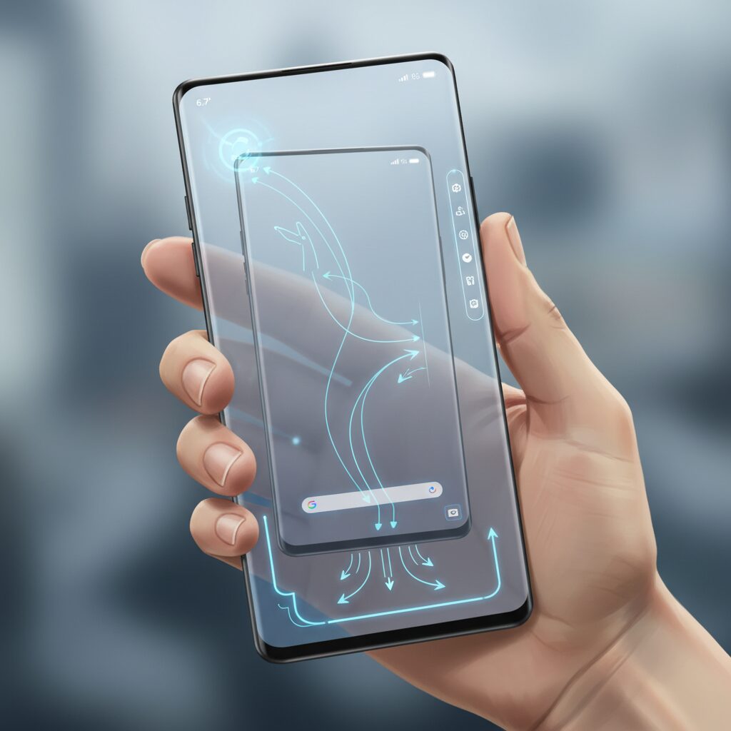
Quick Cursor and the Rise of Virtual Trackpads on Large Phones
As smartphones have expanded to 6.7 inches and beyond, software has begun to borrow ideas from an unexpected place: the desktop. Quick Cursor represents one of the clearest examples of this shift, introducing a virtual trackpad and mouse pointer concept to Android phones that have simply grown too large for comfortable one-handed reach.
Instead of shrinking the entire screen or pulling content downward, Quick Cursor overlays a cursor and a small tracking circle near the bottom edge of the display. When users swipe inward from a configurable trigger zone, a pointer appears on the screen while their thumb stays within a compact, comfortable area. The motion is relative, just like a laptop trackpad, allowing precise control without stretching toward the top corners.
Quick Cursor does not resize the interface. It abstracts touch input itself. That distinction is crucial on large phones where UI scaling can compromise readability or layout integrity.
According to its Google Play documentation and developer discussions on XDA and Reddit, the app leverages Android’s Accessibility Service to simulate touch events. This enables several advanced interactions:
Function
How It Works
One-Hand Benefit
Tap
Cursor click simulation
Reach top UI elements without grip shift
Long press
Hold gesture via pointer
Context menus stay accessible
Drag
Pointer drag across screen
Scroll or rearrange items safely
This model aligns closely with Human-Computer Interaction research on indirect pointing devices. By separating the control surface from the target surface, users reduce biomechanical strain. Studies on thumb reach, including those referenced in ergonomic analyses of large-screen phones, consistently show that upper-screen regions fall into “hard zones” during one-handed grip. A virtual trackpad effectively collapses those hard zones into the natural thumb zone.
What makes Quick Cursor particularly compelling for power users is its customization depth. Trigger size, position, sensitivity, cursor speed, and activation per app can all be configured. The Pro version further refines edge actions and visual parameters. This matters because hand size, grip style, and case thickness vary widely, as Steven Hoober’s grip research has shown. A fixed one-handed mode cannot account for this variability, but a configurable pointer system can.
Another advantage emerges in full-screen scenarios. Video playback, immersive apps, or dense productivity layouts remain visually intact because no scaling occurs. The pointer floats above content, preserving spatial continuity. For users accustomed to desktop workflows, this feels natural rather than intrusive.
The rise of virtual trackpads on large phones signals a broader paradigm shift. Instead of forcing the human hand to adapt to ever-growing displays, software is reintroducing indirection—a concept refined over decades in PC interfaces. In effect, large smartphones are quietly evolving into one-handed desktops, with the thumb acting as both trackpad and trigger.
As screen sizes continue to push ergonomic limits, cursor-based interaction may move from niche utility to mainstream expectation. Quick Cursor demonstrates that the solution to oversized displays may not be smaller screens, but smarter input abstraction.
Hardware Solutions: Foldables, MagSafe Grips, and the Psychology of Straps
When software alone cannot overcome the physical limits of the thumb, hardware steps in as a powerful equalizer. In the context of one-handed usability, three solutions stand out: foldable form factors, magnetic grip ecosystems such as MagSafe, and the culturally distinctive rise of straps.
Each of these approaches tackles a different layer of the problem. Instead of shrinking the interface, they reshape the way the device is held, supported, or psychologically perceived.
Hardware does not change the screen’s geometry. It changes the user’s leverage, balance, and sense of security.
Foldables: Reframing Size Without Sacrificing Immersion
Clamshell foldables such as the Galaxy Z Flip series or Motorola Razr present an intriguing paradox. Opened, they deliver a 6.7-inch-class display comparable to mainstream flagships. Closed, they transform into compact devices with small cover displays designed for quick interactions.
According to manufacturer documentation and feature breakdowns of devices like the Galaxy Z Flip6, the cover screen now supports widgets, notifications, quick replies, and even selected apps. This reduces the frequency of unfolding the device for micro-tasks such as checking messages or controlling music.
Mode
Primary Use
One-Hand Impact
Closed (Cover Display)
Notifications, quick controls, payments
Fully one-handed, minimal thumb travel
Opened (Main Display)
Media, browsing, multitasking
Large canvas, similar constraints to standard phones
This dual-state interaction effectively segments tasks by ergonomic demand. Short, high-frequency actions stay within a compact, thumb-friendly zone. Longer sessions justify the cognitive and physical commitment of unfolding.
Instead of fighting large screens, foldables redistribute when and how that screen is used.
MagSafe Grips and the Mechanics of Leverage
Grip accessories have evolved significantly from early adhesive rings. Contemporary magnetic systems—most notably MagSafe-compatible grips—attach and detach without permanent bonding, addressing earlier trade-offs with wireless charging.
As accessory comparison analyses in the Japanese market point out, rings create a fixed pivot point for the finger, while expandable grips like PopSockets create a raised anchor. Both alter torque distribution across the hand.
From an HCI perspective, this is critical. By inserting a finger through a ring or bracing against a grip, the user effectively extends their stable thumb reach into what Steven Hoober’s thumb zone framework would classify as a stretch or even hard zone. The device’s center of mass feels closer to the palm, reducing micro-adjustments during tapping.
The functional gain is not merely reach—it is reduced cognitive load from fear of dropping the device.
The Psychology of Straps in the Japanese Context
In Japan, where crowded public transportation is routine, straps—either wrist straps or cross-body shoulder straps—have re-emerged as mainstream accessories. While often framed as fashion, their ergonomic implications are profound.
A strap does not expand the thumb’s anatomical range. Instead, it changes perceived risk. When a phone is physically tethered to the body, users tolerate more aggressive grip shifts and deeper thumb extension into edge zones.
Research in ergonomics consistently shows that perceived stability affects motor behavior. Even without altering the interface, a tether reduces anticipatory muscle tension. Users subconsciously loosen their grip, which can increase effective mobility of the thumb.
This creates what could be described as a “psychological thumb zone.” The screen remains the same size, yet the user behaves as if more of it is safely accessible.
Straps solve not geometry, but anxiety.
Taken together, foldables, magnetic grips, and straps illustrate a broader truth in mobile ergonomics. When display size grows beyond natural anatomical limits, the path forward is not only smarter UI, but smarter physical mediation between hand and hardware.
For power users who demand immersion without sacrificing control, the most effective strategy may not be choosing smaller screens—but strategically augmenting how those screens are held.
Android vs iOS: Back Gestures, Reachability, and Customization Power
When it comes to one-handed usability, the real battlefield between Android and iOS lies in three areas: back gestures, reachability, and customization power. These elements directly determine whether a 6.7-inch device feels manageable or frustrating in daily use.
Back Gesture: Symmetry vs. Constraint
Platform
Back Gesture Area
One-Hand Impact (Right-Hand Use)
Android
Left or right screen edge swipe
Thumb-friendly on either side
iOS
Primarily left edge swipe or top-left button
Requires thumb stretch
Research by Steven Hoober shows that nearly half of smartphone interactions are performed one-handed. In this context, Android’s bilateral back gesture is ergonomically significant. Because users can swipe inward from either edge, right-handed users can trigger “Back” with minimal thumb extension.
On iOS, the standard back gesture originates from the left edge, and many apps still rely on a top-left back button. For right-hand users, this area often falls into the “stretch zone” or even “hard zone,” as described in thumb zone studies published in ergonomics research. The difference may seem subtle on paper, but over hundreds of daily interactions, it becomes physically meaningful.
Reachability: Pull-Down Philosophy
Both platforms implement a form of reachability. Android 12 introduced a system-level one-handed mode that pulls the upper portion of the screen downward, while iOS uses a similar downward shift triggered by swiping on the home indicator.
The critical distinction lies in philosophy. Android’s implementation is integrated into its gesture navigation system and can be disabled or adjusted, including timeout behavior. According to Google’s Android Accessibility documentation, the feature is designed as a temporary assistive adjustment rather than a persistent layout change.
Apple’s Reachability, by contrast, is tightly coupled with the system UI and remains visually consistent across devices. However, neither system solves simultaneous top-and-bottom access; when the screen shifts down, bottom elements may move out of view. This makes reachability ideal for quick top-bar actions but less effective for complex multitasking.
Customization Power: Open vs. Curated
This is where the gap widens dramatically. Android allows deep gesture reassignment and edge customization, especially on devices like Samsung Galaxy with One Hand Operation+. Users can define multiple directional swipes, long swipes, and hold gestures on each edge.
Android treats navigation as a customizable system layer, while iOS treats it as a fixed interaction contract.
Third-party tools such as Quick Cursor further abstract input by introducing a trackpad-like pointer controlled from the lower screen area. This effectively bypasses physical reach limitations without shrinking UI elements.
iOS, on the other hand, prioritizes consistency. While iOS 18 finally allows freer home screen icon placement, system gestures remain largely non-configurable. For users who value predictability and uniformity, this approach reduces cognitive load. For power users seeking ergonomic optimization, it can feel restrictive.
In practical terms, Android provides more pathways to engineer one-handed comfort, while iOS delivers a stable, controlled experience with fewer variables. For gadget enthusiasts who obsess over micro-efficiencies, the flexibility of Android often translates into measurable ergonomic advantage during extended daily use.
Public Transport, Mobile Payments, and Cultural Context: A Japanese Case Study with Global Implications
Japan offers a uniquely dense testing ground for one-handed smartphone interaction. In metropolitan areas such as Tokyo and Osaka, millions of commuters rely on trains and buses every day, often standing and holding a strap with one hand while operating a phone with the other.
In this context, one-handed usability is not a convenience feature but a functional necessity. The gap between growing display sizes and fixed human hand dimensions becomes most visible inside crowded public transport.
Data from MMD Research Institute shows that 31.1% of users still prefer a compact, one-hand-friendly smartphone size. This demand persists despite the market standard shifting toward devices around 6.7 inches.
Factor
Japanese Urban Context
Impact on Mobile UX
Transport mode
High reliance on trains
Frequent one-handed use
Crowding
Standing, limited stability
Higher drop risk
Payment behavior
Mobile-first checkout
Speed and reachability critical
Mobile payments amplify this ergonomic tension. Japan’s widespread adoption of FeliCa-based “Osaifu-Keitai” and QR payments such as PayPay means users must unlock, authenticate, and present their device within seconds at ticket gates and convenience stores.
When authentication sensors or app launch flows require grip adjustments, the friction is immediately felt. A payment flow that cannot be completed securely with one thumb introduces both physical and cognitive stress.
This explains why device-level shortcuts such as dedicated payment triggers have emerged in the Japanese market. They compress lock-screen authentication and app launch into a single motion, reflecting a culture where transaction speed directly affects daily rhythm.
Public transport density also changes how “thumb zones” are experienced. Research on natural thumb reach shows that larger screens expand hard-to-reach zones significantly. In a stable seated environment, users can compensate by shifting grip. In a moving train, that compensation increases drop risk.
Therefore, environmental instability magnifies ergonomic limitations. A 6.7-inch phone that feels manageable at home can become unwieldy during rush hour.
According to observations cited by Steven Hoober, nearly half of users still attempt one-handed operation even on large devices. In Japan, situational constraints likely push that percentage even higher during commuting hours.
This case study carries global implications. As cities worldwide promote public transportation and contactless payments, similar ergonomic pressures may intensify elsewhere.
Designers should note that cultural infrastructure shapes interface priorities. In car-centric societies, two-handed interaction is common during stationary use. In rail-centric societies, interfaces must assume mobility and constraint as defaults.
Japan demonstrates that mobile UX is not only a matter of screen size or software features, but of urban design, payment ecosystems, and social behavior.
For global manufacturers, the lesson is clear. Hardware dimensions cannot be optimized in isolation from cultural context. Payment authentication placement, shortcut design, and gesture accessibility must reflect real-world usage environments.
For UX strategists, Japan provides a living laboratory where human-computer interaction, infrastructure, and commerce intersect in measurable ways.
As mobile payments and dense transit systems expand internationally, the Japanese experience offers a preview of the ergonomic challenges—and design opportunities—that lie ahead.
Desktop Mode and Android 15+: Are We Moving Toward Pointer-Based Mobile Interaction?
As display sizes approach 6.7 inches and beyond, the fundamental tension between reach and readability becomes impossible to ignore. Against this backdrop, Android’s renewed focus on Desktop Mode in Android 15 and later signals something deeper than just external display support. It suggests a gradual shift from direct touch dominance toward pointer-based interaction models.
According to reporting by TechRadar and hands-on previews cited by Android Authority, Google has been actively developing a more robust desktop-style environment, similar in concept to Samsung DeX. When connected to an external monitor, supported devices can present resizable app windows, taskbar-like navigation, and multi-window management. This is not merely a larger screen—it is a different interaction paradigm.
The key shift is conceptual: from tapping UI elements directly to managing windows and targets through a cursor-driven logic.
Desktop Mode introduces structural changes that echo traditional PC environments.
Touch-Centric Mobile
Desktop-Oriented Mode
Full-screen apps
Resizable floating windows
Direct finger input
Mouse or trackpad pointer
Edge gestures for navigation
Taskbar-style switching
What makes this evolution particularly interesting is how it feeds back into smartphone ergonomics. Pointer-based interaction reduces the need to physically reach distant UI elements. Instead of stretching your thumb toward a top-corner button, you move a cursor within a confined, comfortable zone. This mirrors what third-party tools like Quick Cursor have already demonstrated on handheld screens: indirect input can compensate for physical reach limitations.
In large-screen contexts—especially foldables—windowed multitasking already blurs the boundary between phone and PC. If Android continues refining freeform window management internally, the smartphone itself could adopt more desktop-like behaviors even without an external display. Reddit discussions around early Android 15 and 16 previews frequently highlight how natural a mouse-and-keyboard workflow feels once enabled, especially on tablets and foldables.
This raises an important question: are we moving toward a hybrid input future where touch and pointer coexist as equal citizens?
From a Human-Computer Interaction perspective, this shift represents a partial abstraction of input. Direct manipulation—touching exactly what you want—has defined mobile UX since the iPhone era. Pointer systems, by contrast, introduce mediation: you control a proxy (cursor) that controls the interface. While this adds a layer of indirection, it dramatically expands reachable space without increasing physical strain.
For productivity scenarios, the advantages are obvious. Precise selection, text manipulation, spreadsheet editing, and multi-window workflows benefit from pixel-level control. But even for casual use, a system-level pointer option could solve the “dead zone” problem identified in ergonomic studies of large smartphones. Instead of redesigning UI layouts around thumb zones, the OS could dynamically adapt interaction mode depending on context—handheld, docked, folded, or propped up.
Importantly, this is not a replacement for touch. It is an expansion of interaction vocabulary. Just as laptops evolved to support both trackpads and touchscreens in some configurations, Android’s trajectory suggests a platform preparing for input plurality. If Desktop Mode continues maturing in Android 15 and beyond, pointer-based interaction may stop being a niche accessory feature and become a core pillar of mobile computing.
In that sense, the rise of Desktop Mode is not just about productivity. It is about redefining what “mobile interaction” means in an era where screens are large, devices are foldable, and the limits of the human thumb are increasingly apparent.
AI-Driven Adaptive Interfaces: The Future of Context-Aware One-Handed UX
The next leap in one-handed usability will not come from shrinking screens or adding more gestures, but from interfaces that adapt in real time to context. AI-driven adaptive interfaces aim to dissolve the fixed layout paradigm and replace it with fluid, situation-aware UX that responds to how, where, and with which hand you are using your device.
Research in Human-Computer Interaction has long emphasized that grip style changes dynamically. Steven Hoober’s observational studies show that nearly half of smartphone interactions still occur one-handed, yet users frequently switch hands depending on situational constraints. An intelligent system that assumes static behavior inevitably fails. An adaptive system, by contrast, learns and anticipates.
Context-aware UX means the interface reorganizes itself based on grip, motion state, predicted intent, and reachability—without requiring manual mode switching.
Today’s one-handed modes are reactive and uniform. AI-driven systems would instead operate on four contextual layers.
Context Layer
Detected Signal
Adaptive Response
Grip & Hand
Touch heatmap, edge pressure
Shift key actions into reachable zone
Motion State
Accelerometer, gyroscope
Simplify UI while walking
Intent Prediction
Usage history, time patterns
Surface likely next action
Visual Attention
Gaze estimation (if available)
Relocate primary CTA dynamically
For example, if the system detects right-hand one-handed grip through dominant touch clustering on the lower-right quadrant, primary controls could migrate toward the natural thumb zone defined in ergonomic studies. If motion sensors indicate the user is walking, secondary elements may collapse automatically, reducing precision demands and cognitive load.
Google’s work on predictive interfaces and Sony’s Side Sense already hint at this trajectory by surfacing likely apps based on behavioral data. However, the next stage extends beyond app prediction into micro-level UI adaptation. Instead of pulling the whole screen downward, the system would reposition only the actionable elements that matter in that moment.
Academic HCI research on adaptive layouts suggests that users tolerate dynamic repositioning when changes are gradual and contextually justified. Abrupt layout shifts cause disorientation, but subtle spatial morphing—guided by learned reach patterns—can reduce thumb travel distance without breaking mental models.
Imagine opening a payment app in a crowded train. The system recognizes habitual right-thumb use, detects motion instability, and elevates the confirmation button into the lower-right arc automatically. No mode toggle. No gesture memorization. The interface becomes cooperative rather than static.
This is not about shrinking the screen. It is about abstracting interaction away from fixed coordinates. Just as Quick Cursor introduced indirect pointing as a workaround, AI-native UX would integrate indirect control, predictive surfacing, and spatial reflow at the OS level.
As on-device machine learning accelerators become standard in flagship SoCs, real-time contextual inference no longer requires cloud latency. This enables privacy-preserving adaptation that continuously refines a personal reachability model unique to each user’s hand geometry and habits.
The paradox of ever-larger displays colliding with unchanging human anatomy will not be solved by hardware alone. The future belongs to interfaces that sense, predict, and reposition—quietly transforming one-handed UX from a compensatory feature into an intelligent default state.